League of the americas
Riot Games | LTA ● Art Director, Creative Services ● 2025
The year-long experiment to merge the NA LCS, CBLOL and LLA leagues into one super Pan-American League.
Creative Services, NA Regional Lead: Ann Nguyen ● Graphics Producer: Brianne Oliver
Post-Production Supervisor: Denise Kuan ● Studio Outsourcing: Histeria
Post-Production Supervisor: Denise Kuan ● Studio Outsourcing: Histeria
In June 2024, 3 months after my contract ended with Riot Games on the LCS, Riot would announce the formation of the LTA (League of the Americas), combining the North American League Championship Series (NA LCS), Campeonato Brasileiro de League of Legends (CBLOL) and Liga Latinoamérica (LLA).
NA Regional Lead Ann Nguyen asked me to return to Riot with a contract role as the Art Director of the LTA. I would become the only designer on the Creative Services team throughout the year, with the bulk of the static visual work being done by the internal regional offices, and only Brazilian studio Histeria to handle the motion work that I wouldn't have the bandwidth for.
BRAND BOOK
My first task coming in to the LTA after the launch of Split 1 was to help triage and repair the brand guide for the league. Created by EAT Studio, the LTA brand had a solid foundation but was far too ambiguous for the North and South regions to parse, leaving many gaps, particularly with motion content and broadcast capabilities. Because of the nature of competitive League of Legends, planning out where exactly in the schedule updates to the brand would be made was a priority. There are 3 splits with an international event in between each -- those events were where the changes would happen.
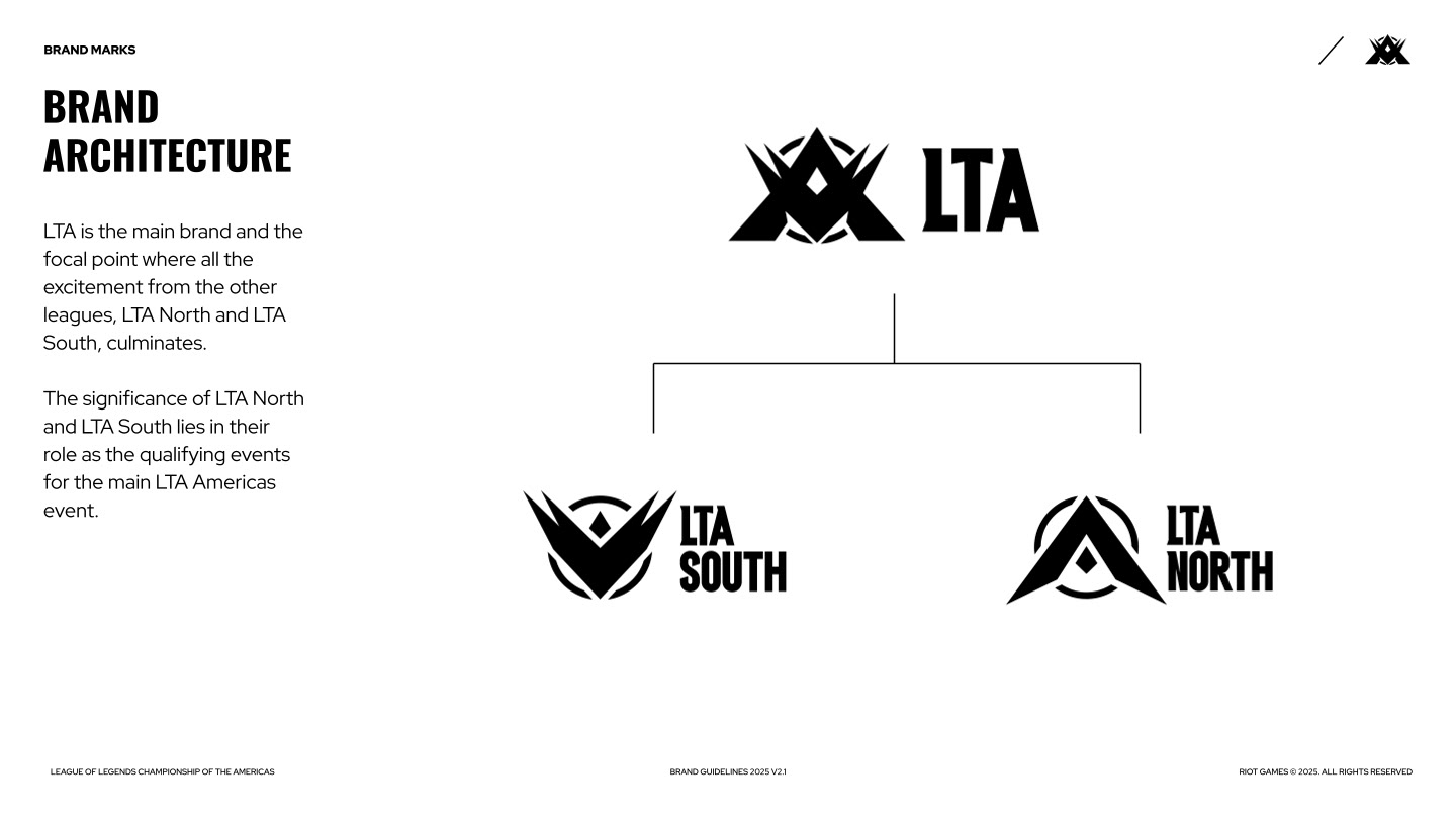
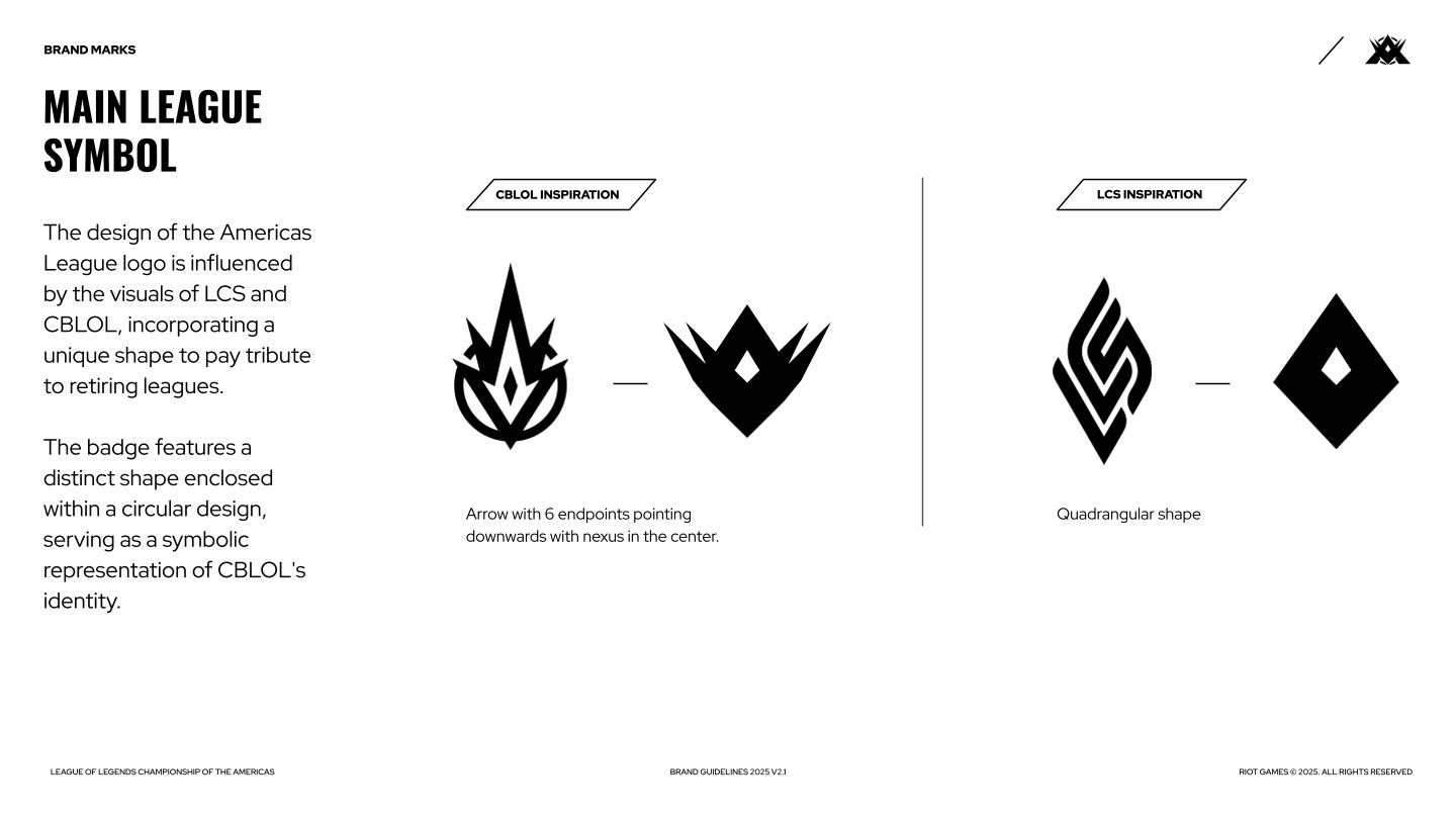
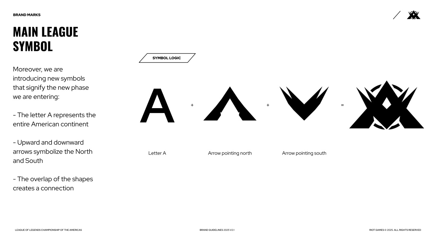
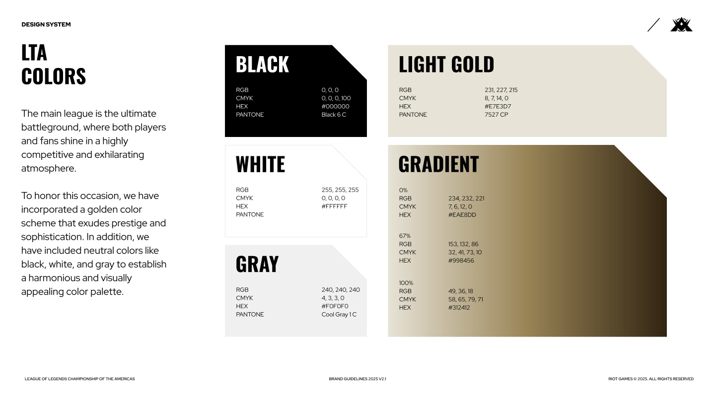
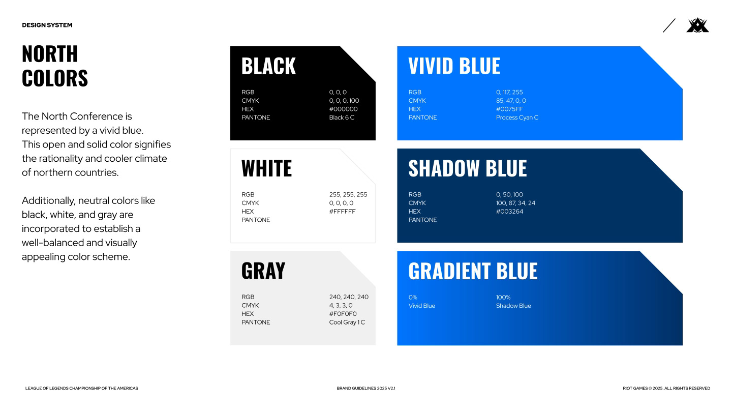
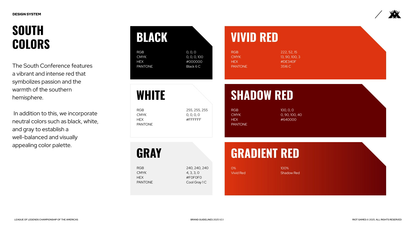
The original guide spent a lot of time explaining the logic of the logo marks and their usage -- perfect for most brands looking for consistency, though a bit minimal for the needs of an esports league spread out across two global regions. Over several months, I would expand the brand guide from 50 to 170 pages, bringing greater clarity to designers and quicker asset creation with easy-to-use templates. The sections below are but a fraction of the final guide.
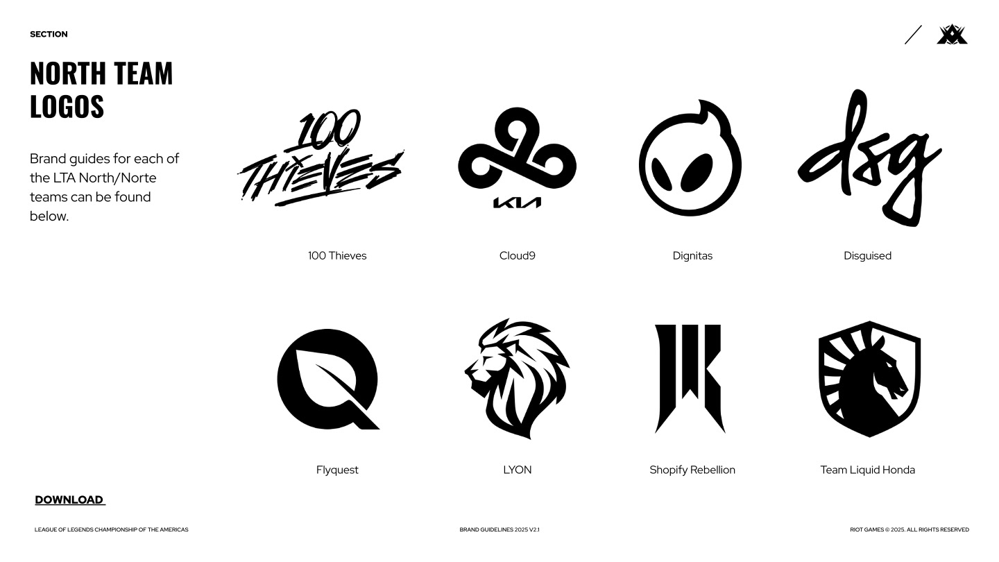
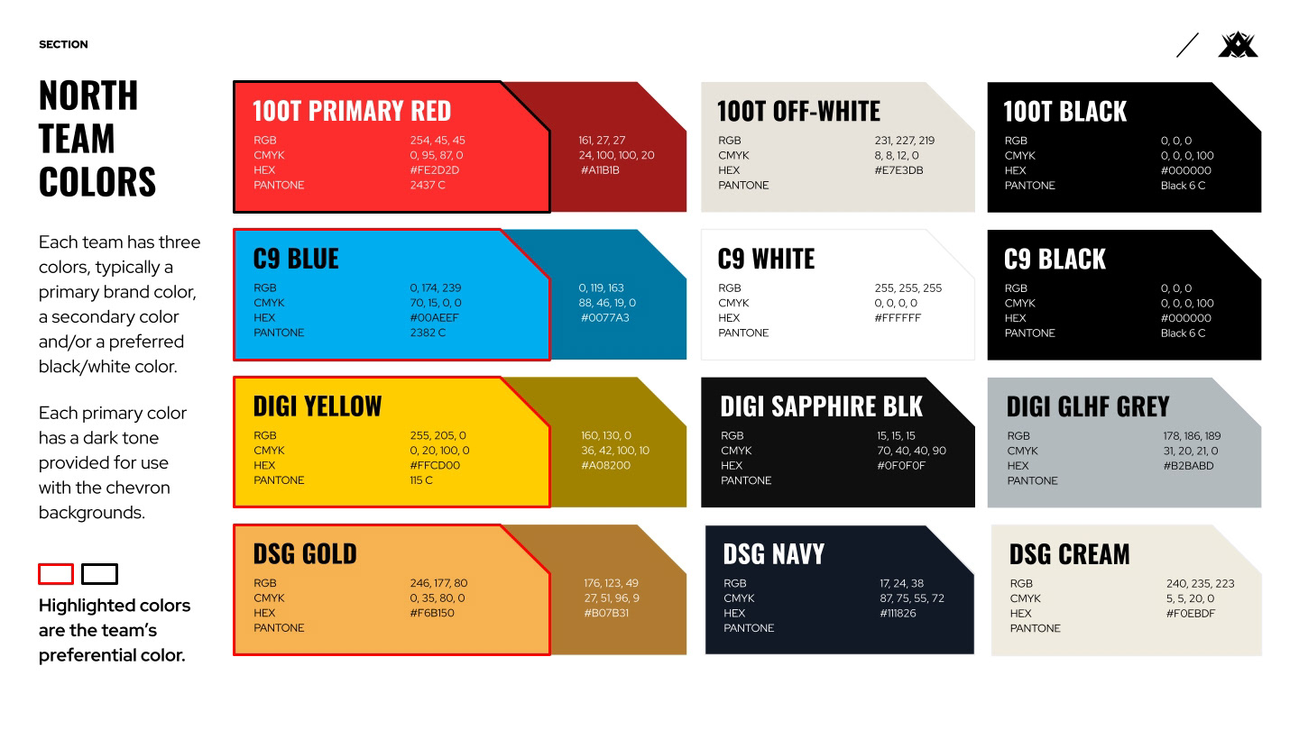
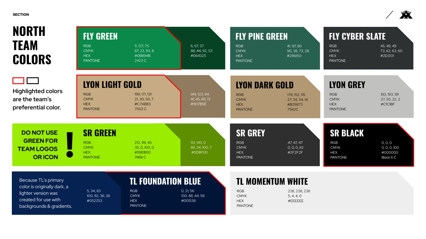
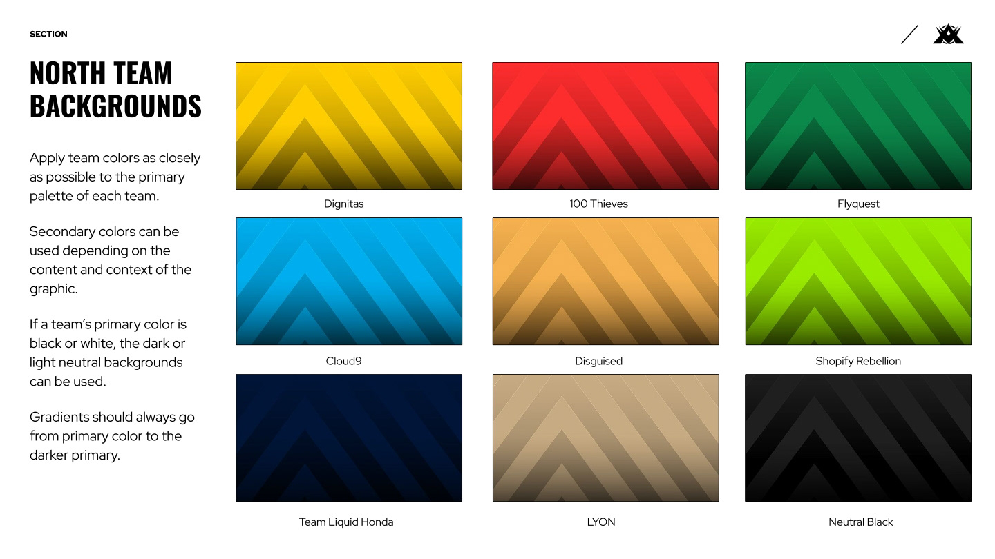
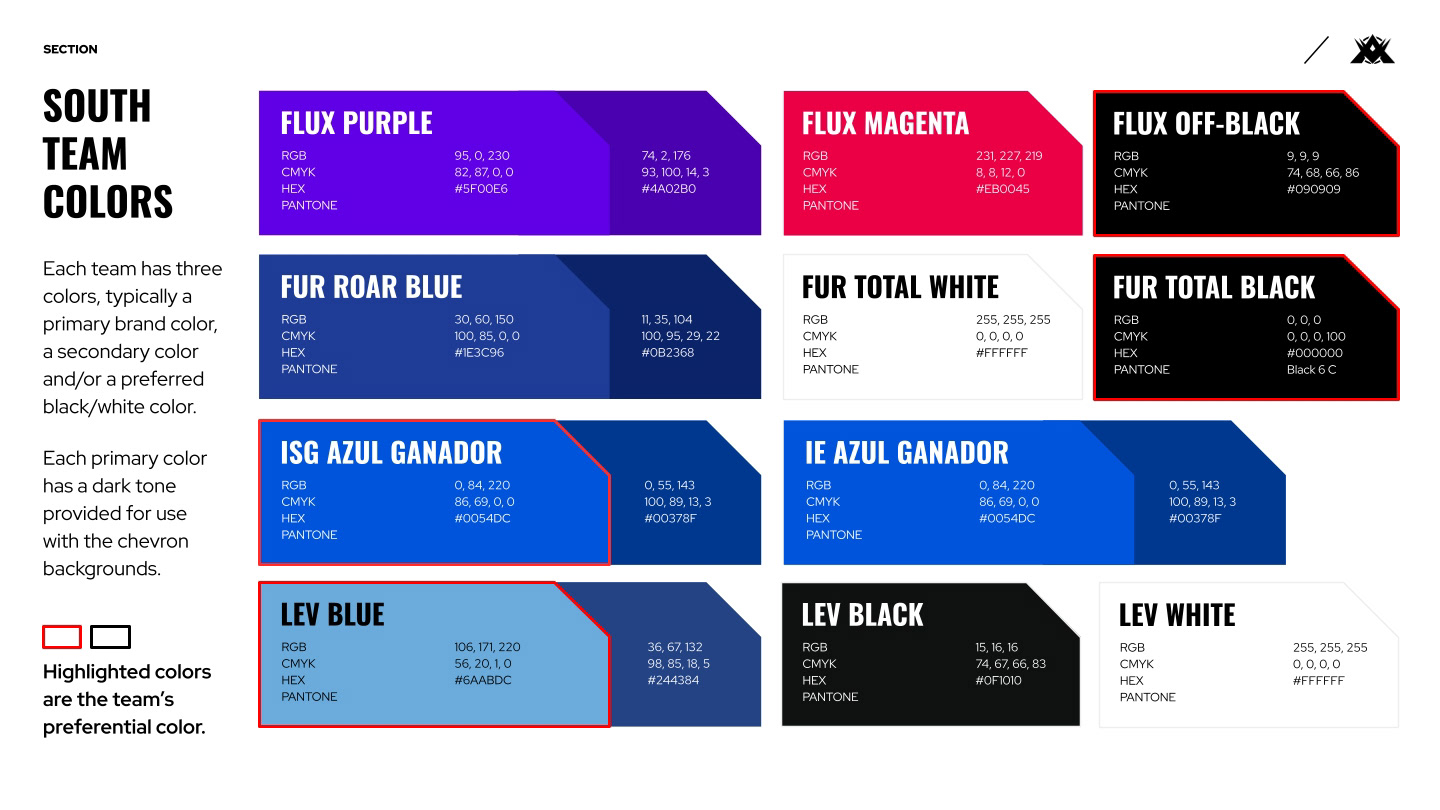
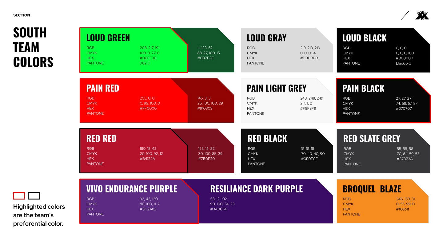
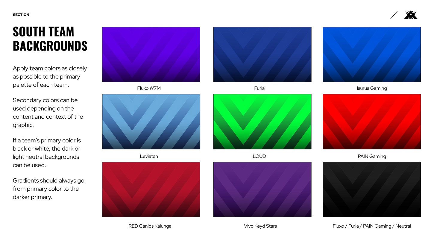
Part of maintaining a successful guide is to consolidate information and help prevent common errors from recurring. One of these errors, surprisingly, is the slow shift in team colors from their true brand colors by way of designers sampling colors from different images. By pulling each teams colors from their respective brand guides, designers had a quick way to find exact color codes for each team.
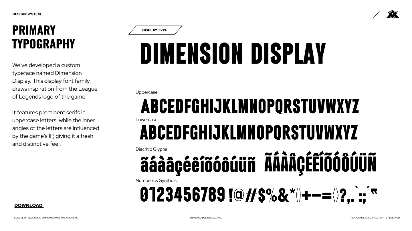
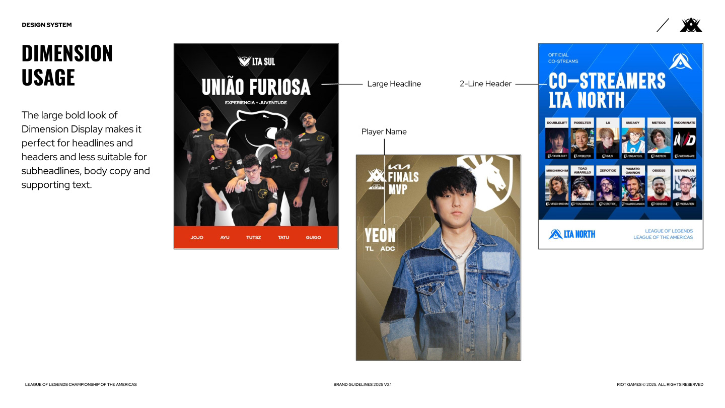
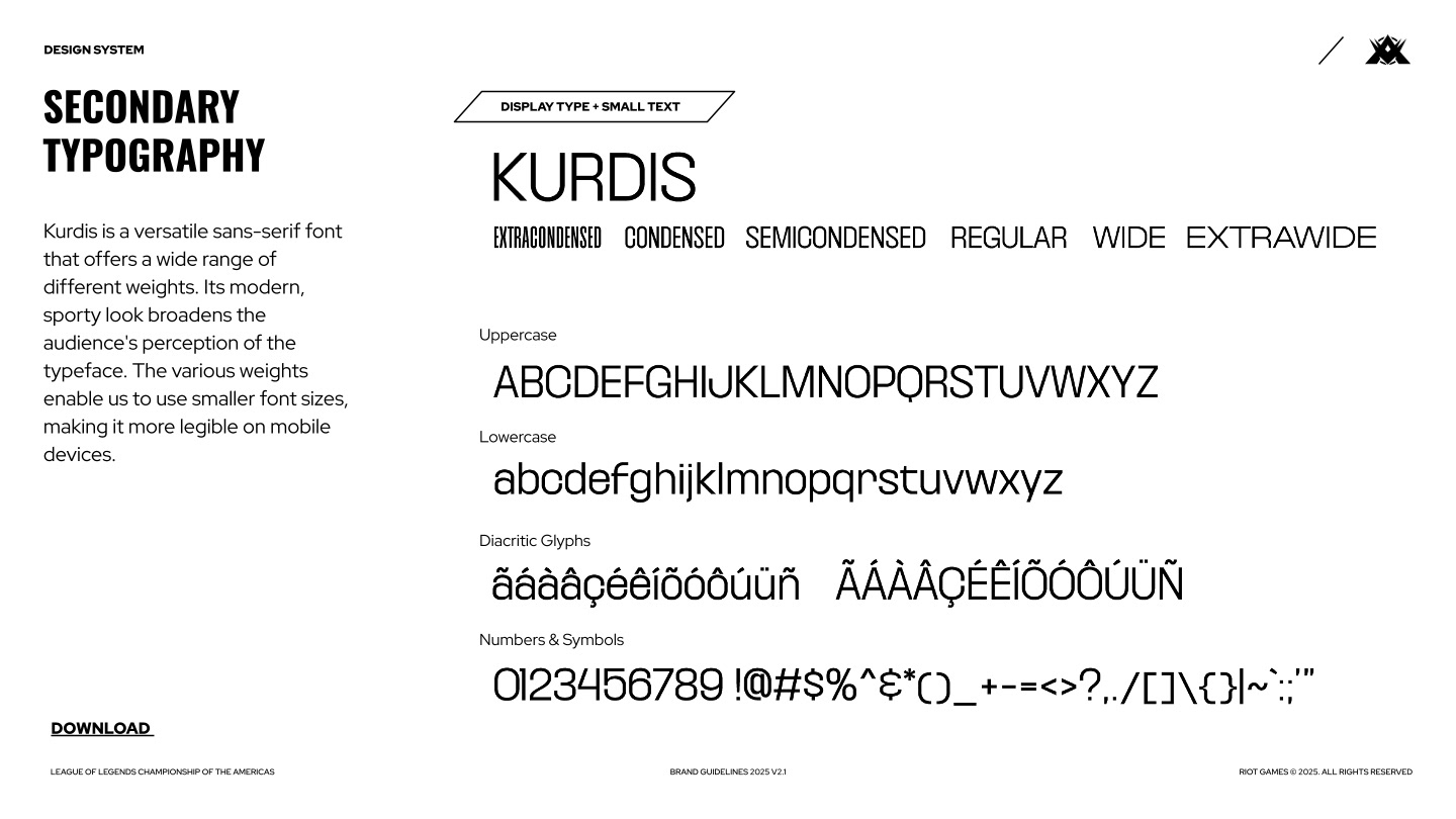
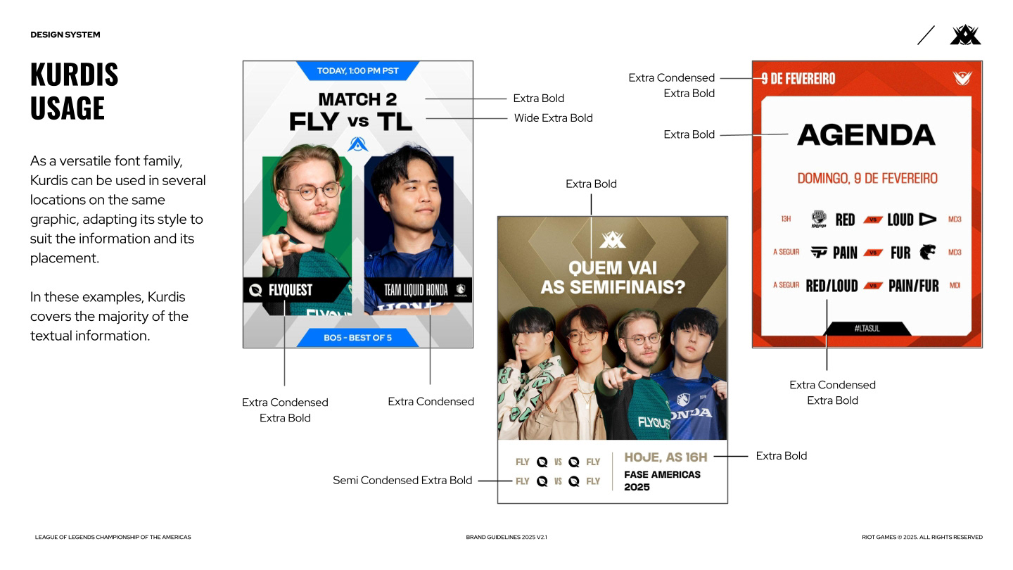
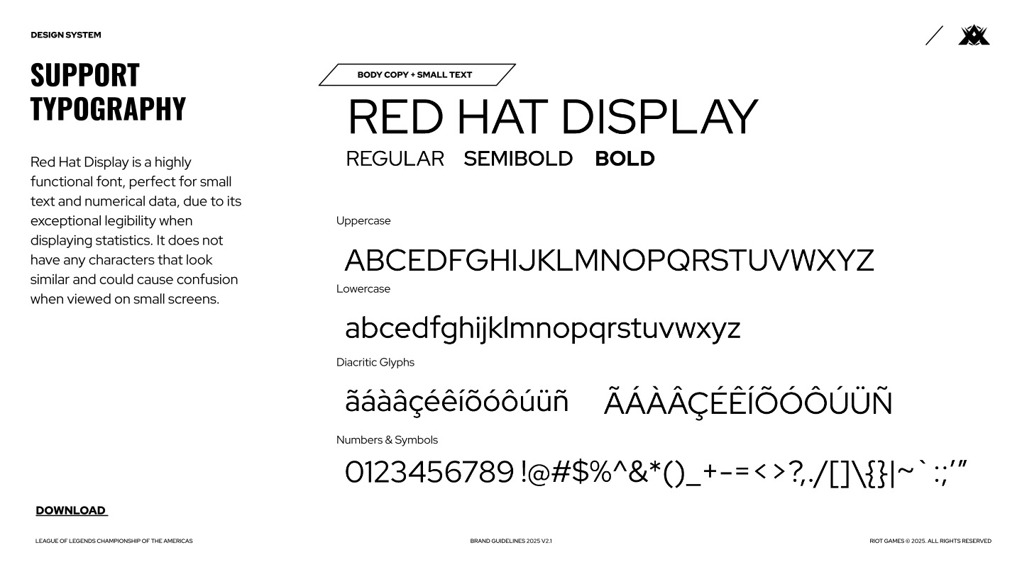
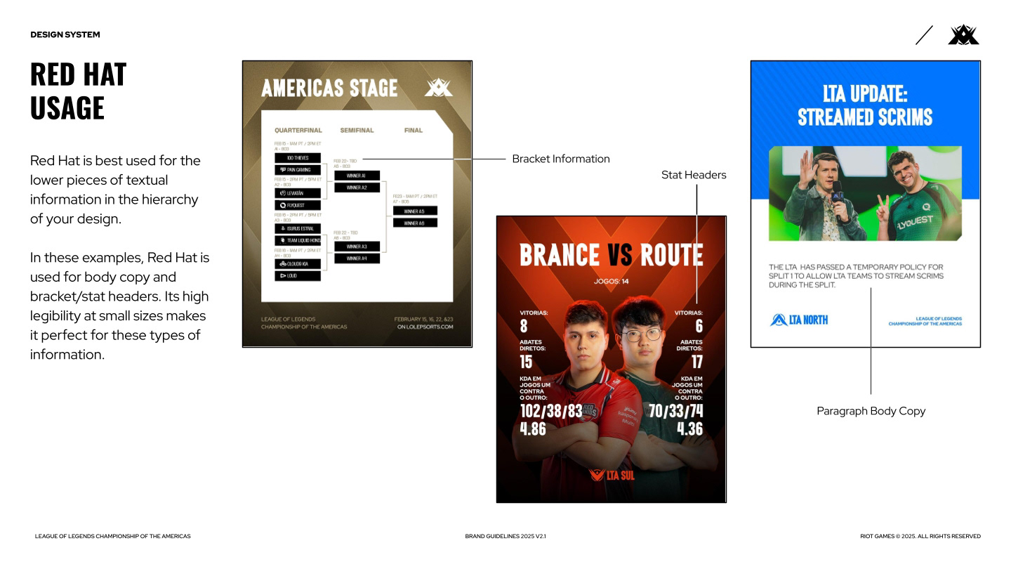
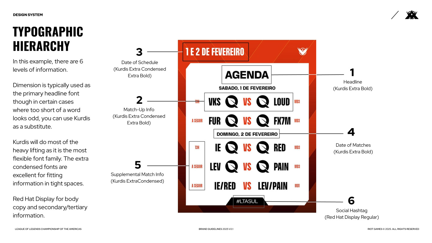
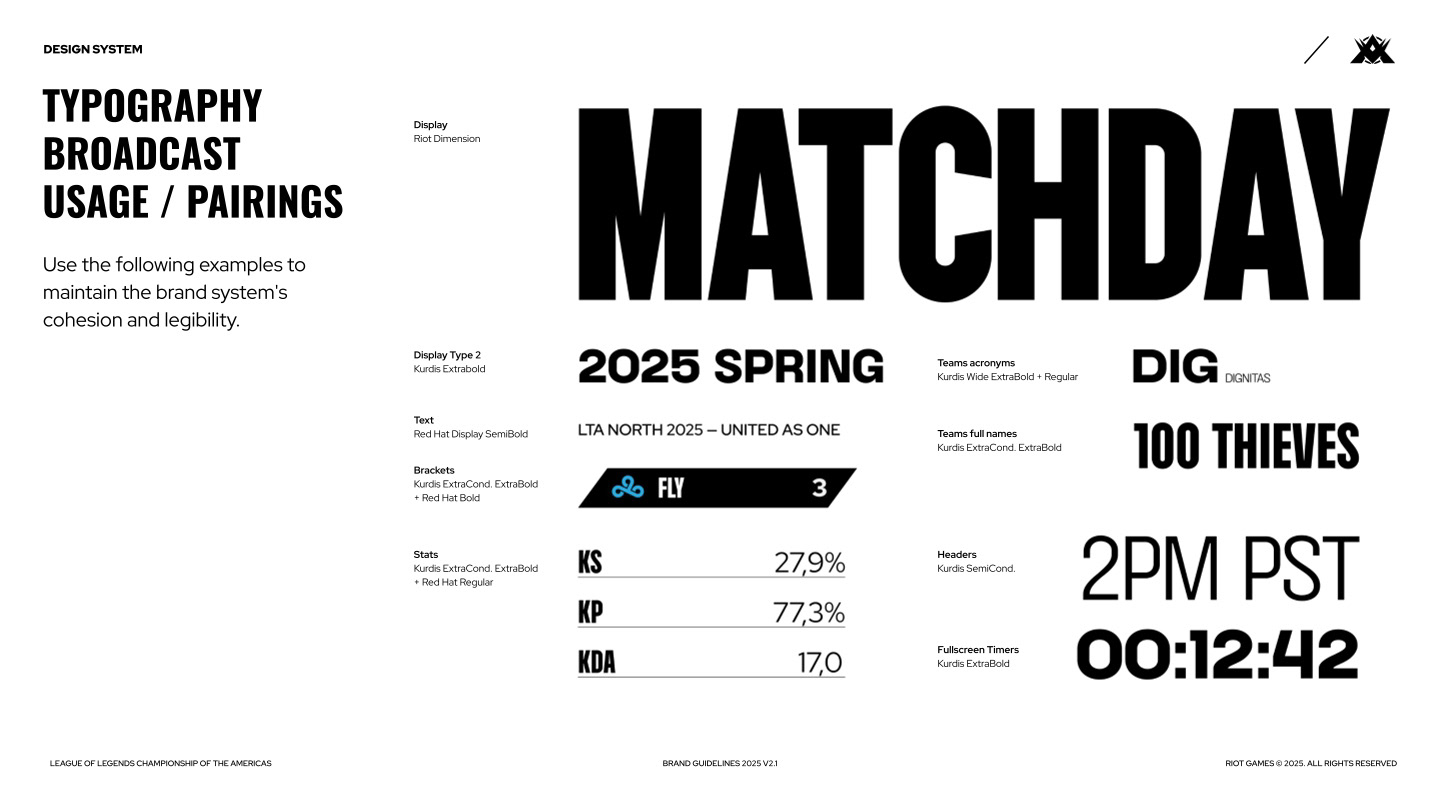
Typography was a rather tricky design element to tackle for the brand, particularly because there were no established principles on the usage of the type for many of our use cases, and designers in each region were interpreting their usage differently. So rather than restrict our regional teams to a narrowly specific look, it was decided that we'd let each region express themselves as best they could to their fans, while documenting and guiding their use towards something more consistent.
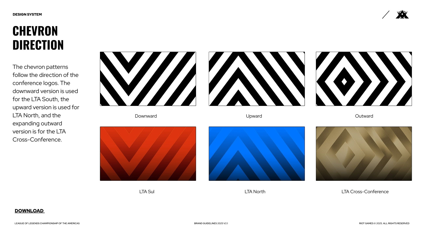
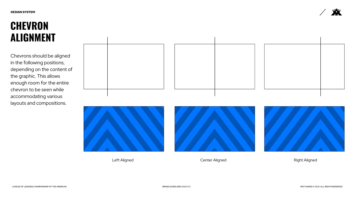
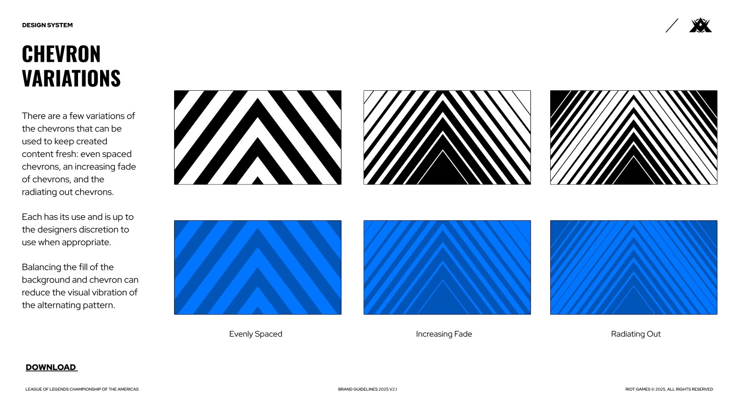
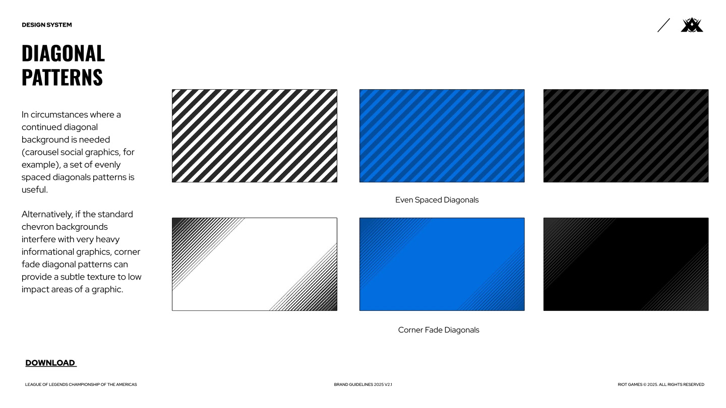
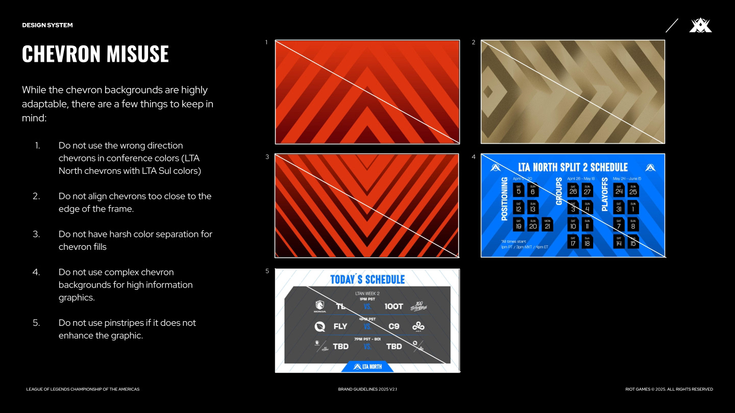
Believe it or not, one of the biggest hurdles I ran into, was making sure each regional team was using their specific chevron "direction" in their graphics. I'd often come across LTA South graphics that featured upward-moving chevrons or LTA North graphics that featured sideways-moving chevrons (reserved for the LTA Cross-Conference looks). Providing a set of diagonal patterns helped alleviate the desire by designers to use different chevrons when they felt the need to break from convention.
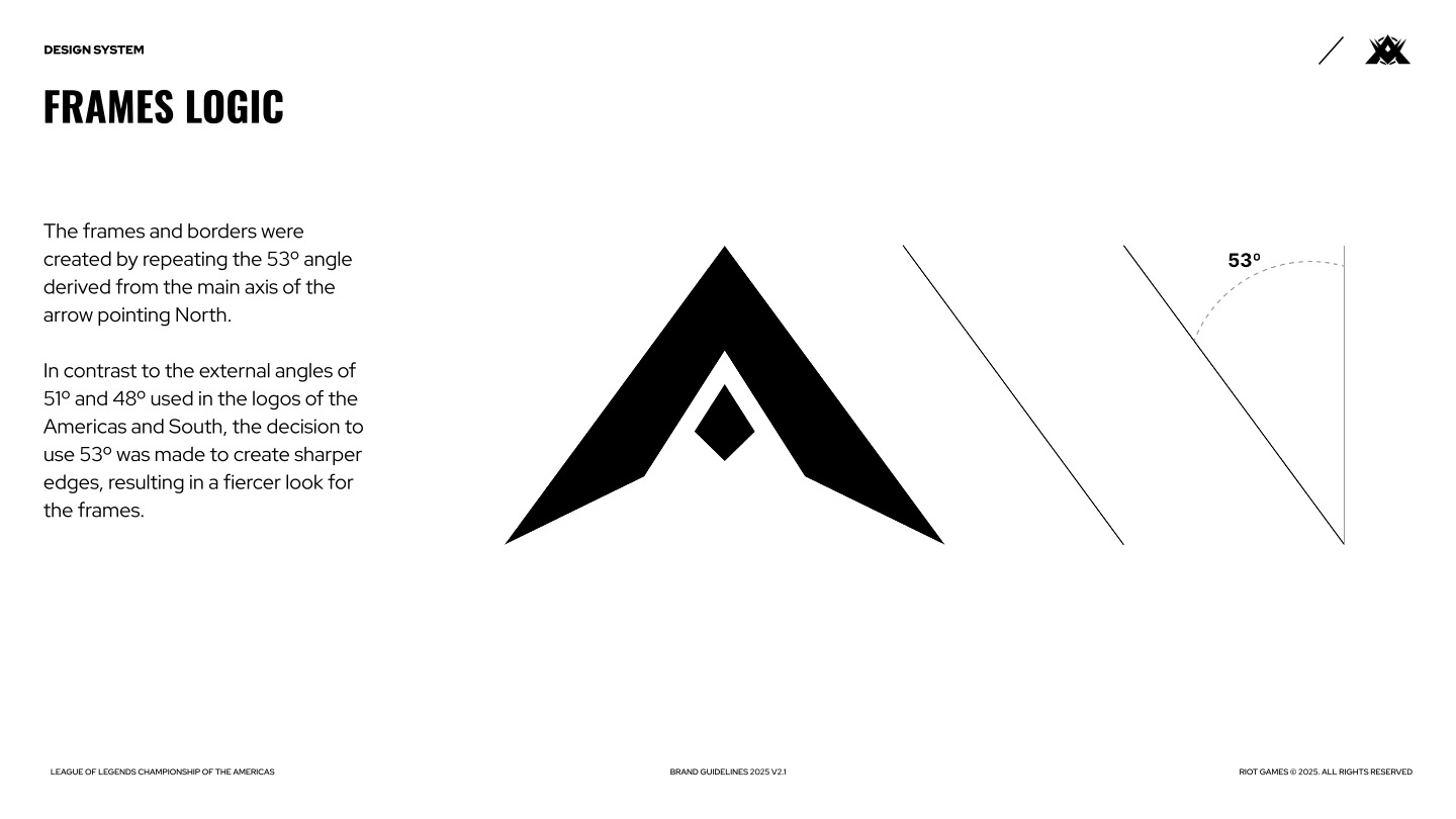
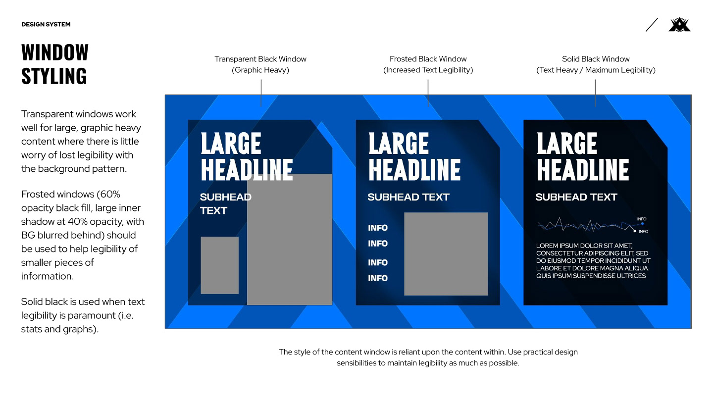
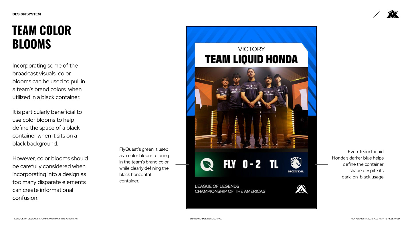

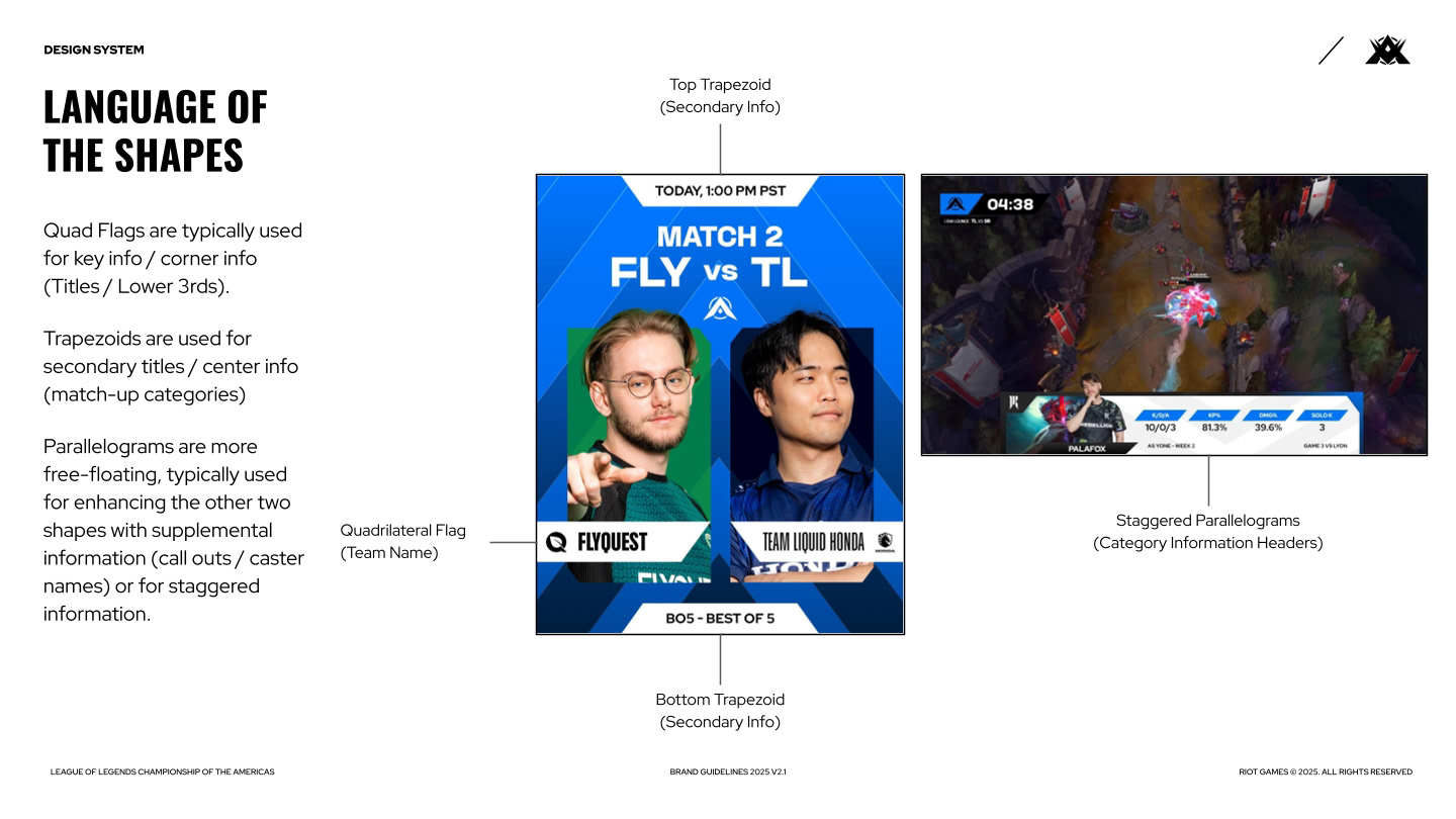
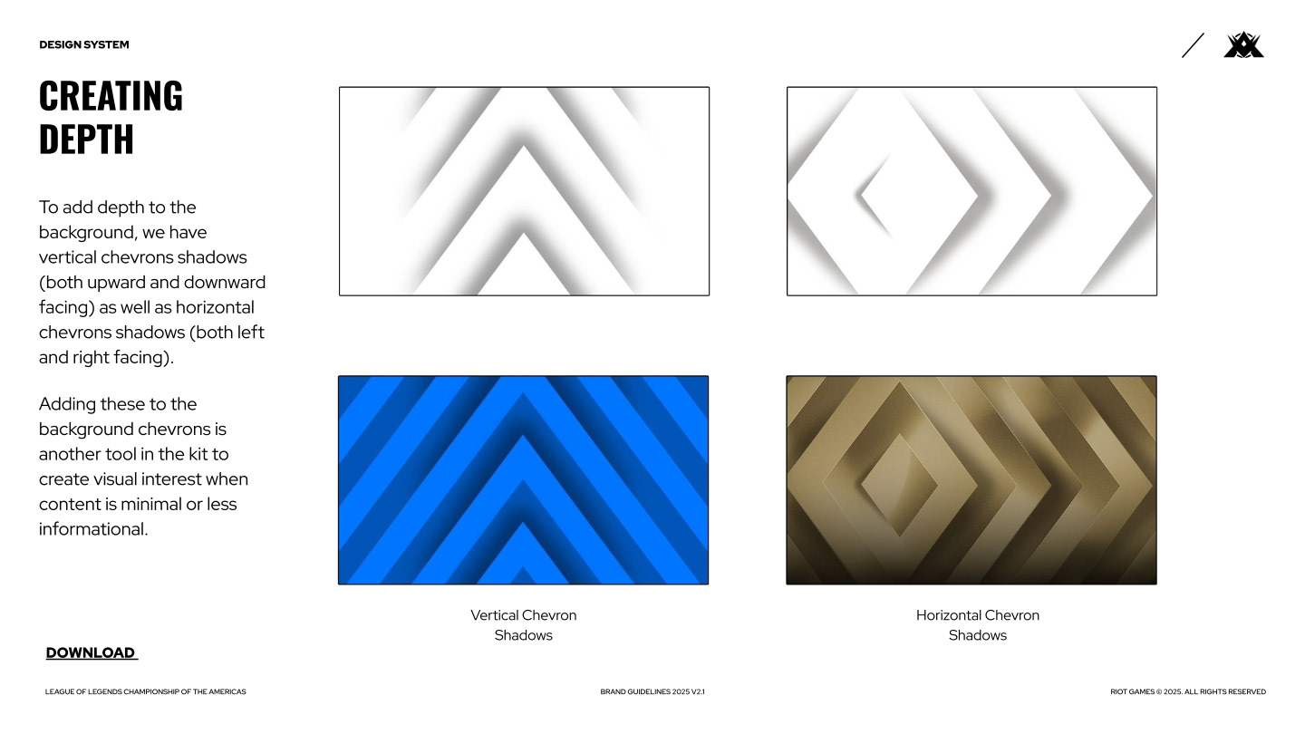
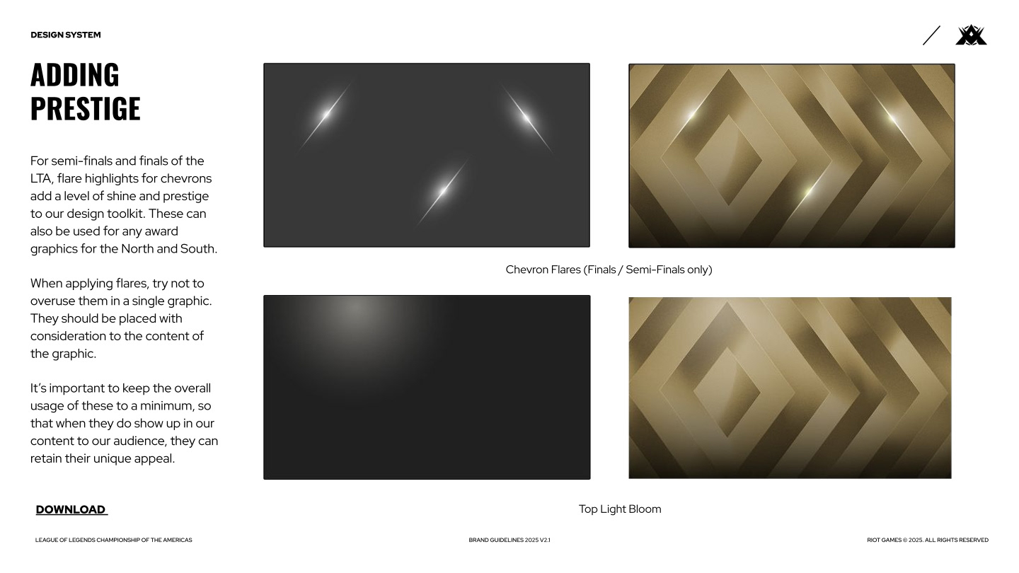
When it came to all the design elements, ensuring they were implemented with intent was key. Guiding designers thoughtfully through the logic of elements being used allowed them to find a better balance for the graphics they were creating.
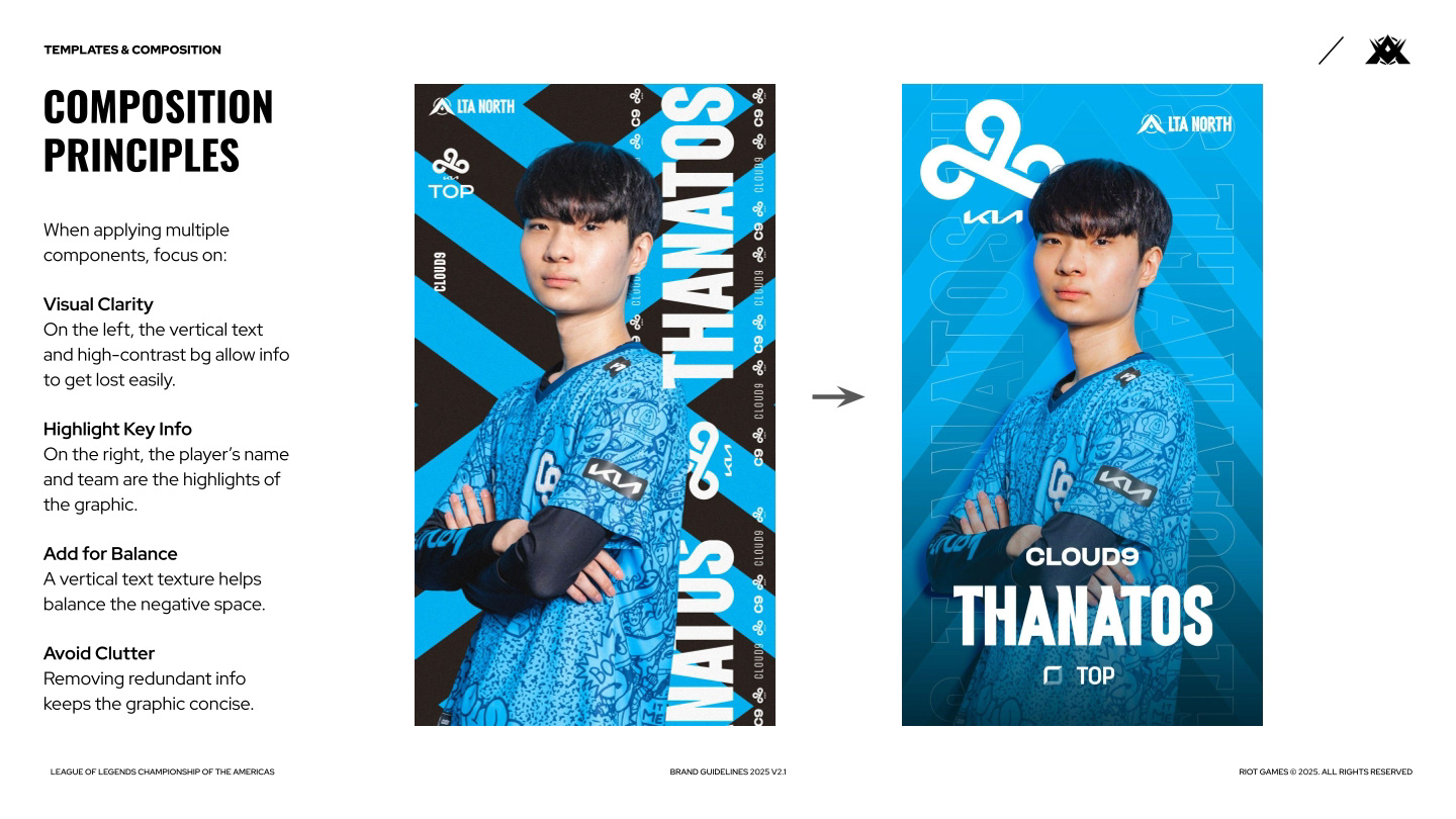
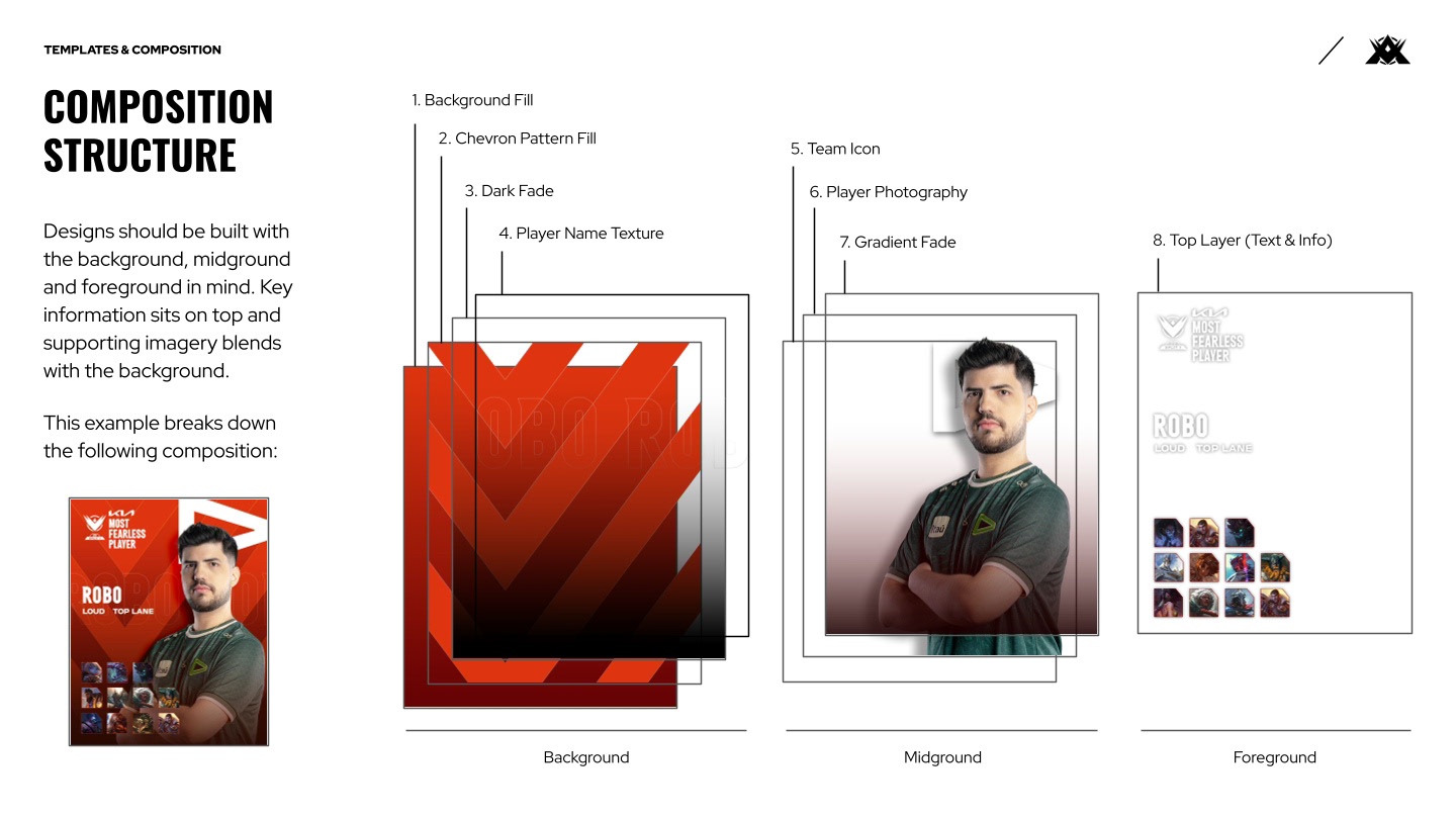
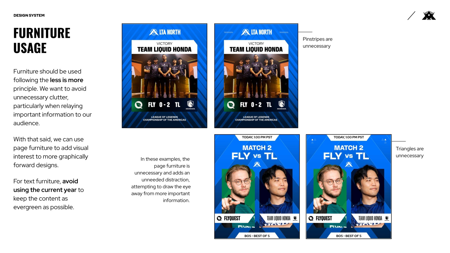
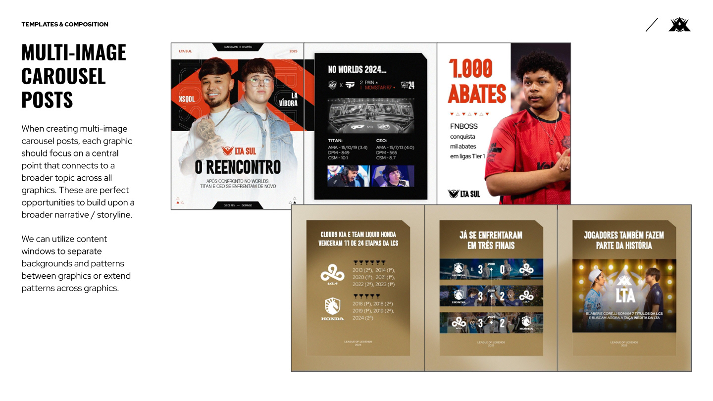
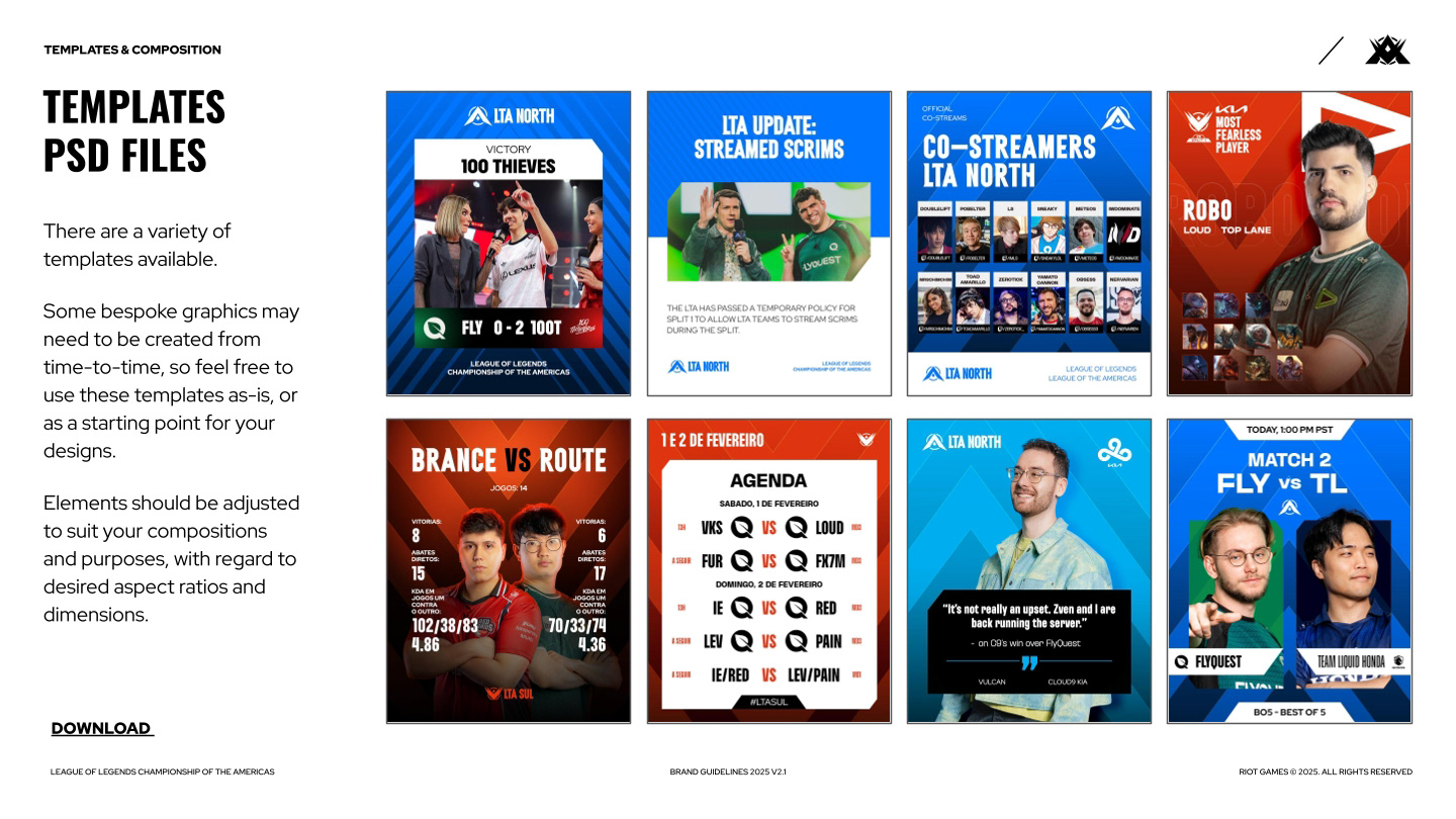
Key principles in composition and usage were provided alongside new and updated design templates. These were used frequently to create social and digital assets for every week during each of the 3 splits.
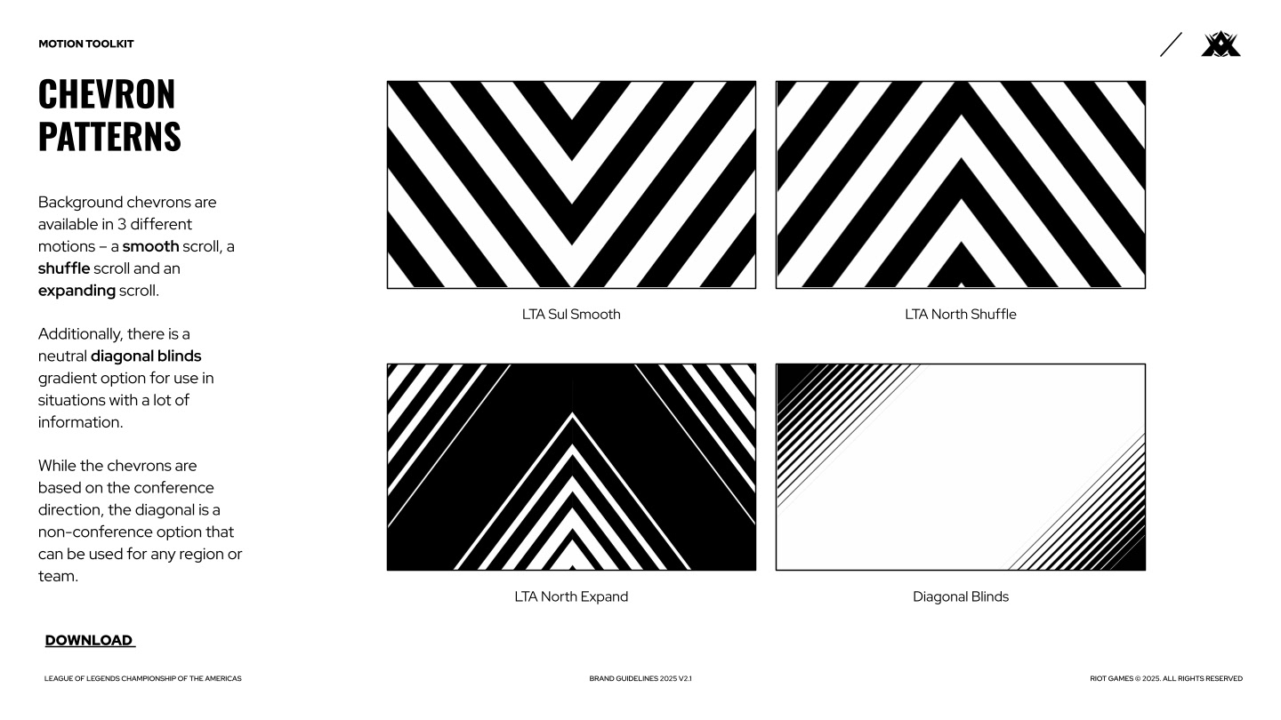
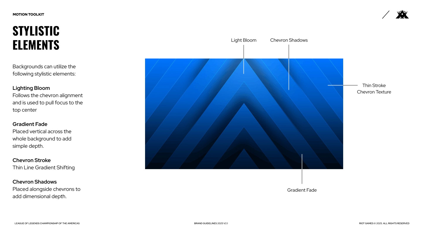
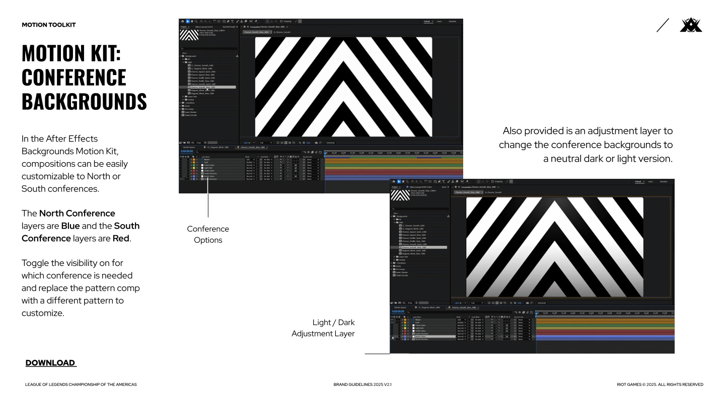
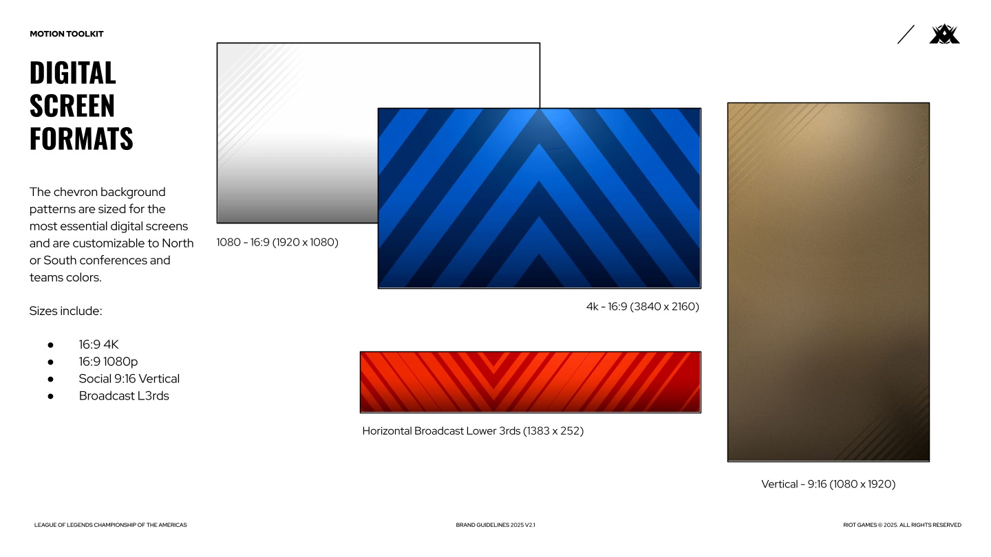
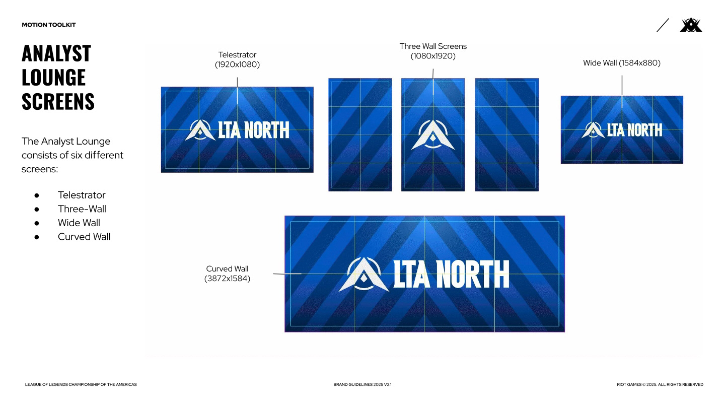
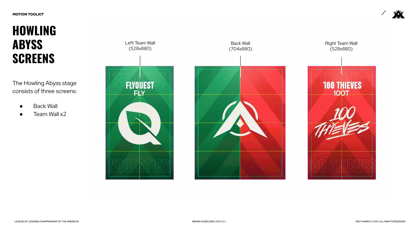
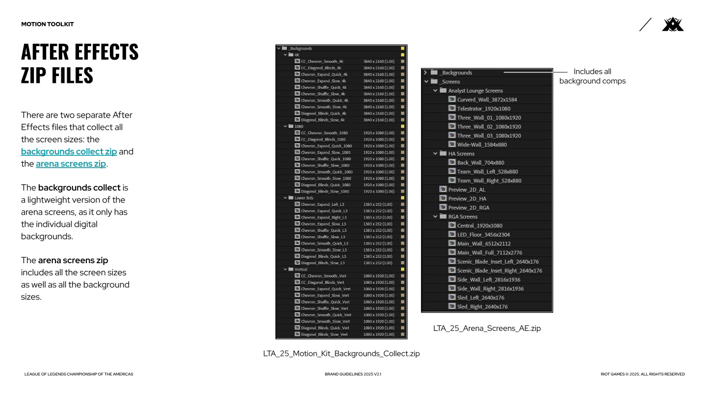
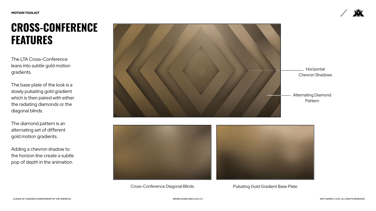
SPLIT 1
Split 1 debuted on Jan 29 and ran only 7 weeks, culminating in the First Stand international event. For me, this split was all about seeing what the North American and South American creative teams were struggling with and understanding the separate tone of voice each region wanted to present. Using observations across the first 2-3 weeks, I began developing the brand guide shown above.
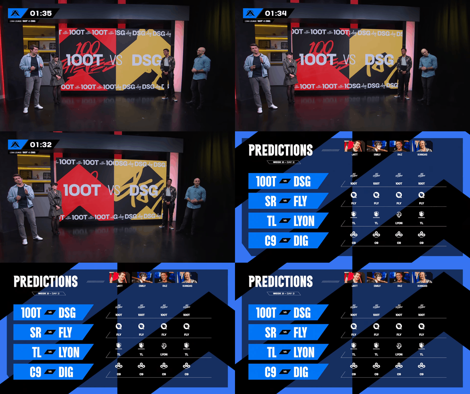

In some of the above graphics, you can see some of the instances where the elements of the brand are being used without intention and inconsistently -- the diamond pattern background during the broadcast mortise, the downward chevron transitions, and the trapezoidal container for partner logos. All these issues were assessed for updates within the year's schedule.
SPLIT 2
With the general brand principles in place, my work on Split 2 consisted of building out the motion kit available to everyone to work with, as well as monitoring each teams understanding of the brand guide and helping correct course as needed.
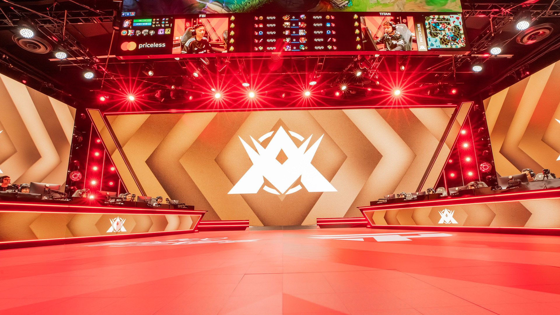
Split 2 began with the introduction of a new forced perspective stage animation.
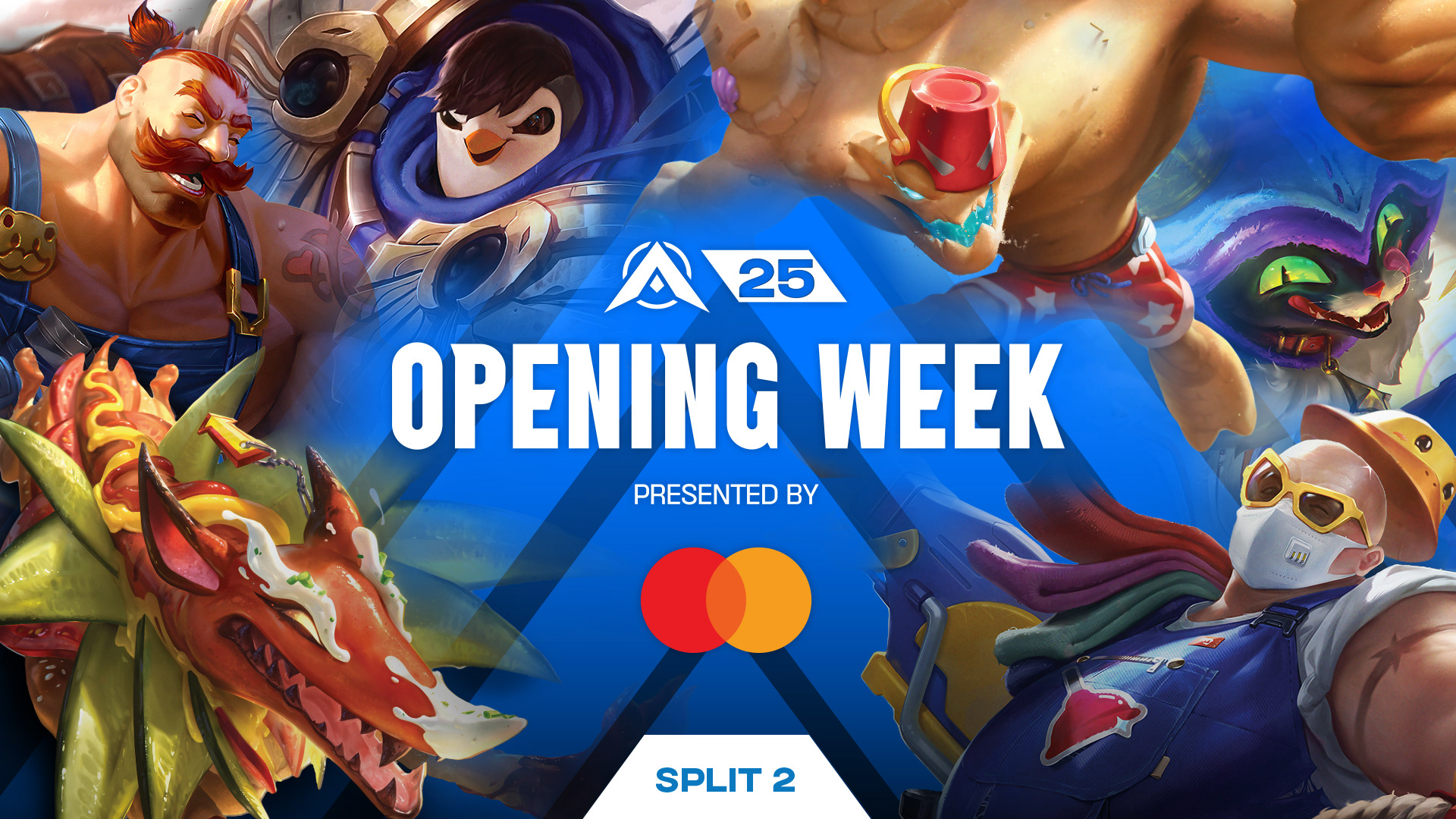
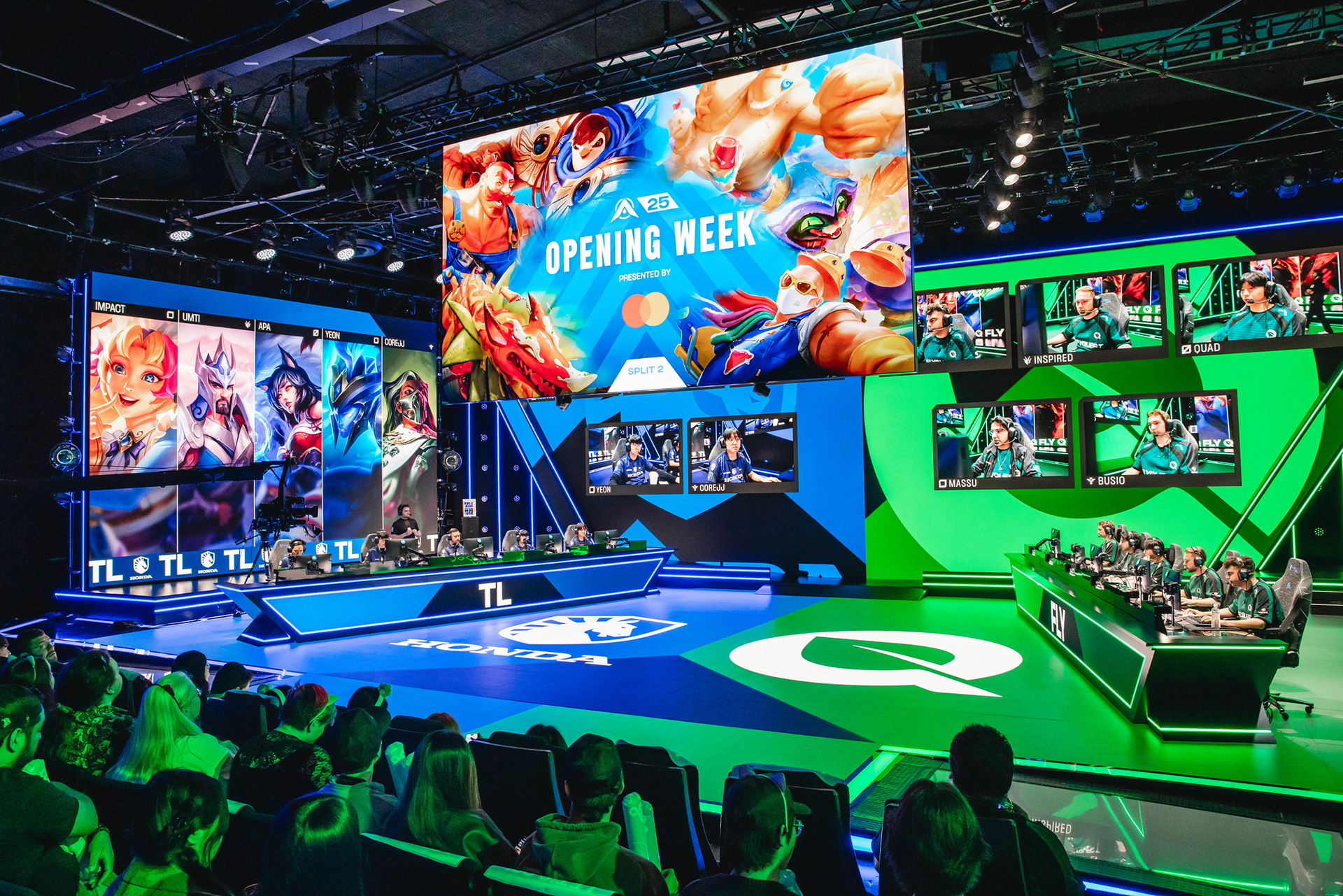
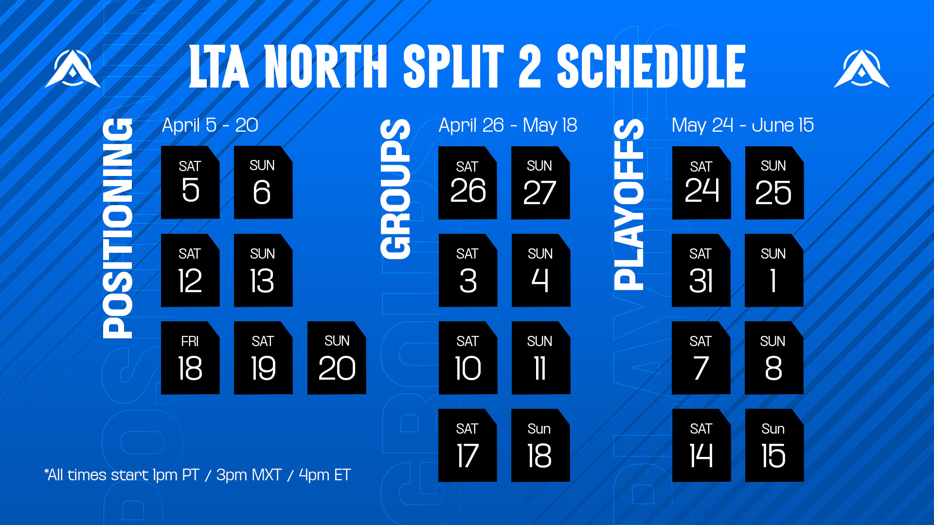
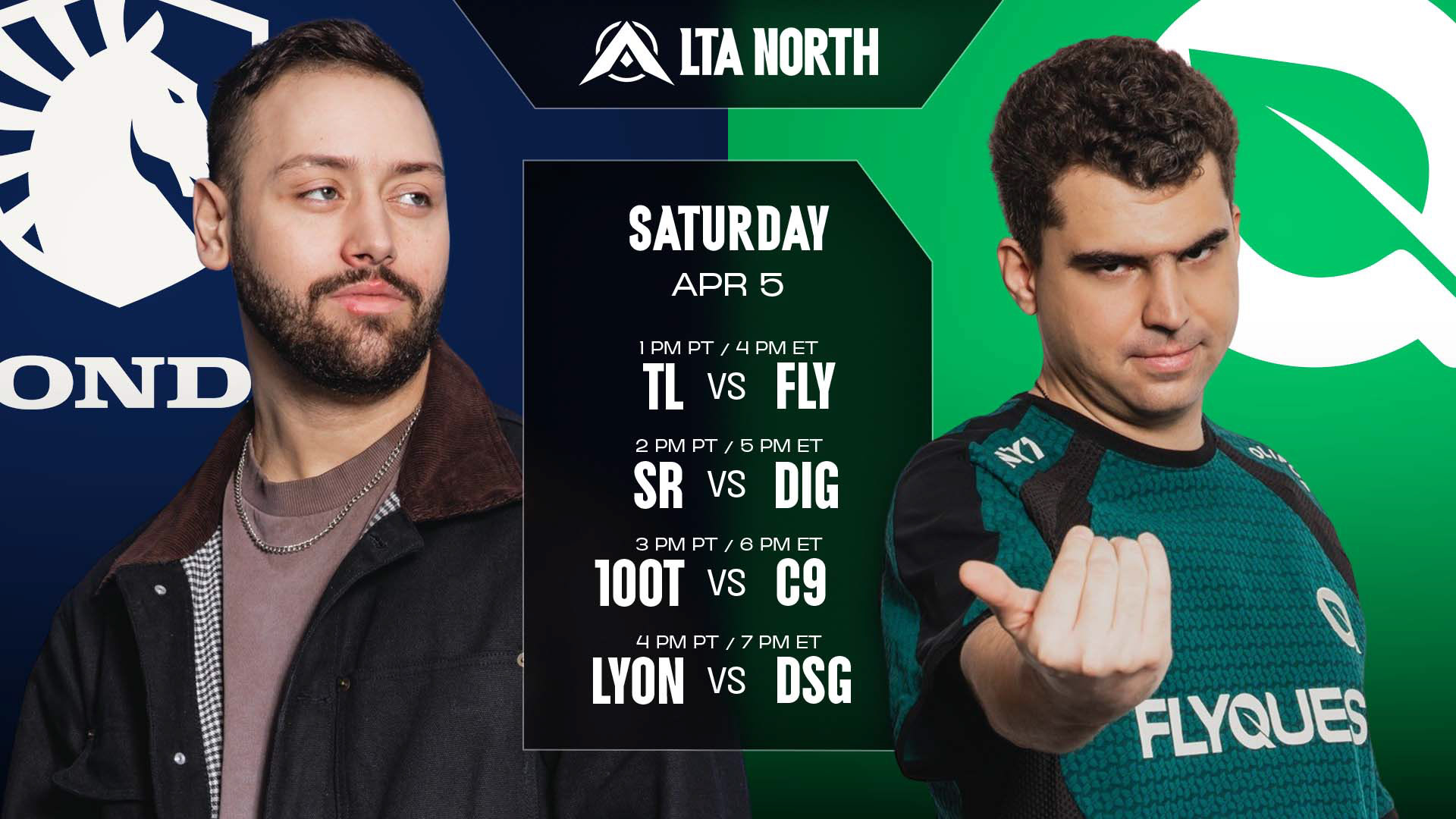
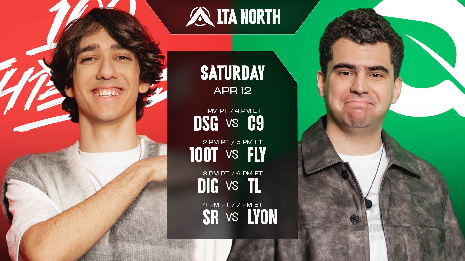
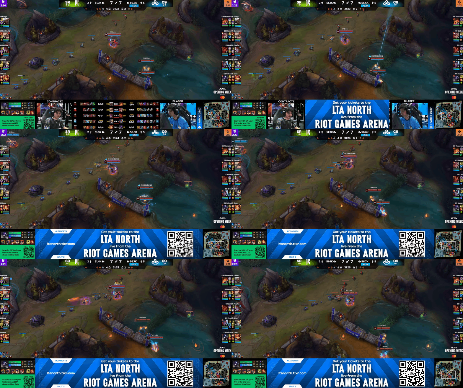
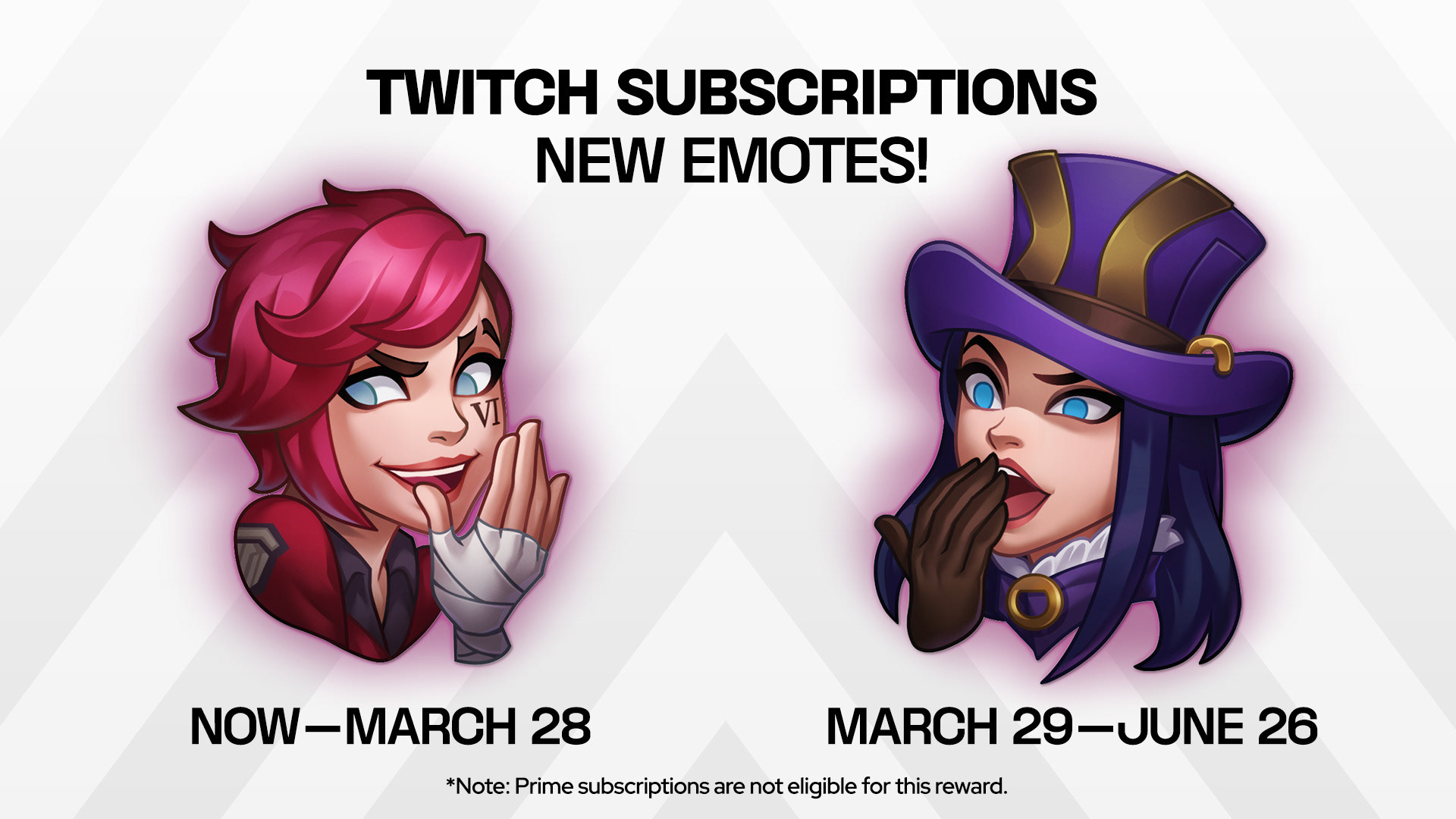
A drop in the bucket of the assets created for Split 2.
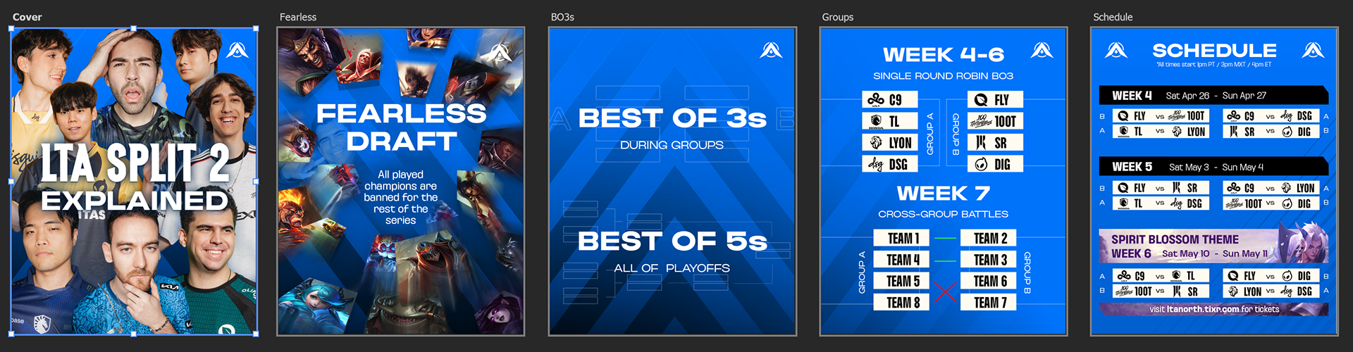
Explaining the complicated formats of the LTA Splits 2 and 3 were always a challenge create concise infographics.
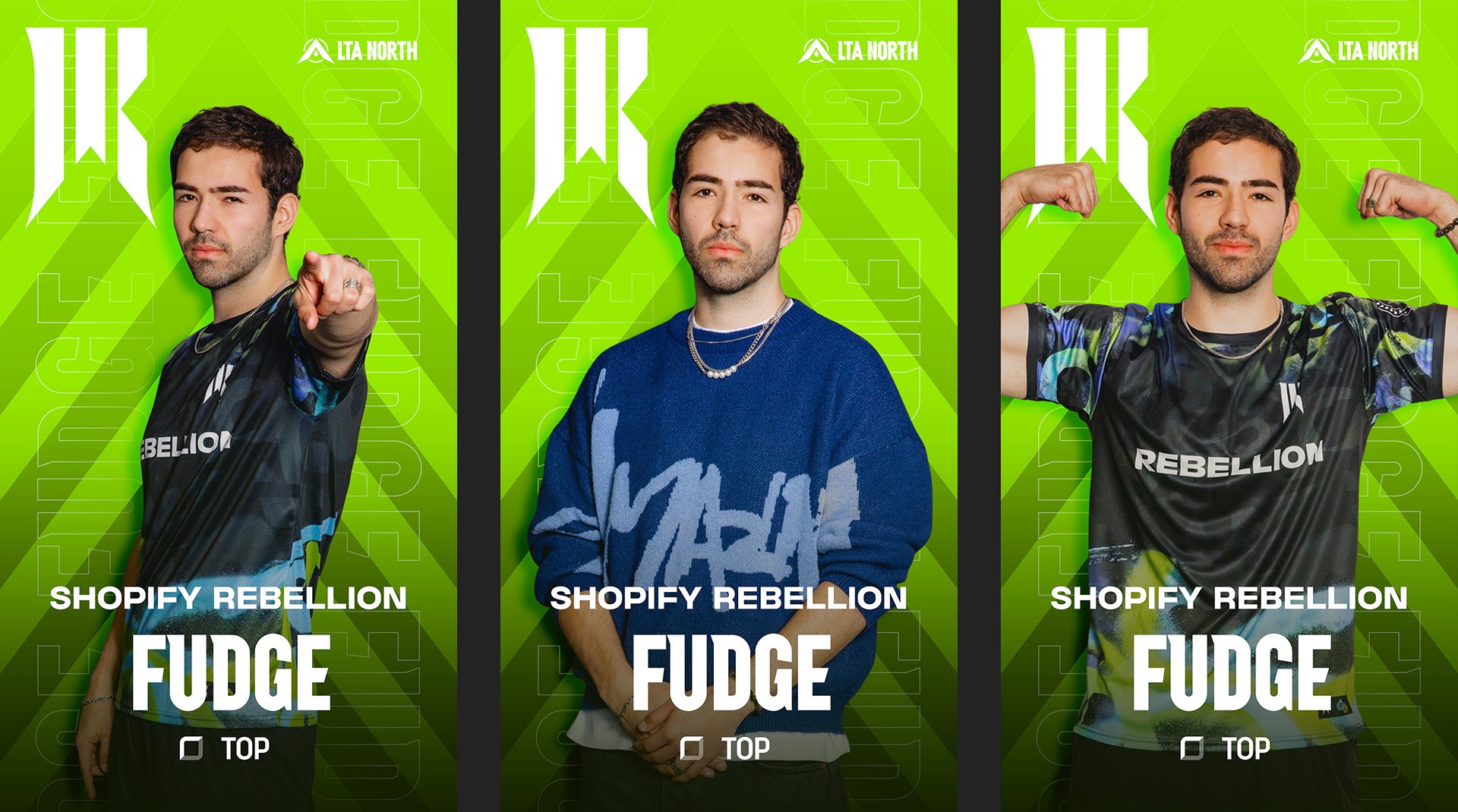
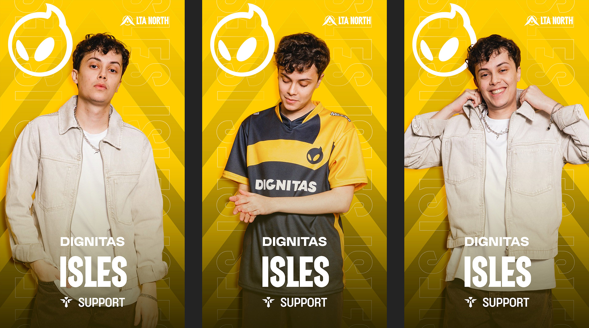
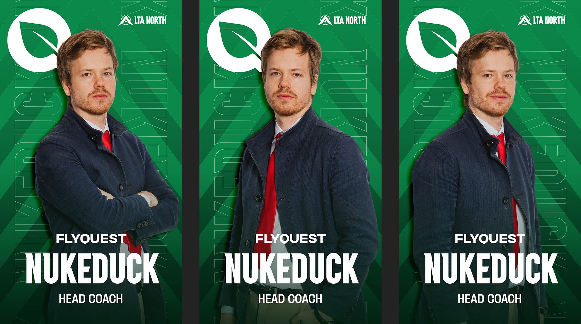
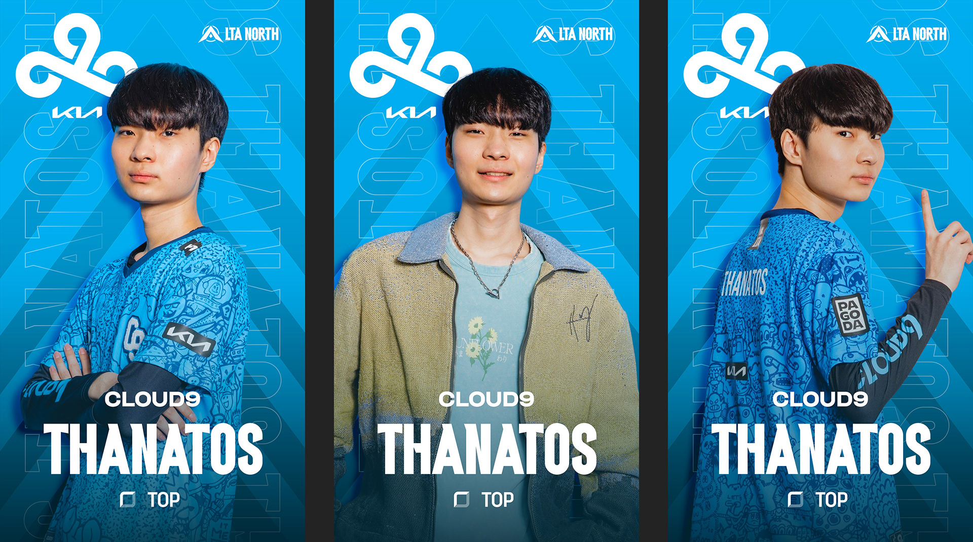
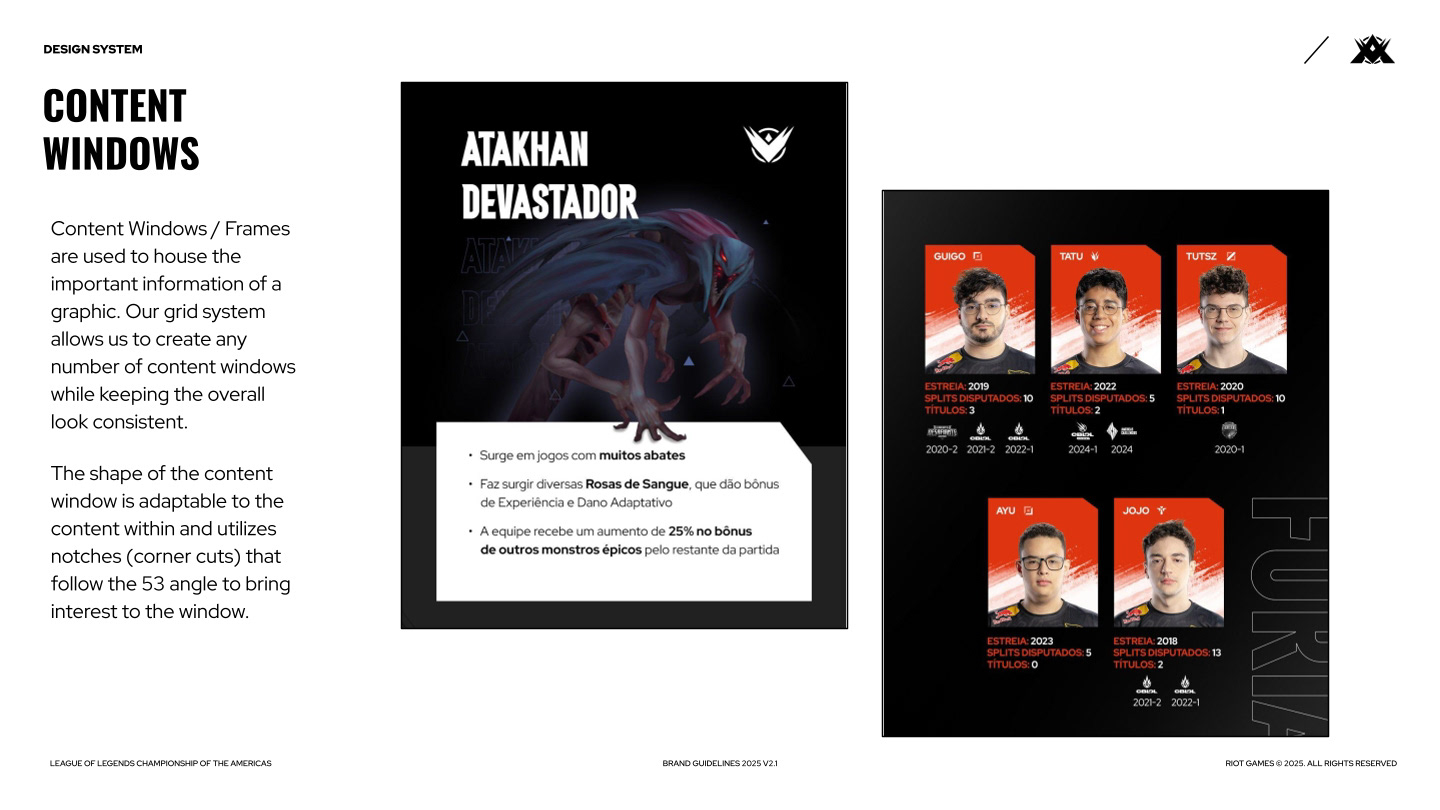
Rotating team roster graphics featured in the RGA (Riot Games Arena).
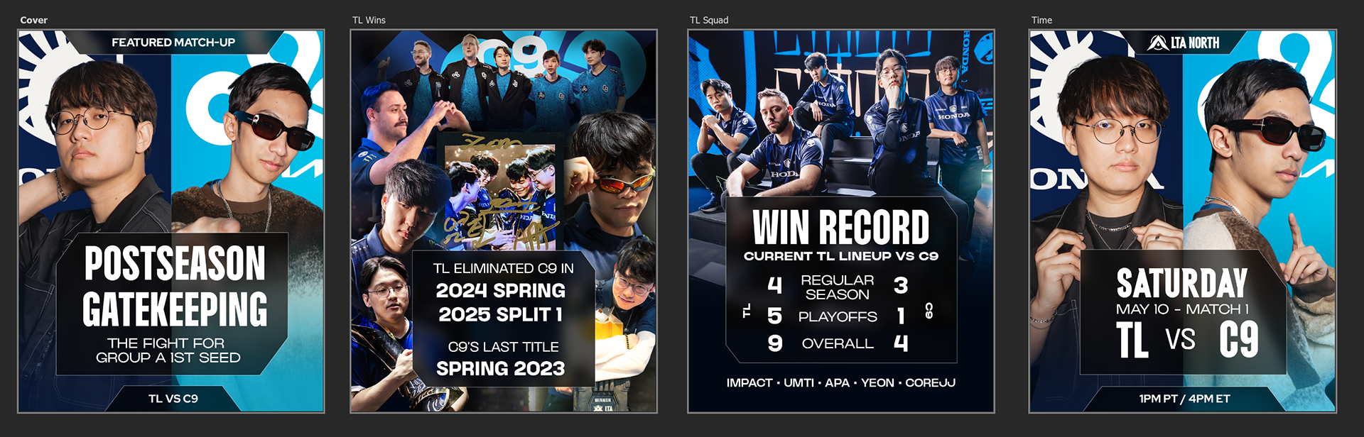
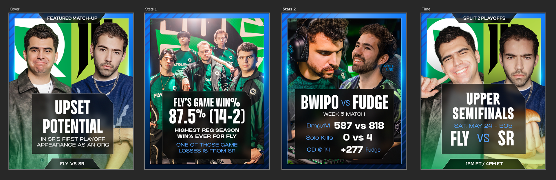
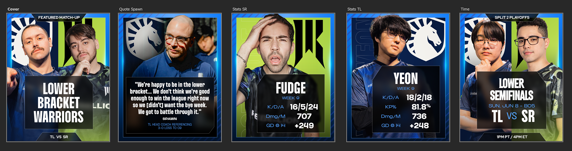
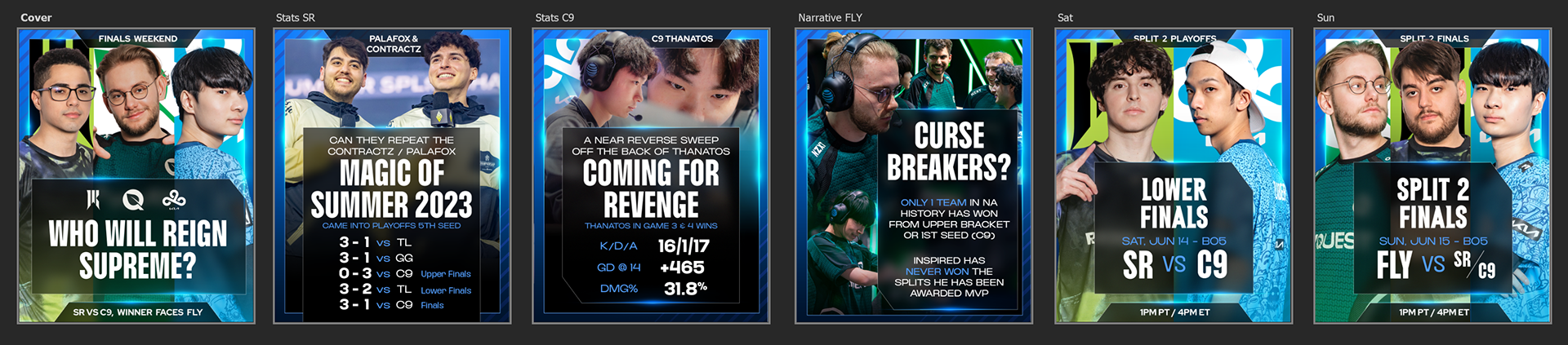
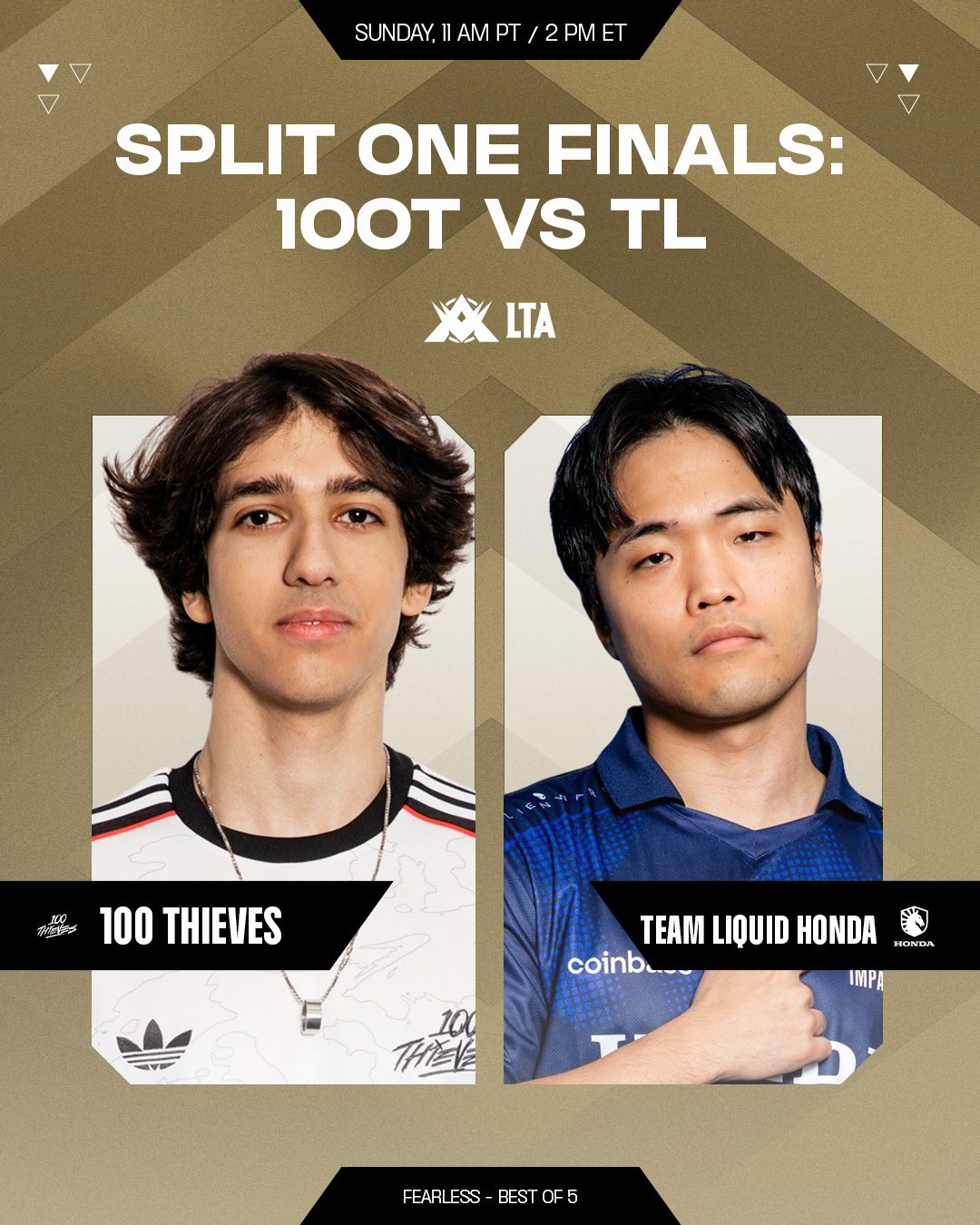
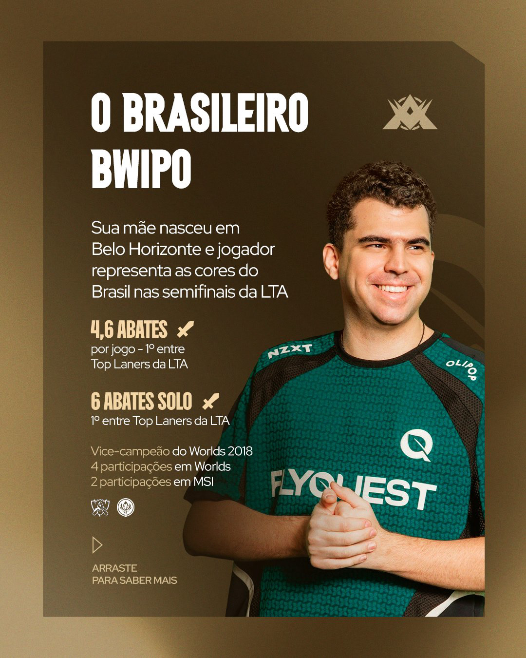
Beginning with week 3, I became responsible for helping developing the narrative context for the weekly matches. I created a social media carousel template, that utilized historic data to inform fans of what was at stake with each match and how the narrative arcs of each team and player had progressed throughout their careers. These were created each week, highlighting the key match-up for each show day.
SPLIT 3
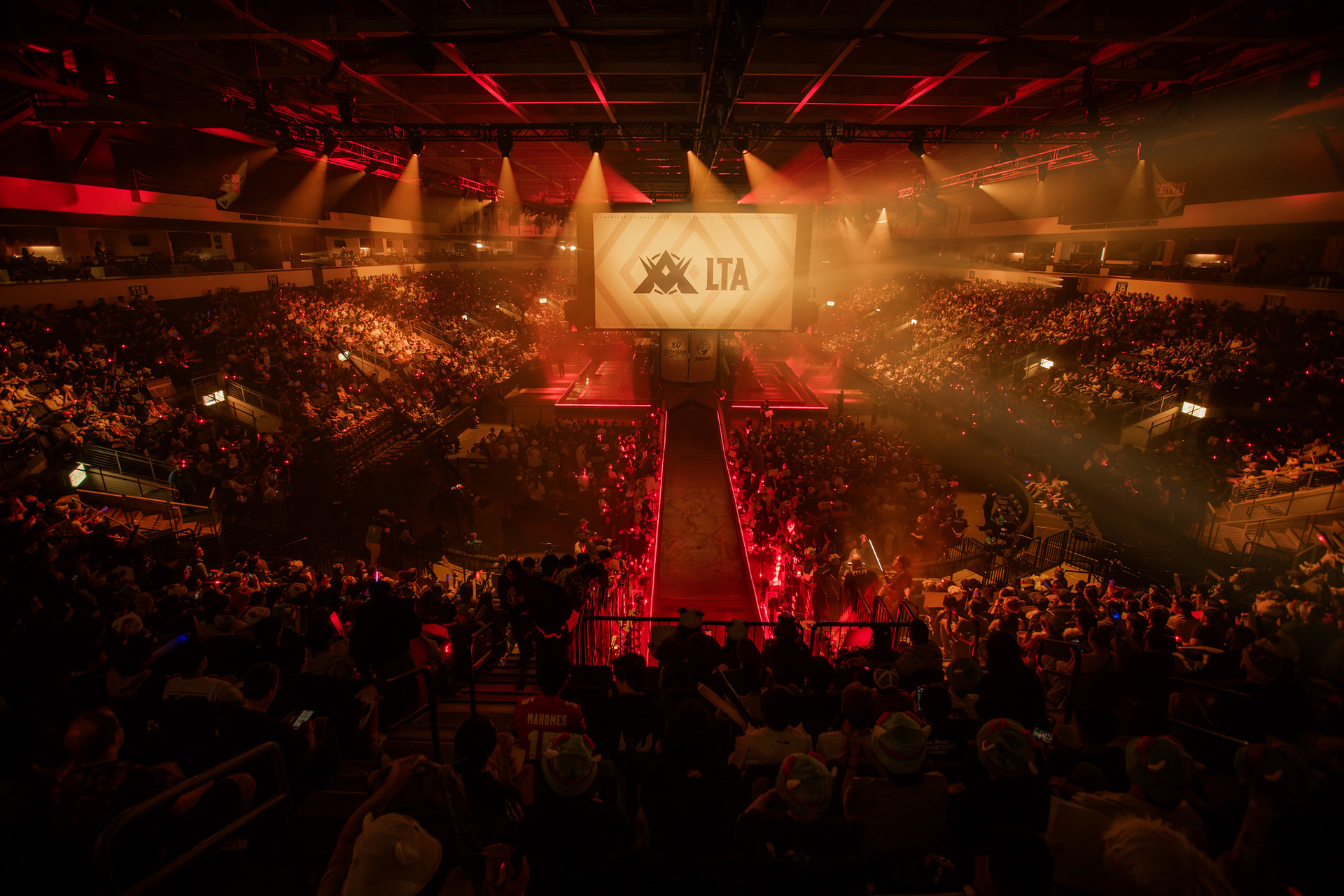
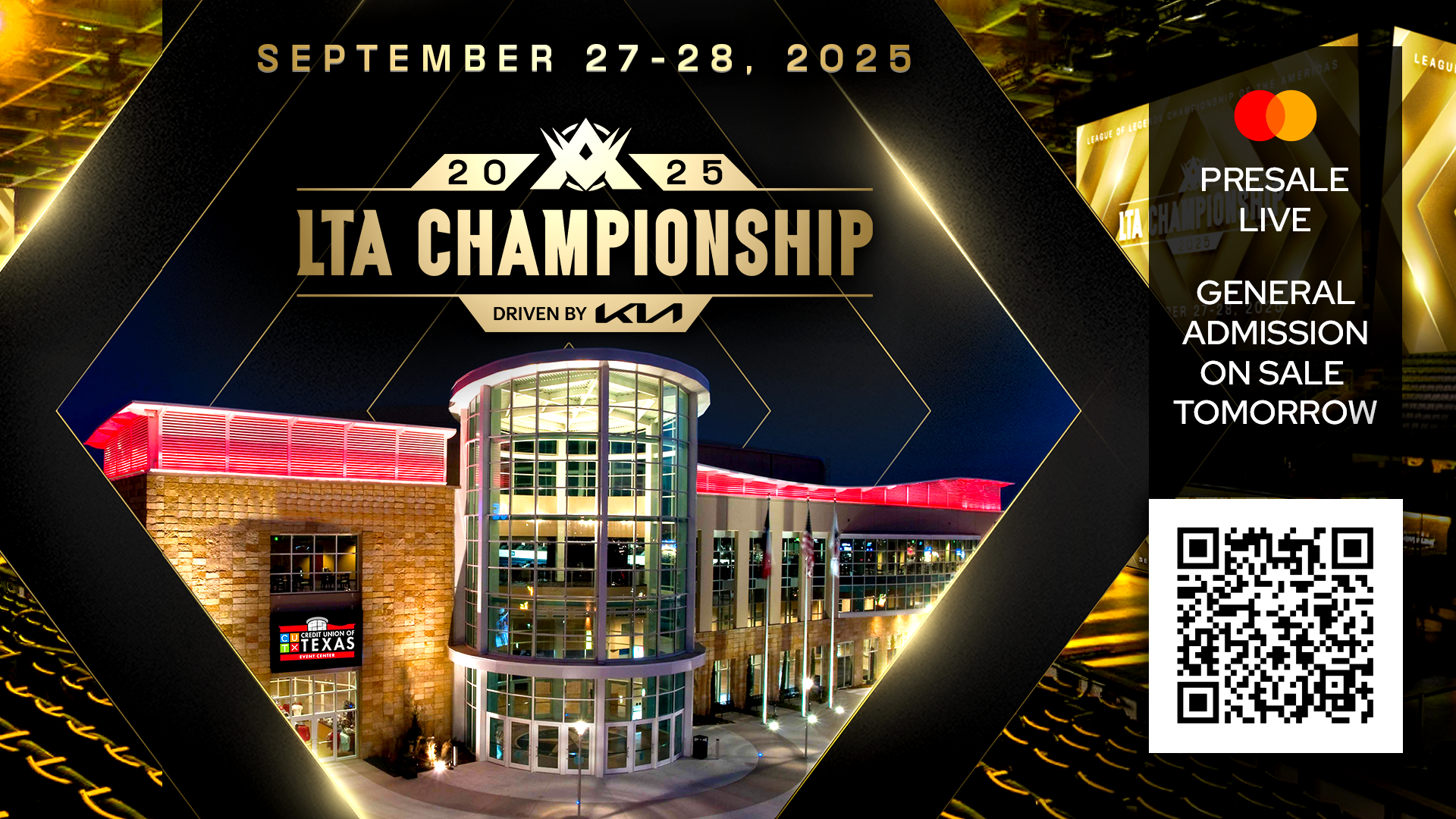
The final split was dedicated to crafting our LTA championship look and motion assets while maintaining brand consistency between the regions. At some point throughout Split 3, Riot had decided the LTA would be disbanded and return the leagues to their former structures, which would not be revealed publicly until after the LTA Finals.