Perils in Paradise marketing
Blizzard Entertainment | Creative Design & Content Live Ops Designer | 2024
As a long-time fan of Blizzard and after a year of working on the LCS, it was a welcome change of pace switching from Esports work at Riot to marketing expansions on Hearthstone.
I joined the Creative Design & Content team in the summer of 2024 right at the tail end of the Whizbang’s Workshop expansion as a Live Ops Designer on the community side of things. This role would have me create everything from live stream assets to blog posts to user acquisition ads. With Hearthstone’s 4-month development cycle, my contract at Blizzard would allow me to experience the full duration of a release, from the launch of one expansion to the pre-release phase of the next. And so, I began work on Hearthstone patch 30.0 Perils in Paradise, a lighthearted vacation themed release.
Logo by the CD&C Team and Key Art by ?????????
One of the main aspects of the job is to utilize Hearthstone’s treasure trove of gorgeous card artwork -- commissioned work from talented artists from across the globe. Below are a few examples of card art from Perils in Paradise and the repurposed elements that ended up in some final assets.
Card Artwork Dissection & Repurposing
30.0 Launch
My main responsibility as the CD&C Live Ops Designer assigned to community projects was to maintain quality and consistency across all the blog posts. At the time, the posts were written by Nicholas Weiss (on the development team as of 2026) whom I worked alongside to create the visual content for each one.
The Blog Suite of Graphics
Blog Content
Theorycrafting Announcements
Theorycrafting Community Social Frames
30.2 Battlegrounds
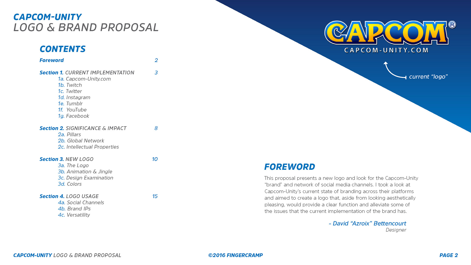
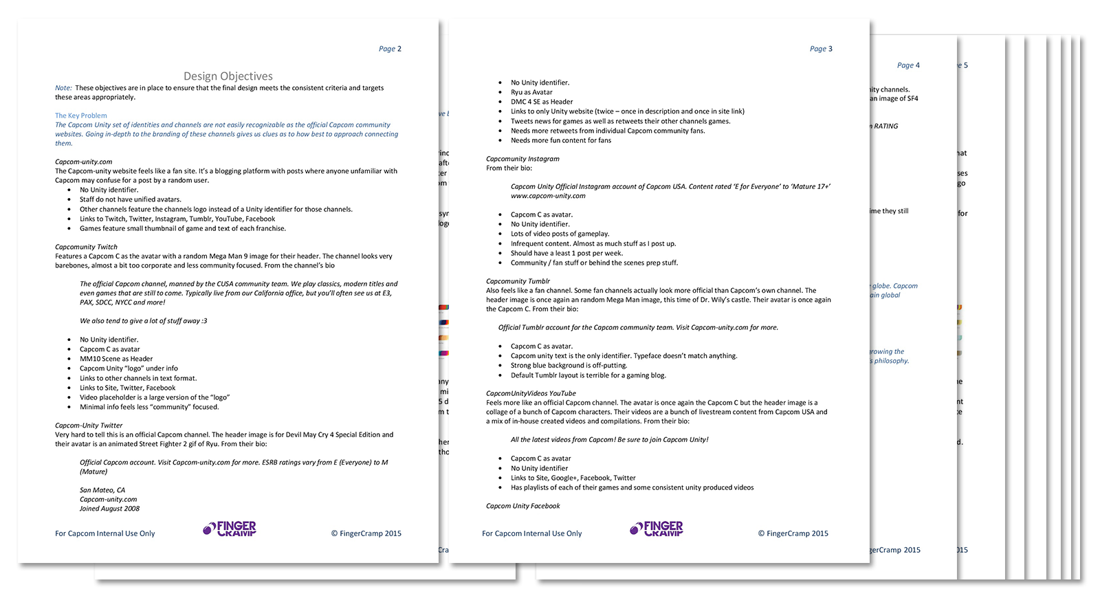
The final logo seen here is the result of a few months of iteration and rumination. Trying to figure out how best to express the complex web of fan expectations from multiple brand IPs for such a titan of the games industry was a tough but fun challenge.
Battlegrounds Early Access Event
Battlegrounds Key Art & Announcement Blog
Balance Patch Blog Posts
30.4 Mini-set
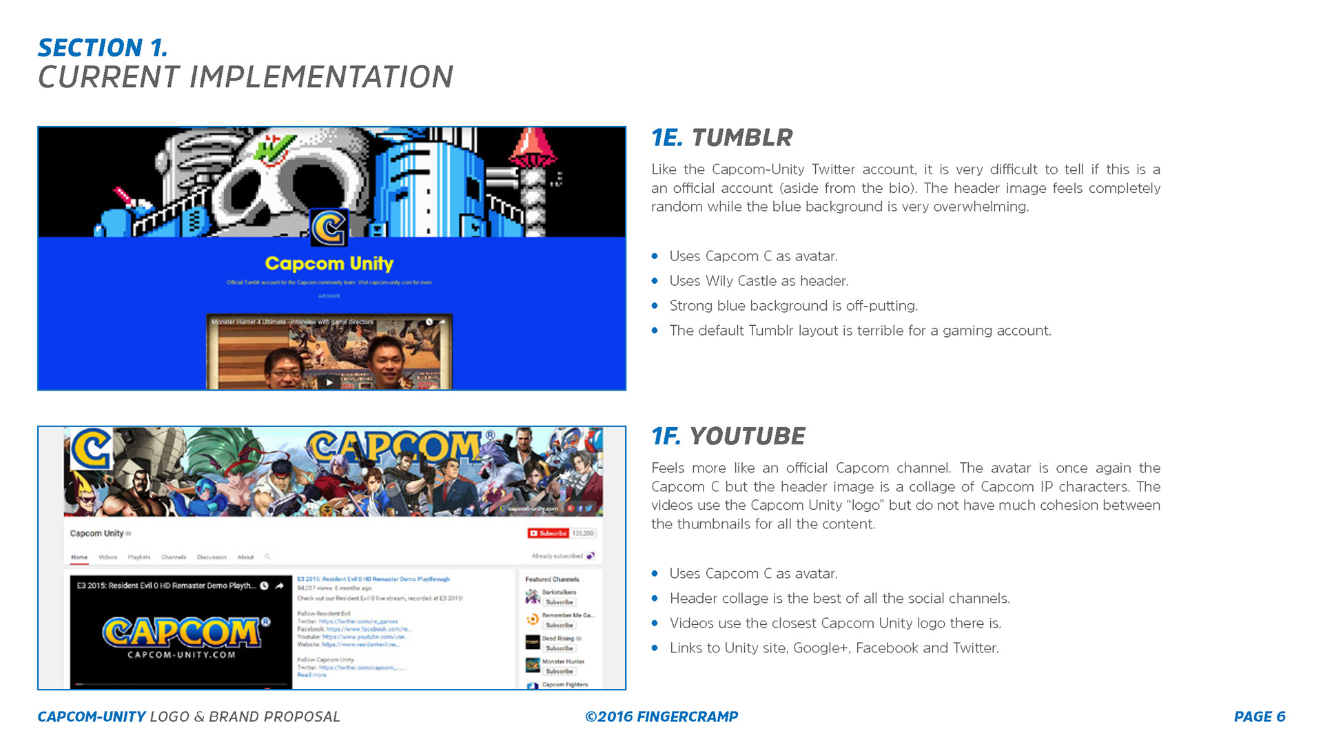
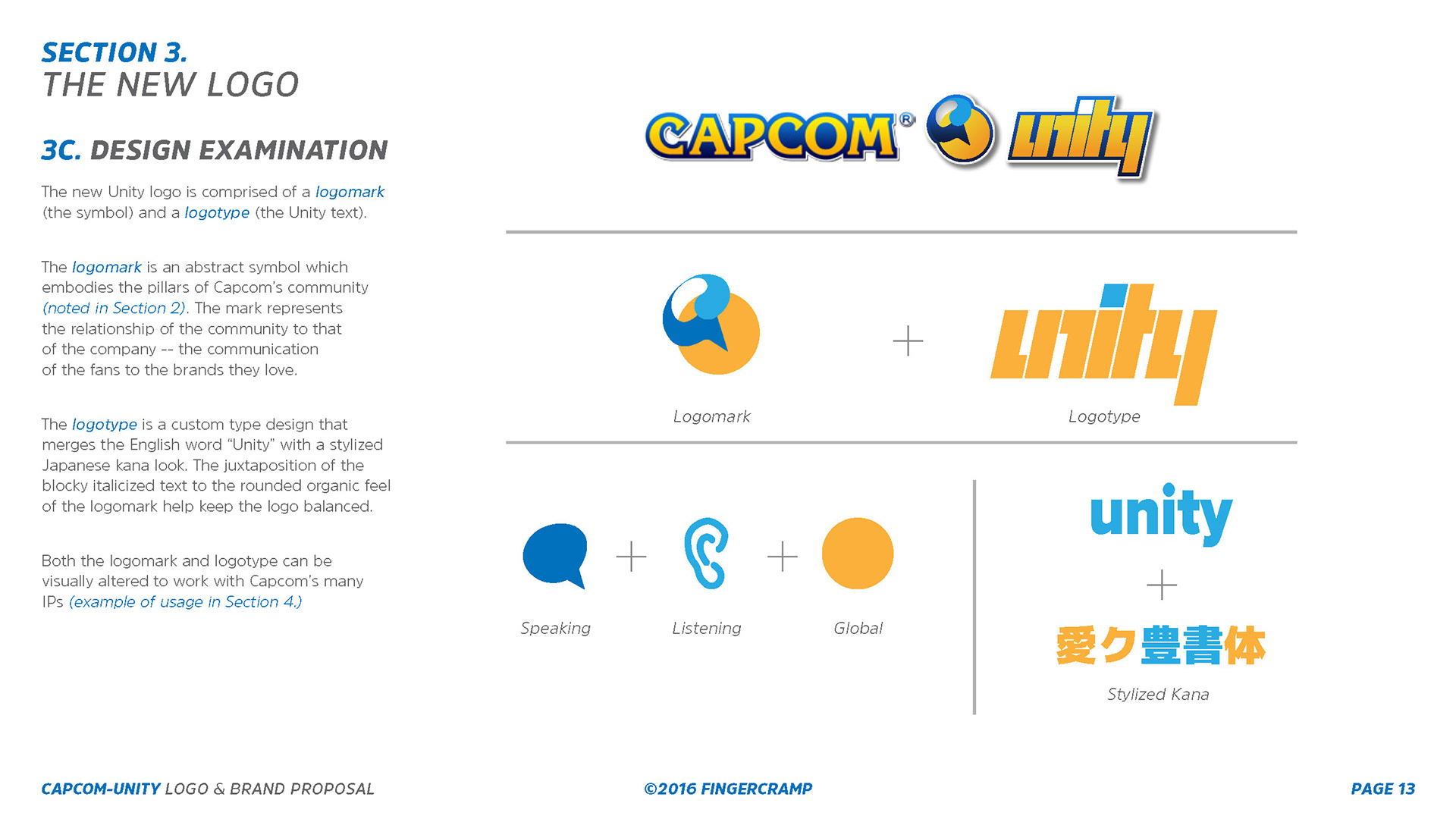
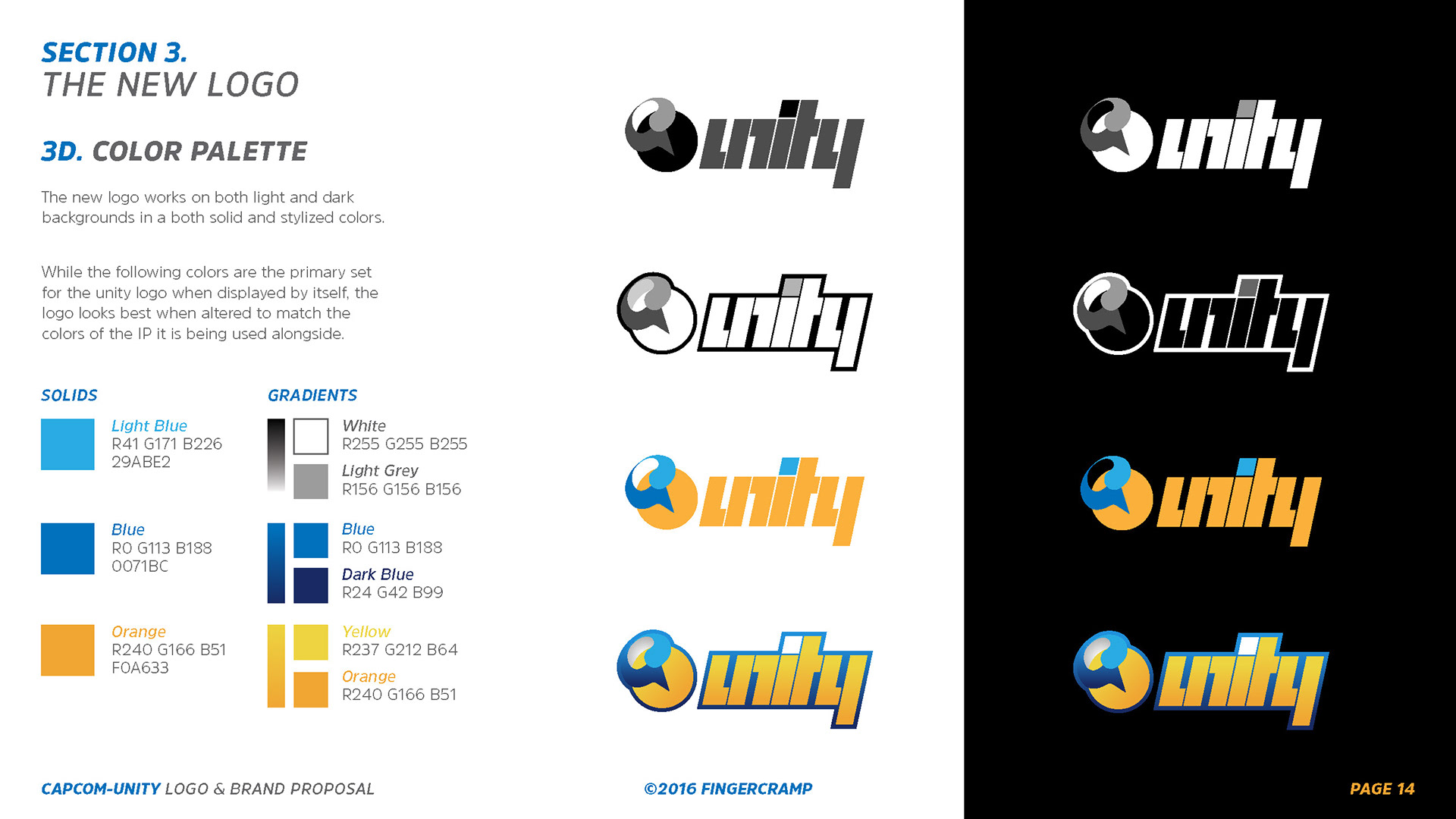
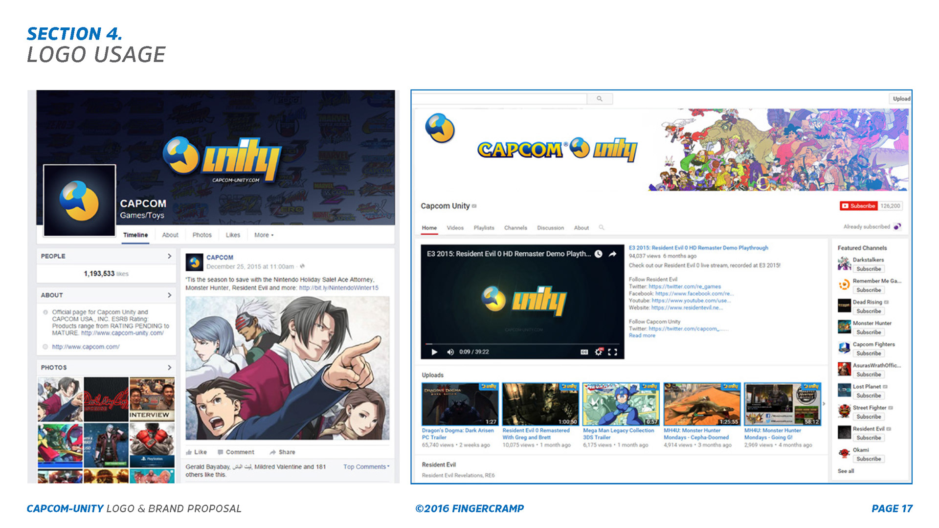
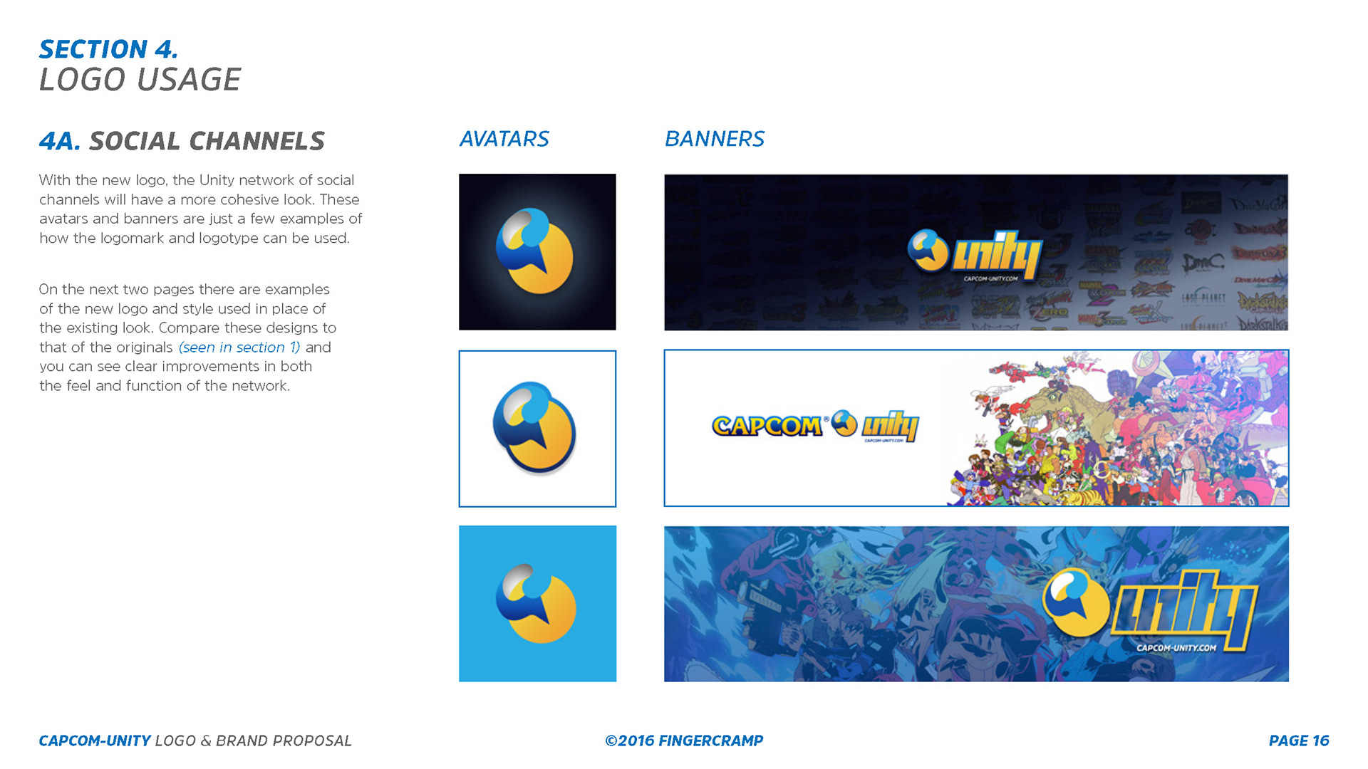
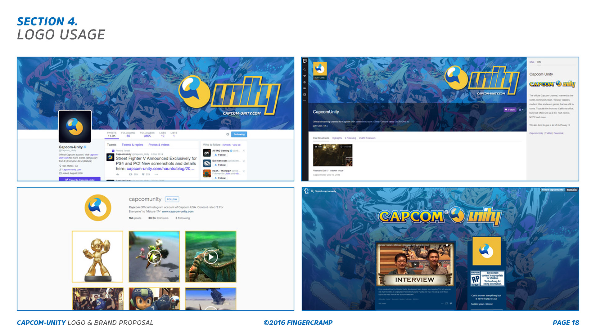
Revisiting the examples shown earlier in the pitch deck, I applied the new branding and demonstrated how connected and unified the various social channels felt. Part of the strategy of tying sub-brands together was to have the unity logo adopt the brand colors of Capcom's many IPs -- inspired by the logomark adaptations of Sony Santa Monica Studios and DC Comics.
Mini-Set Blog
Mythic Ragnaros Skin
30.6 Pre-release
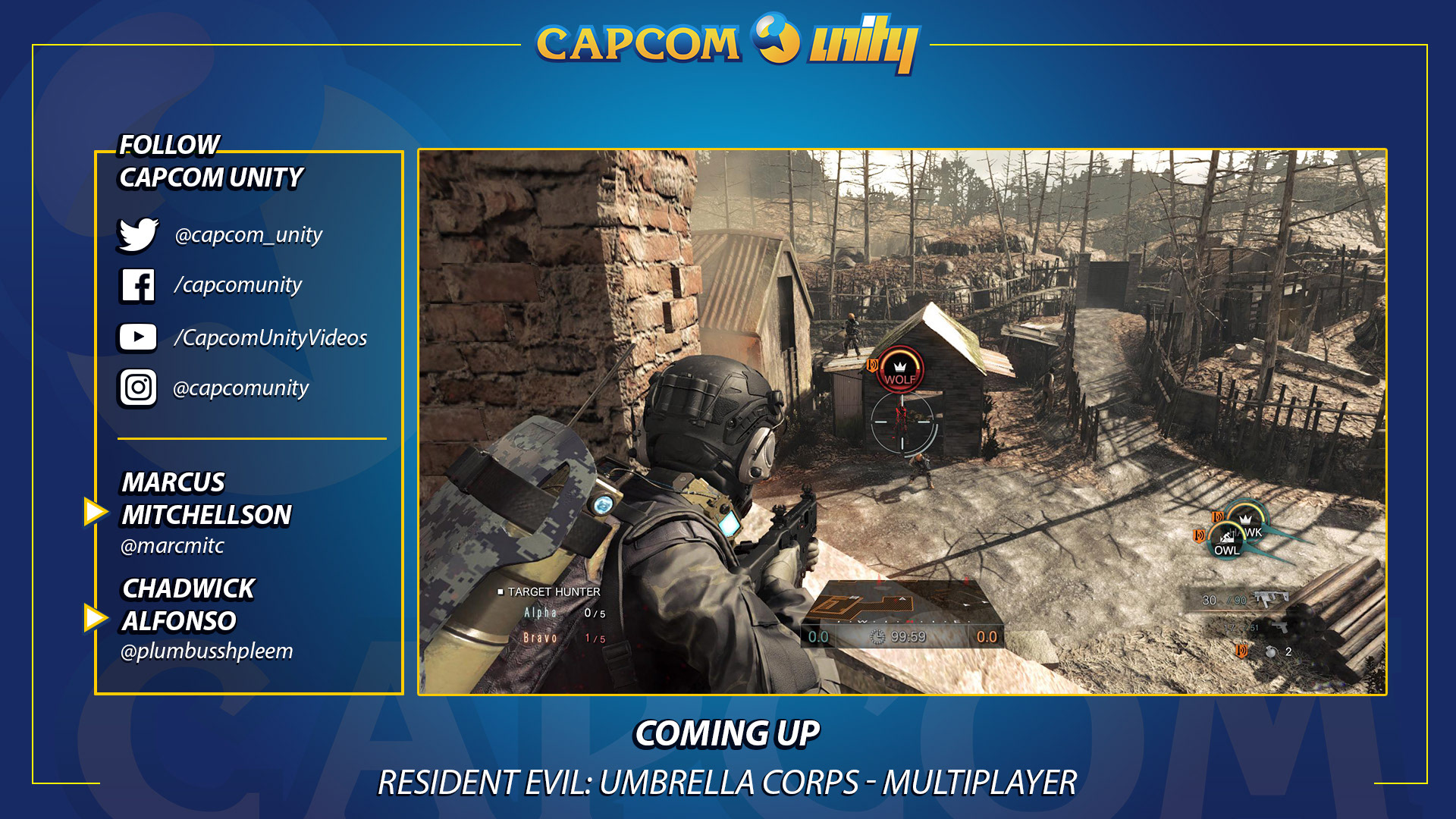
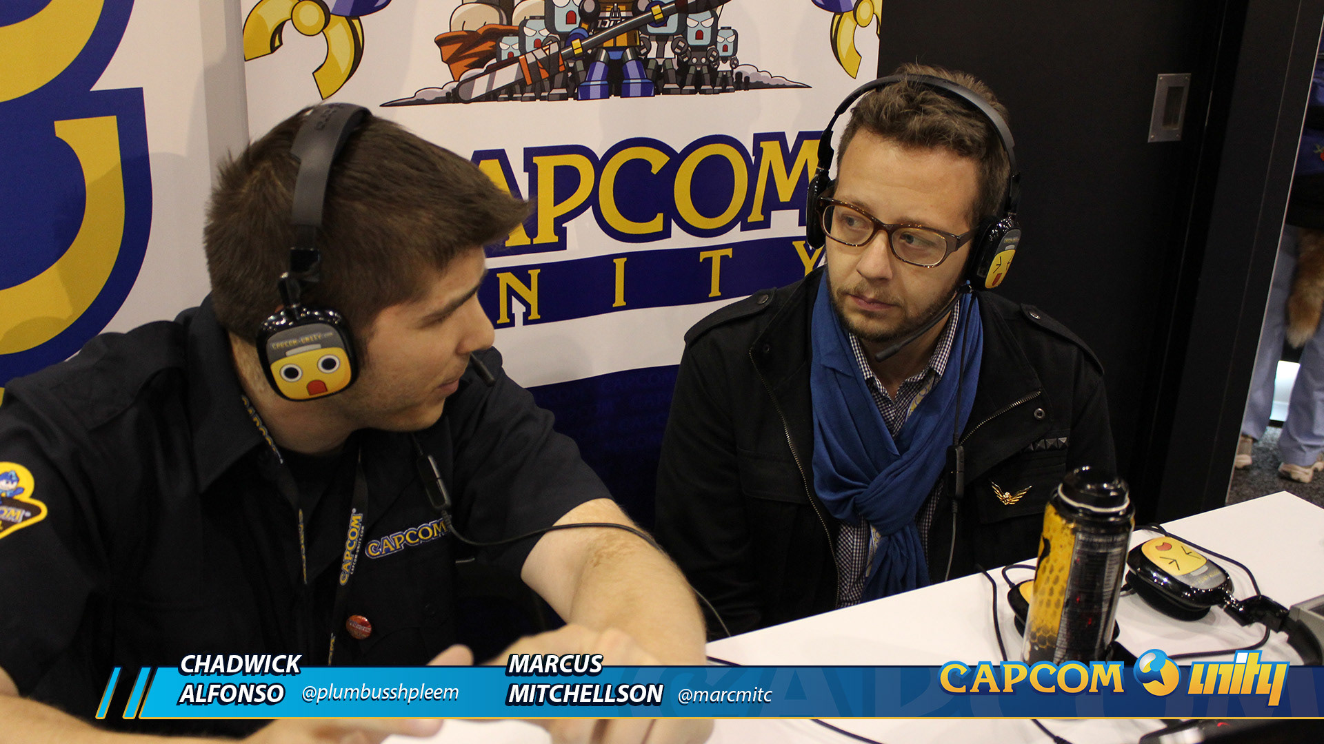
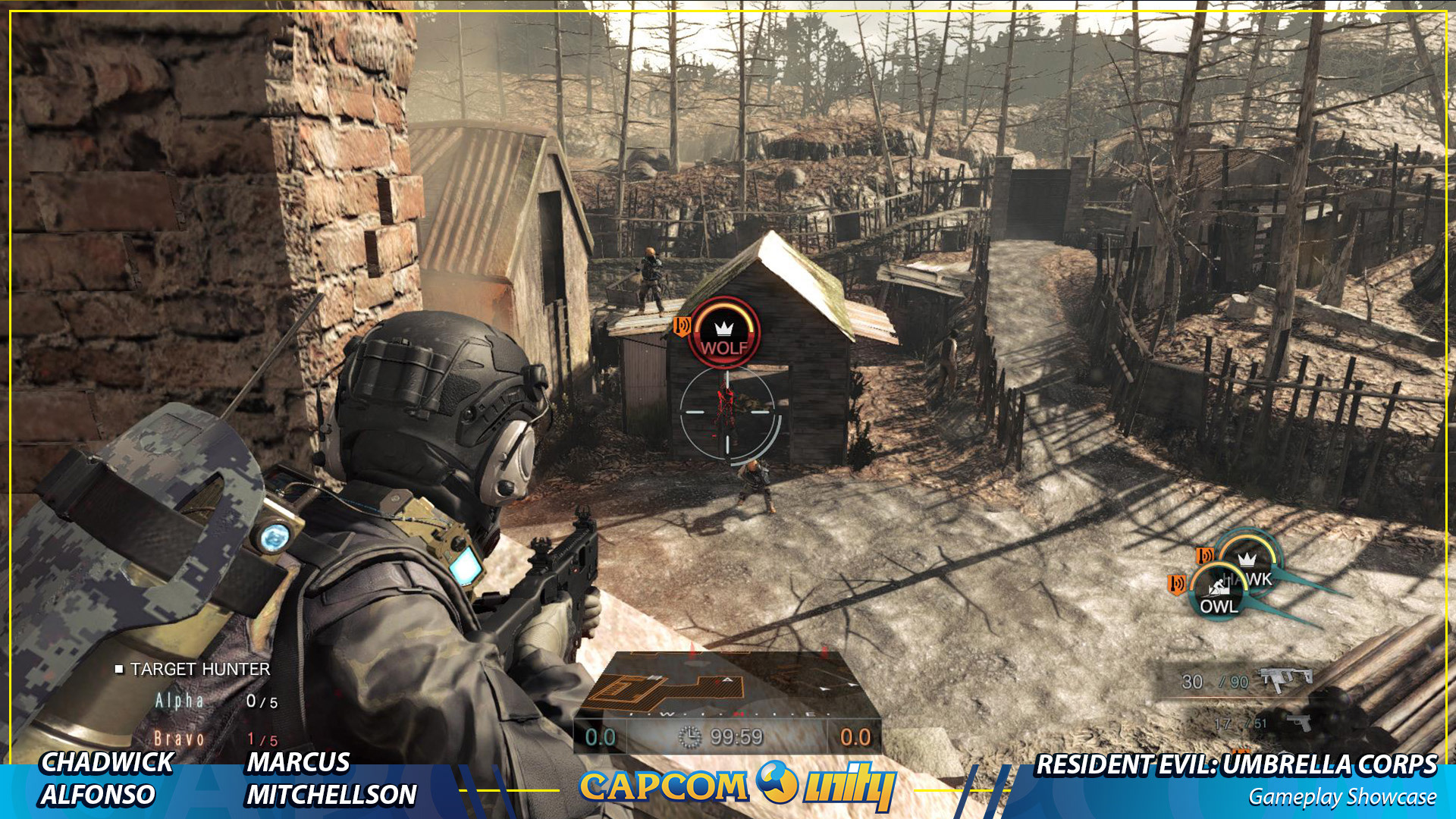
Part of Capcom USA’s marketing tactics were to livestream their game content prior to launches and after major announcements on their branded channels. As such, they needed a brand agnostic graphics package that would allow for better cross-promotion without having to use the corporate level official branding. So while Capcom Unity was a corporate division, it was seen by the community as a more casual and grounded entity.
Pre-Release Tavern Brawl
Influencer Card Reveal Stream
The Great Dark Beyond Video Thumbnails