Combustion Kickstarter Campaign Redesign
Retro Dungeon | Late-Campaign Management, Game Capture & Marketing Insight | 2019
Discovered through the Kickstarter portal, I reached out the campaign creator and offered to redesign the campaign page after noticing the campaign remained stagnant. This included combing through their playable demo for graphical assets and thinking of unique stretch goals to entice backers to pledge more. Upon revision, the campaign saw a boost towards the end that resulted in reaching over 150% of their funding goal.

Key Information
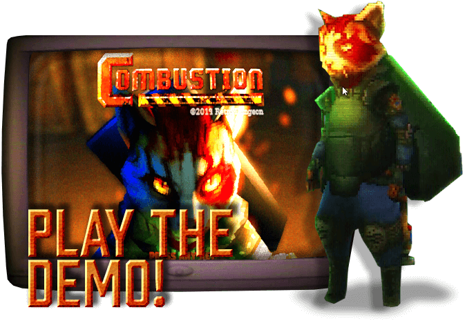
Two graphics that immediately helped answer backer questions were a "Play The Demo!" button right at the top of the page, and a timeline graphic that shows where in development the project was.



Backer Rewards
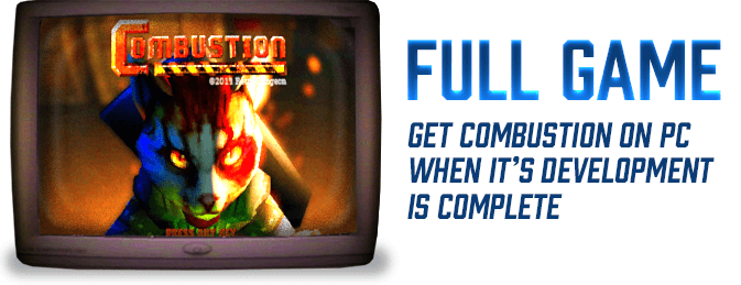
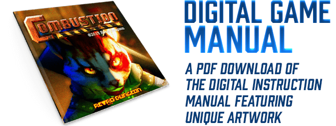
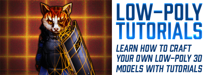
One of the core things I wanted to help improve was the clarity of the rewards. With just a text description in the Kickstarter pledge tiers, it was hard for backers to know what they were actually getting at a glance without any accompanying visuals.


Section Headers
These were created from the tutorial messages in game. The police dog character was perfect to use as a header mascot and the subtitles for each header was fun to write.
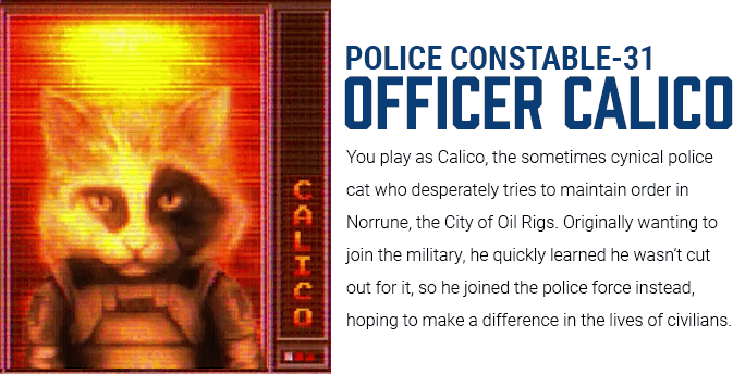
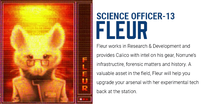
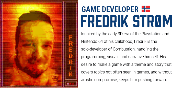
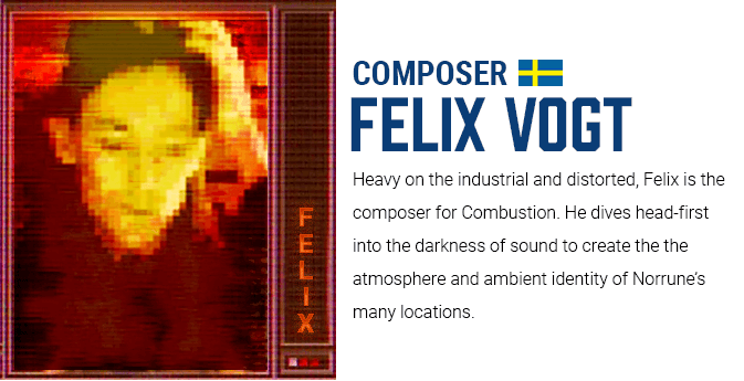
Character & Dev Bios
The character portraits are displayed in-game through an MGS-style radio, so I figured why not have the developer portraits displayed on the campaign page in a similar manner.


Stretch Goals
Working with the developer to create ideas for stretch goals was fun. Many of these goals harken back to the retro console days when fun extras were part of the expected package.
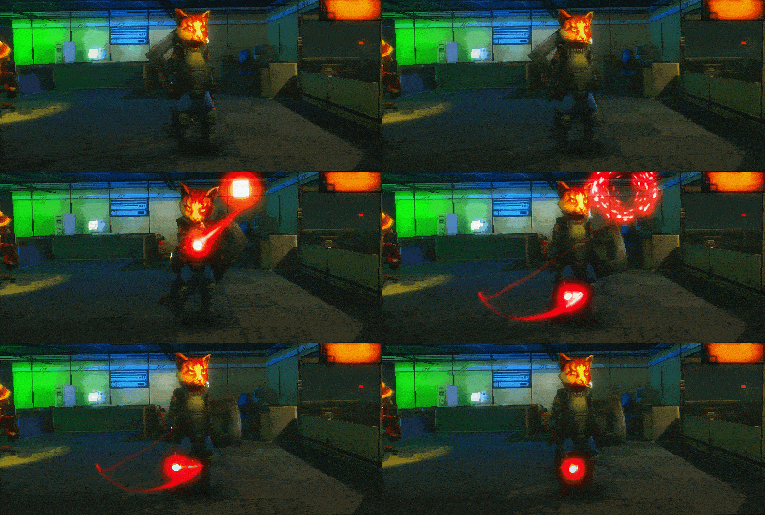


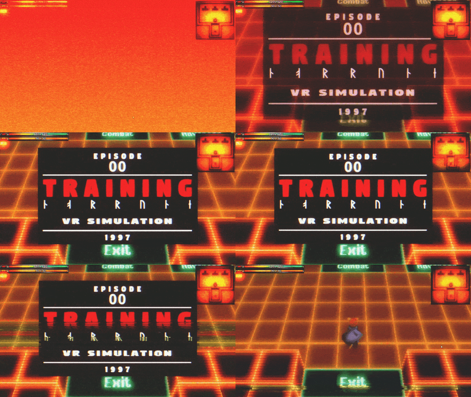
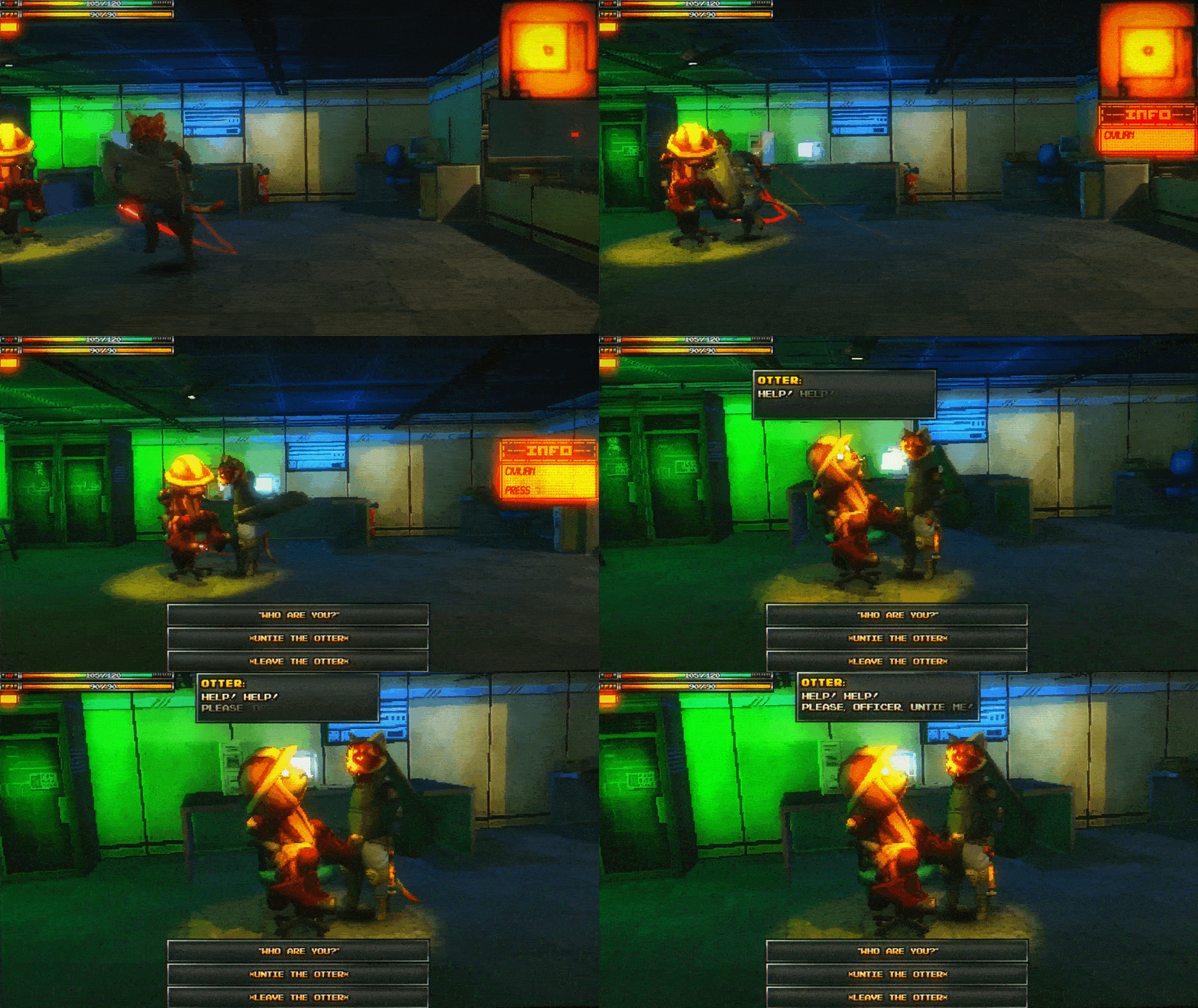
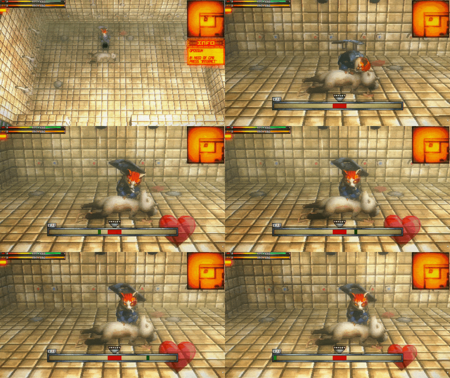
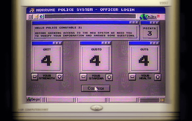
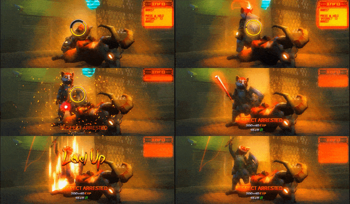
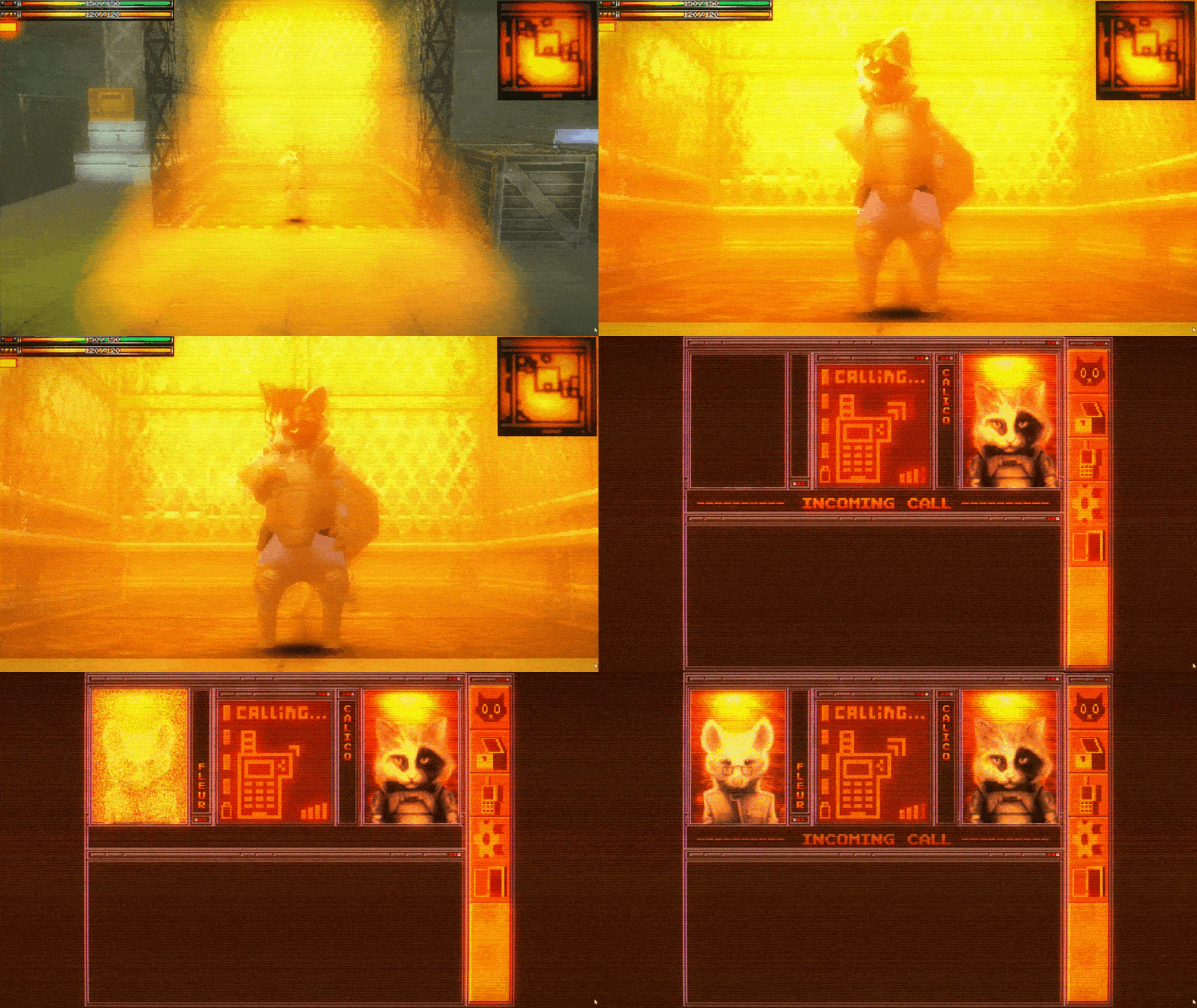


Gameplay Capture Gifs
Captured from the Playable Demo and edited to showcase the many gameplay features of Combustion, something that was only depicted as screenshots in the original campaign layout.