Capcom Unity REBRAND
Capcom USA | FingerCramp ● Identity Designer & Brand Strategist ● 2015 - 2016
With Capcom-Unity being the central hub for all things Capcom, a focus on branding and consolidation among their many channels was long overdue.
As fans of Capcom's many IPs, we felt the Capcom-Unity portal did not offer a singular and cohesive vision that delivered an experience that fans wanted. Analyzing Capcom Unity's network of social media channels, I developed a brand identity built on 3 core pillars. With a new logo and clear strategy, I proposed how this identity would be utilized in this 24-page pitch deck. The rebrand launched in early 2017 before Capcom-Unity as a brand was dissolved just 3 years later in mid-2020.
Confidential slides have been omitted.
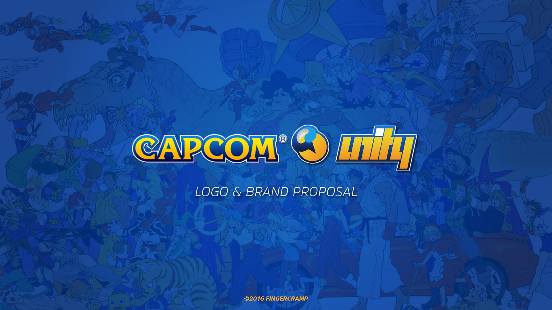
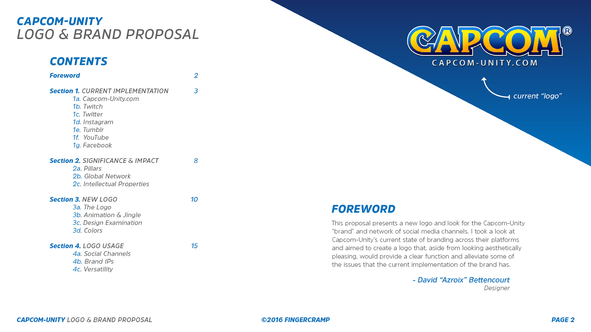
Assessment
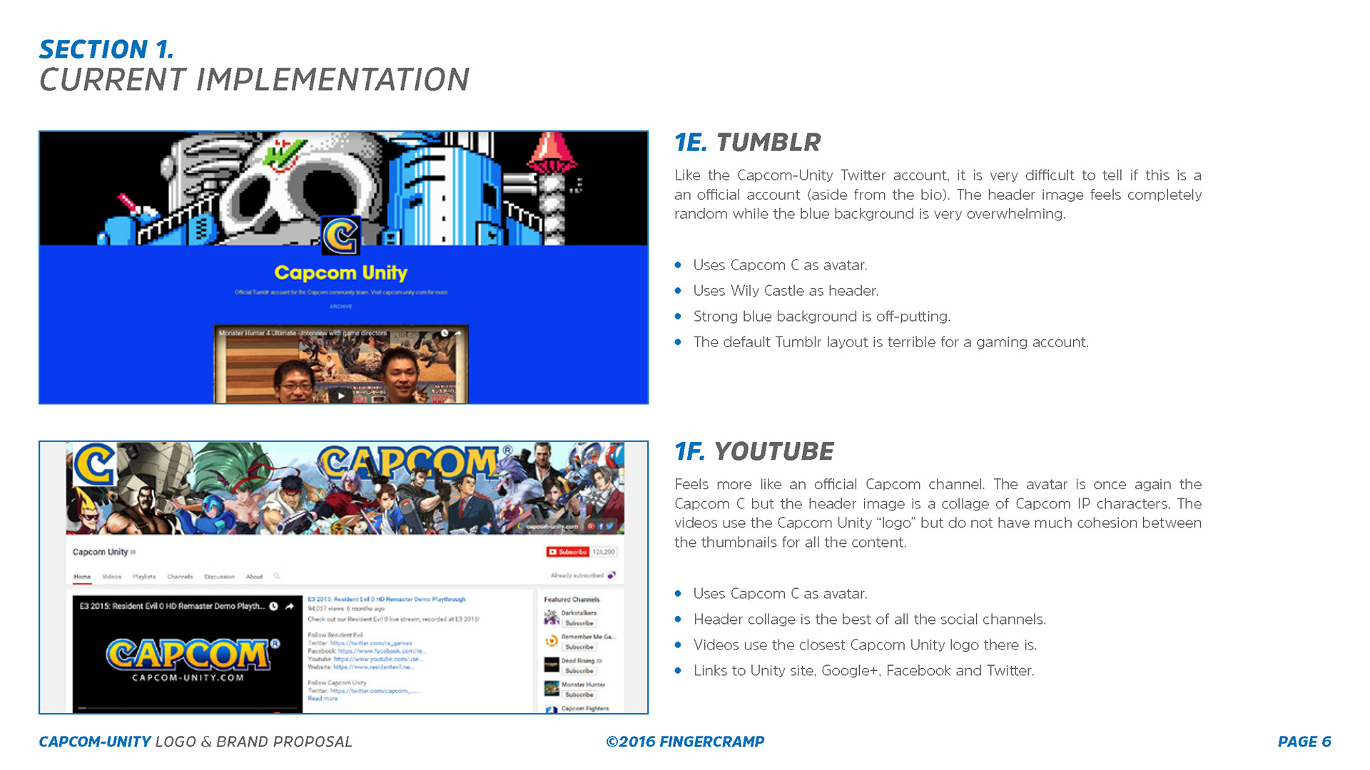
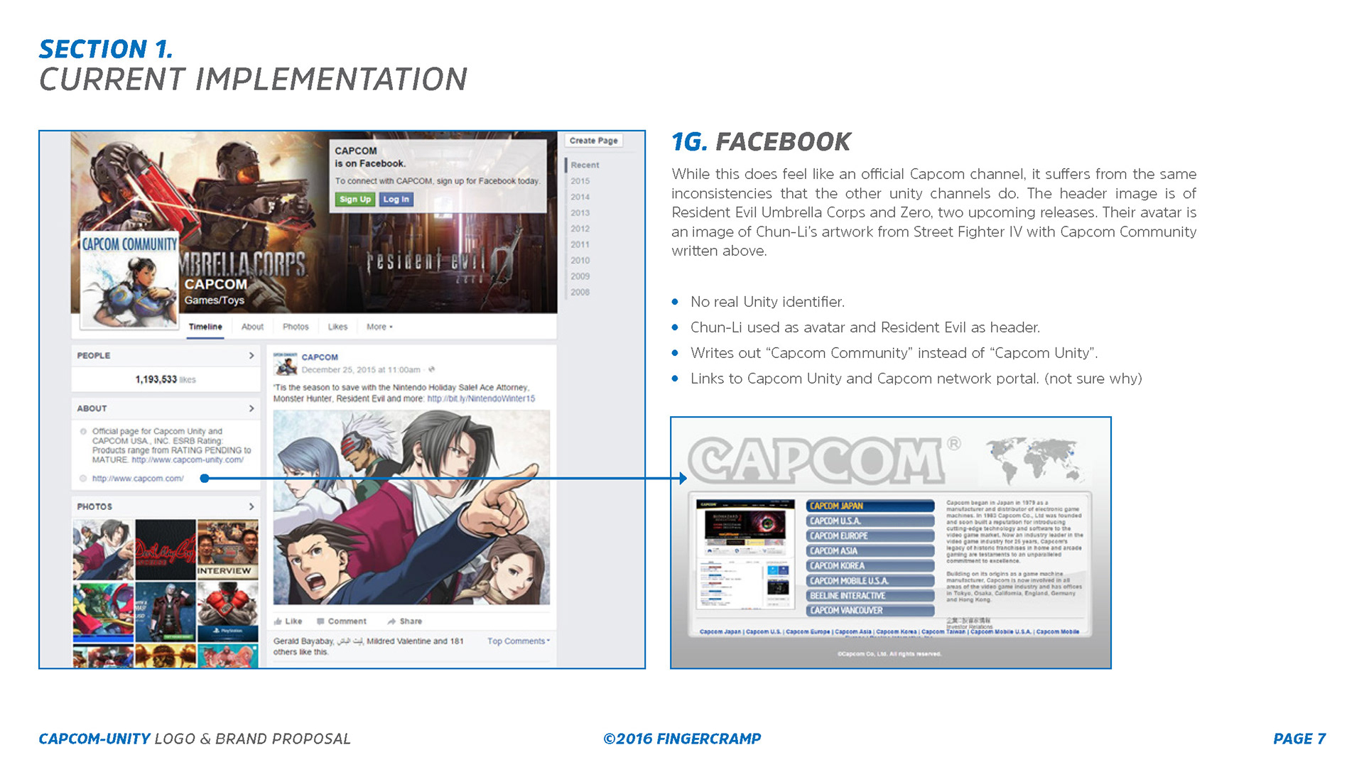
I took a look at Capcom-Unity’s current state of branding across their platforms and aimed to create a logo that, aside from looking aesthetically pleasing, would provide a clear function and alleviate some of the issues that the current implementation (at the time) of the brand has. To start, I put together an 11-page strategy assessment that I would discuss internally with Hak (FingerCramp) before compiling my findings to include in the final pitch deck.
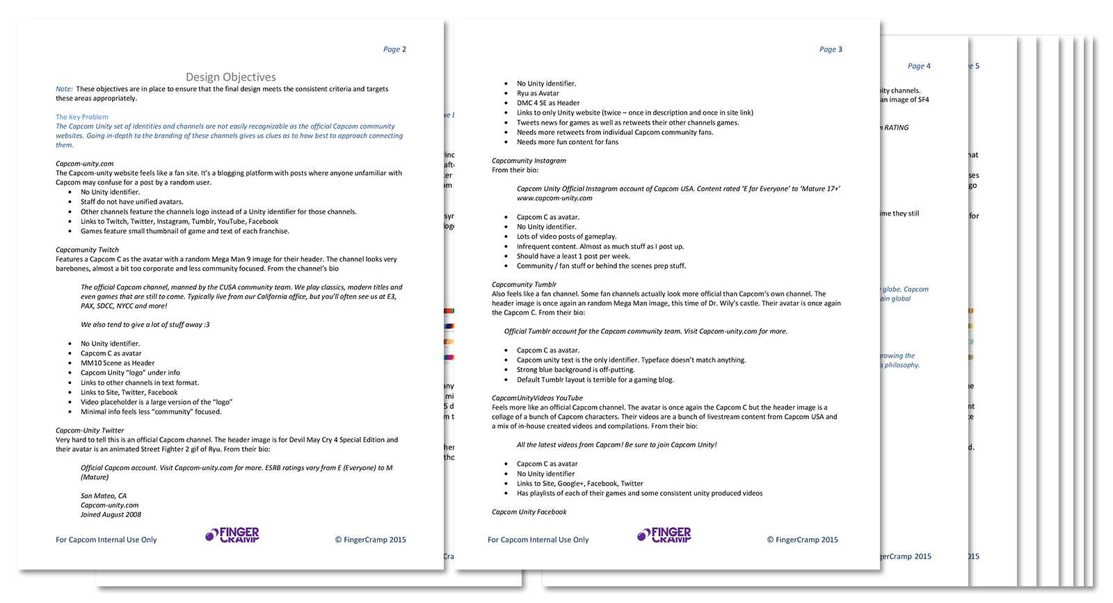
11-Page Strategy Assessment

The Logo
The final logo seen here is the result of a few months of iteration and rumination. Trying to figure out how best to express the complex web of fan expectations from multiple brand IPs for such a titan of the games industry was a tough but fun challenge.
Final Logo Animation w/ Sound
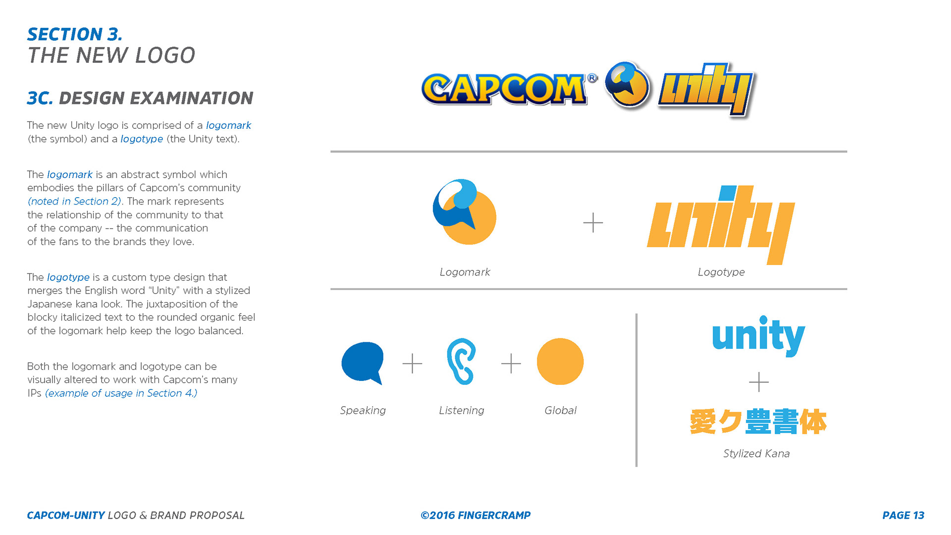

I took inspiration from the logo treatments and brand expressions of studios like Sony Santa Monica, DC Comics, the city of Melbourne, as well as Microsoft’s Rare.
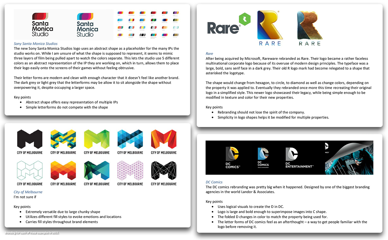
I determined an abstract icon would be ideal and would need to be set alongside a logotype that would work with the Capcom logo – after all, you can’t have spell Capcom-Unity without Capcom.
BRand Usage
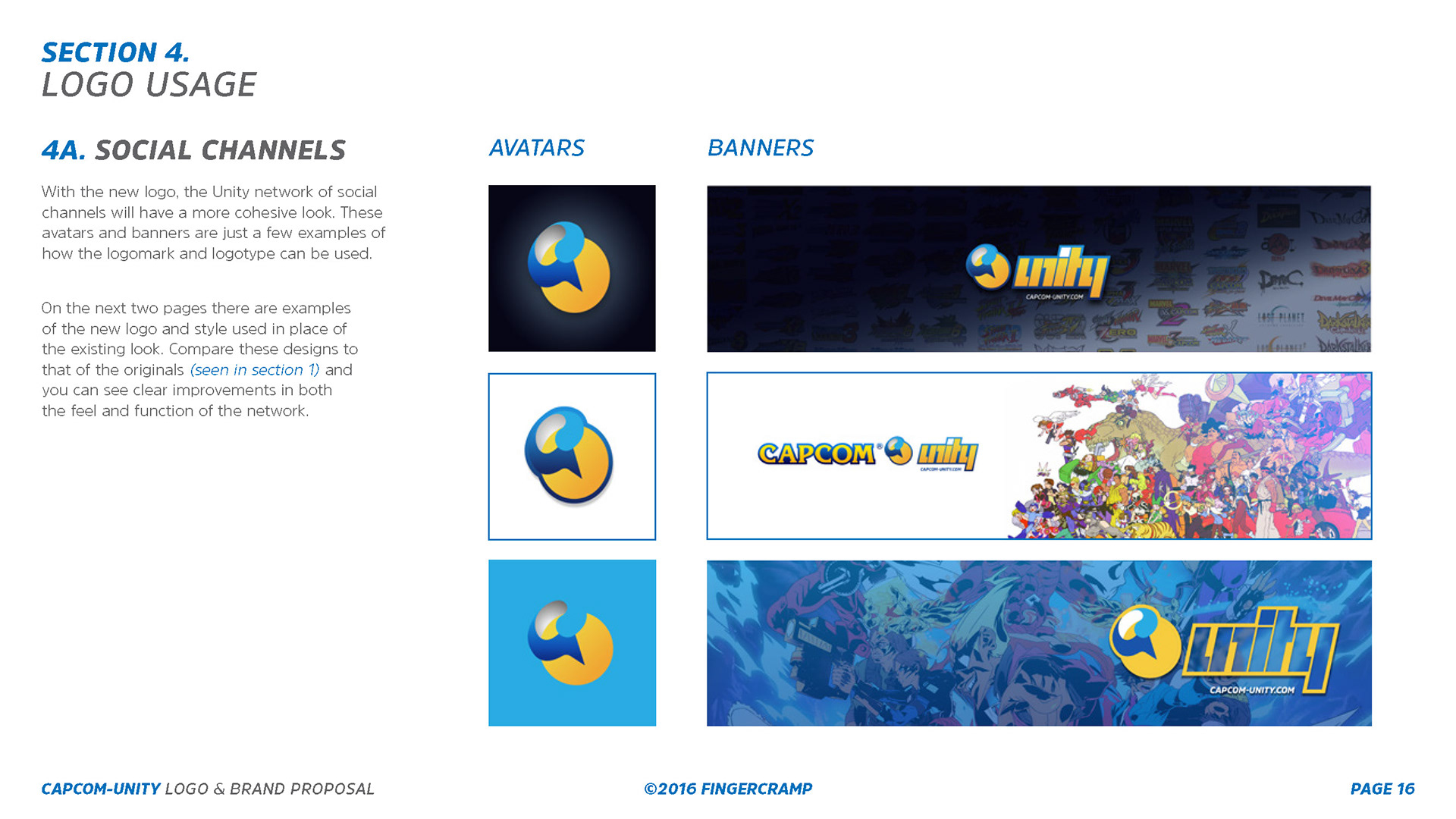
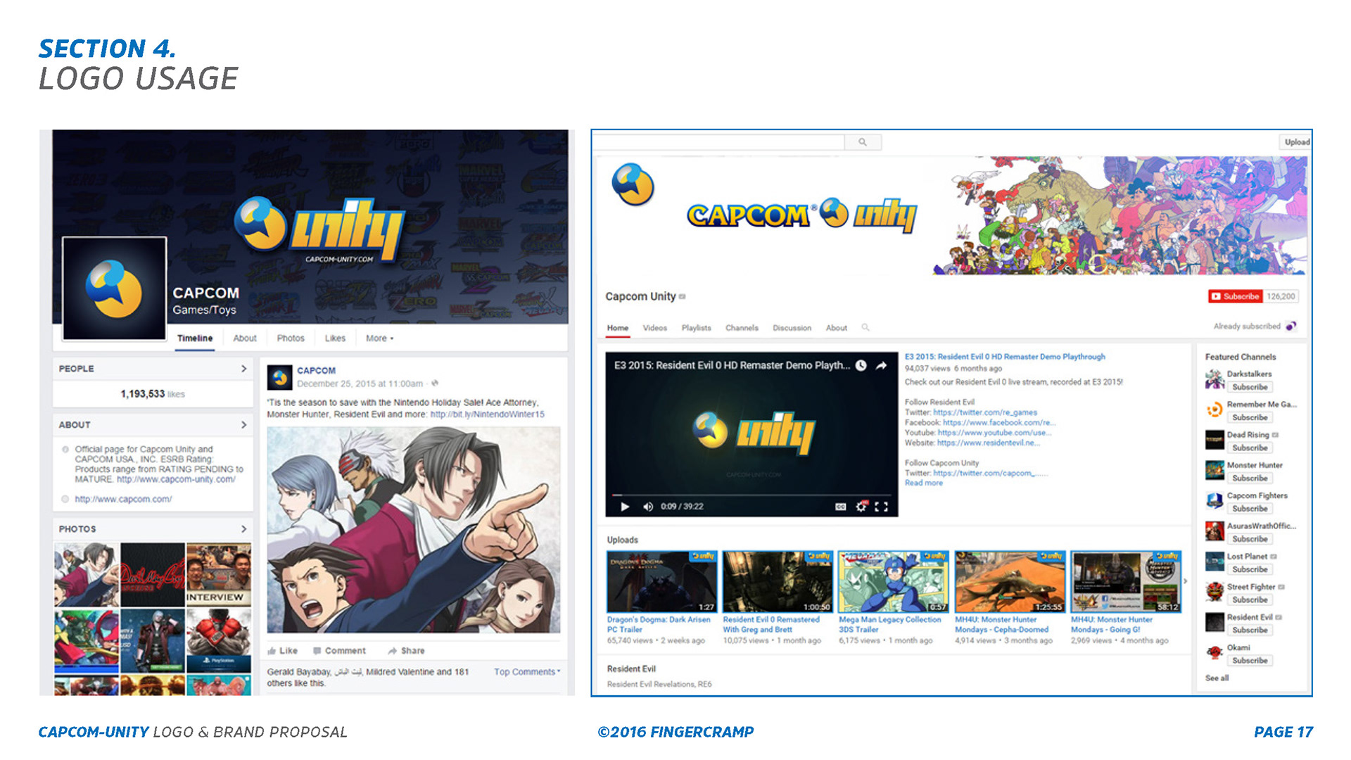
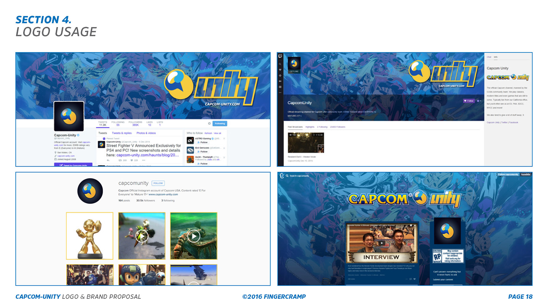
I created a small set of avatars and channel banners that could be used across the Unity channels. Revisiting the examples shown earlier in the pitch deck, I applied the new branding and demonstrated how connected and unified the various social channels felt after the introduction of the new assets.
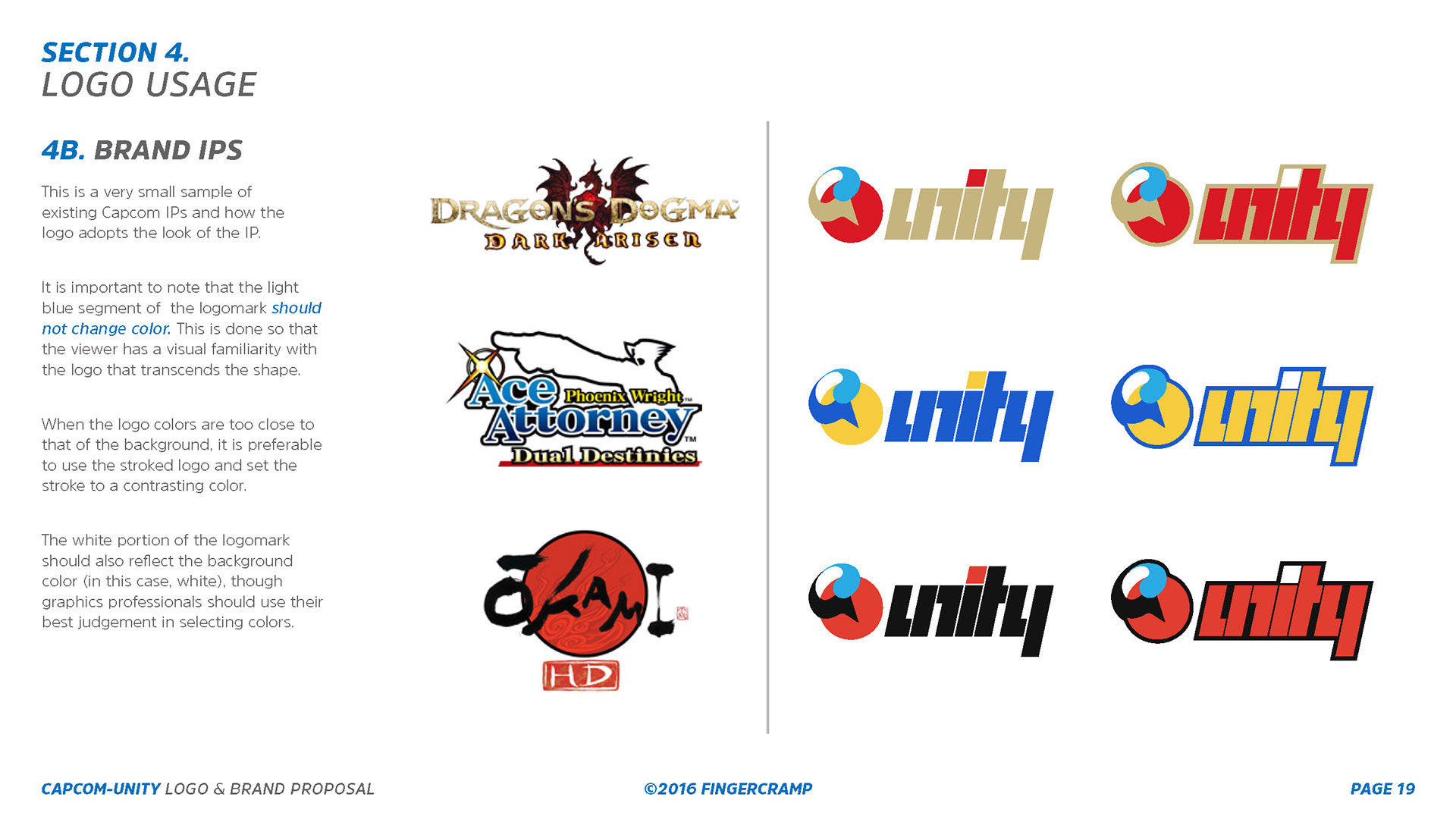
Part of the strategy of tying sub-brands together was to have the unity logo adopt the brand colors of Capcom's many IPs -- inspired by the logomark adaptations of Sony Santa Monica Studios and DC Comics.
Logo Animation with Street Fighter IP colors
Unity Stream
Part of Capcom USA’s marketing tactics were to livestream their game content prior to launches and after major announcements on their branded channels. As such, they needed a brand agnostic graphics package that would allow for better cross-promotion without having to use the corporate level official branding. So while Capcom Unity was a corporate division, it was seen by the community as a more casual and grounded entity.

Unity Stream Downtime Mortise Mock-Up
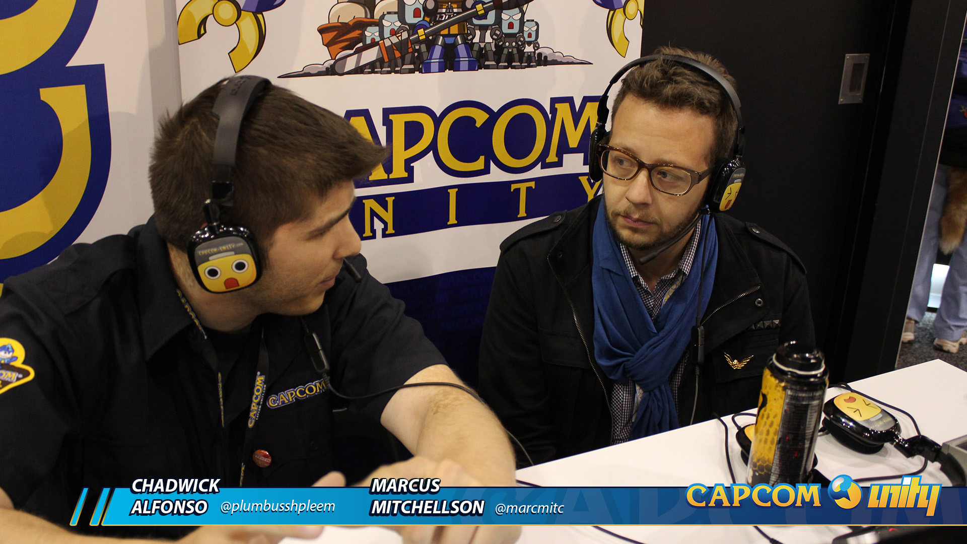
Unity Stream 2-Person Lower 3rds Mock-Up
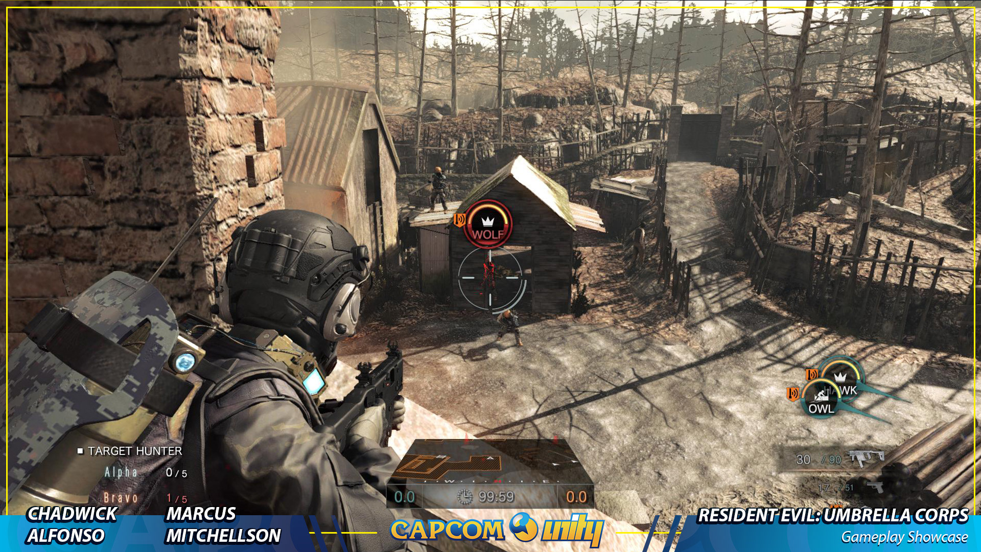
Unity Stream Full Frame Mock-Up
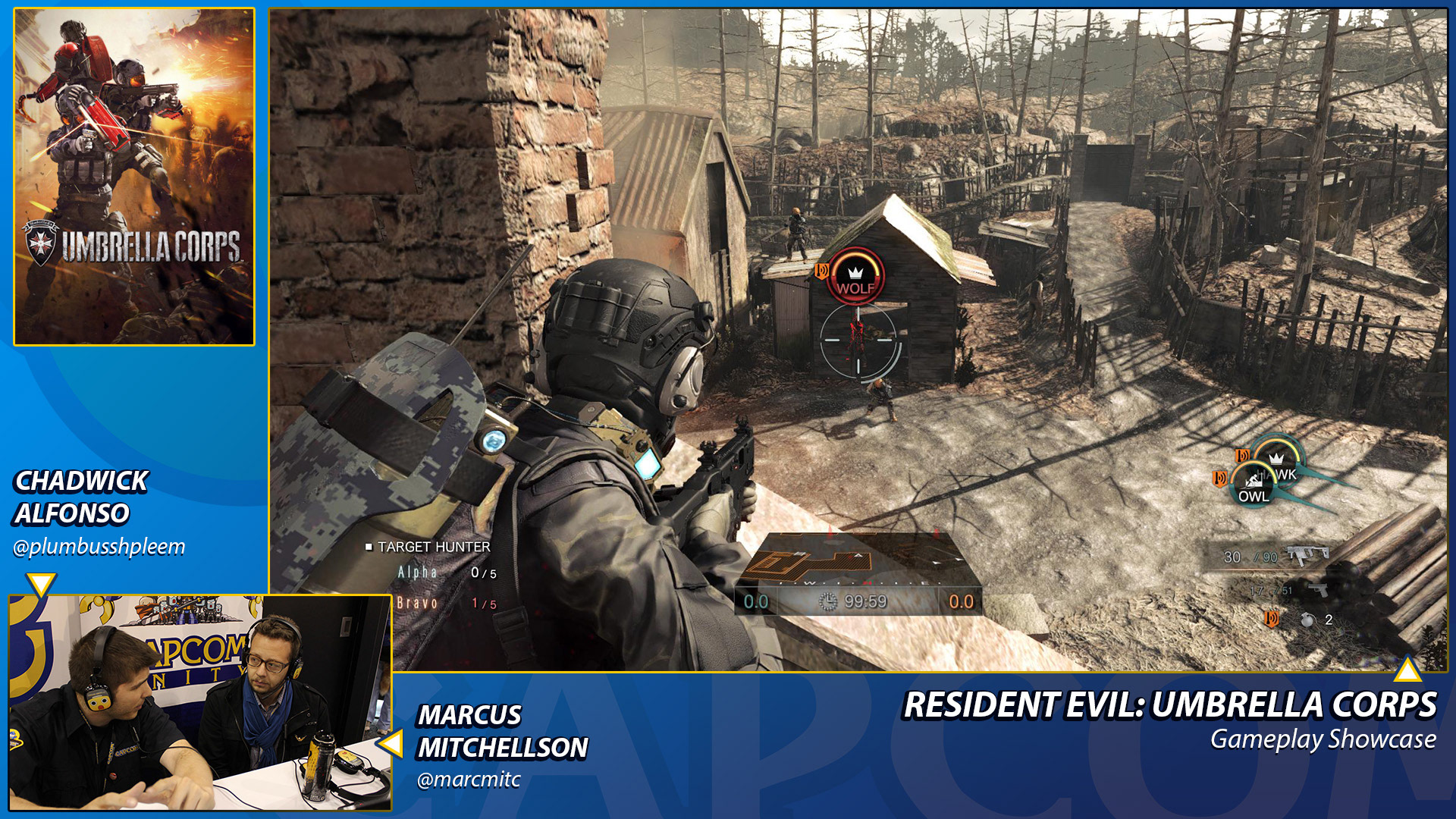
Unity Stream PIP Mock-Up