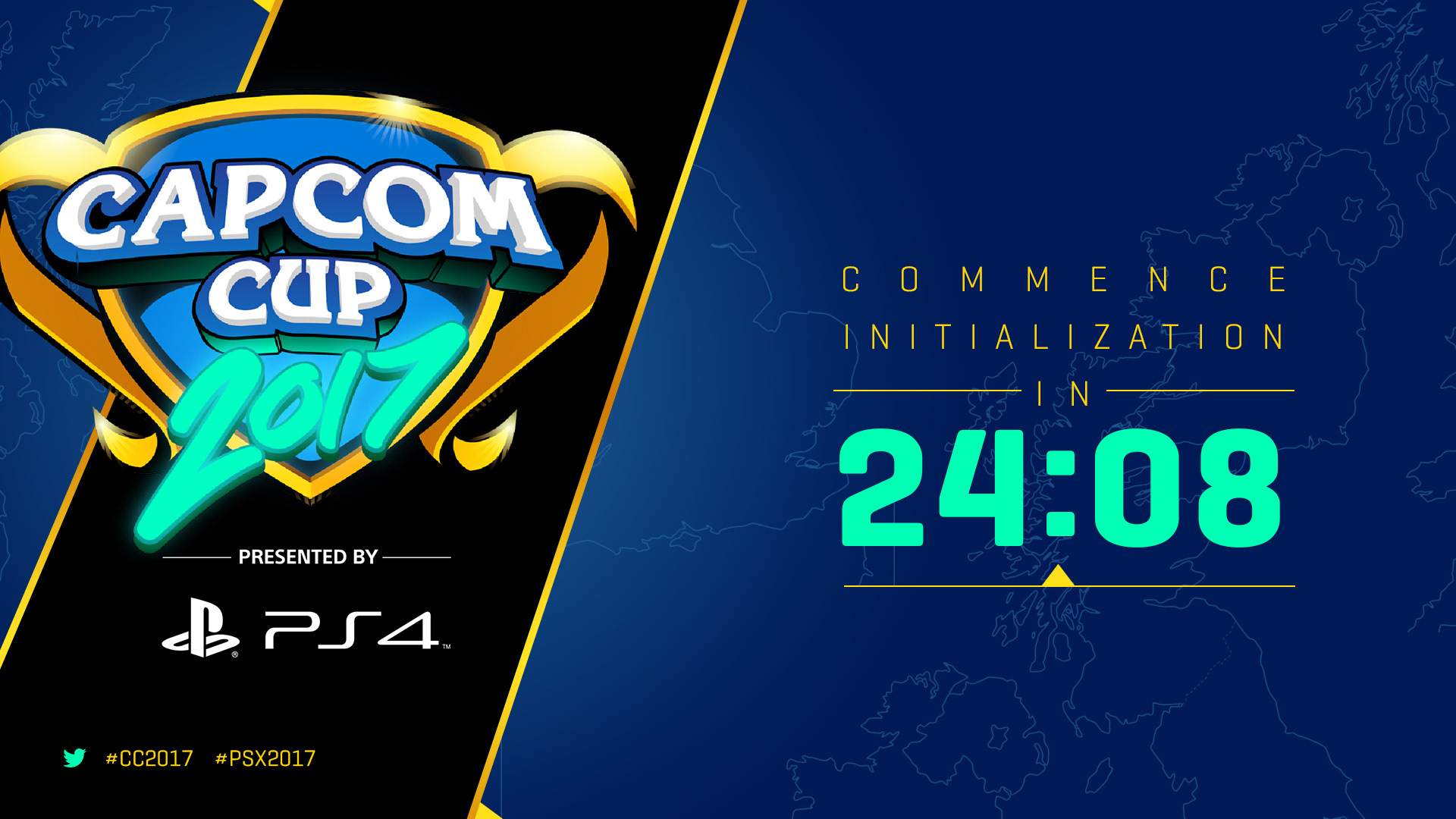
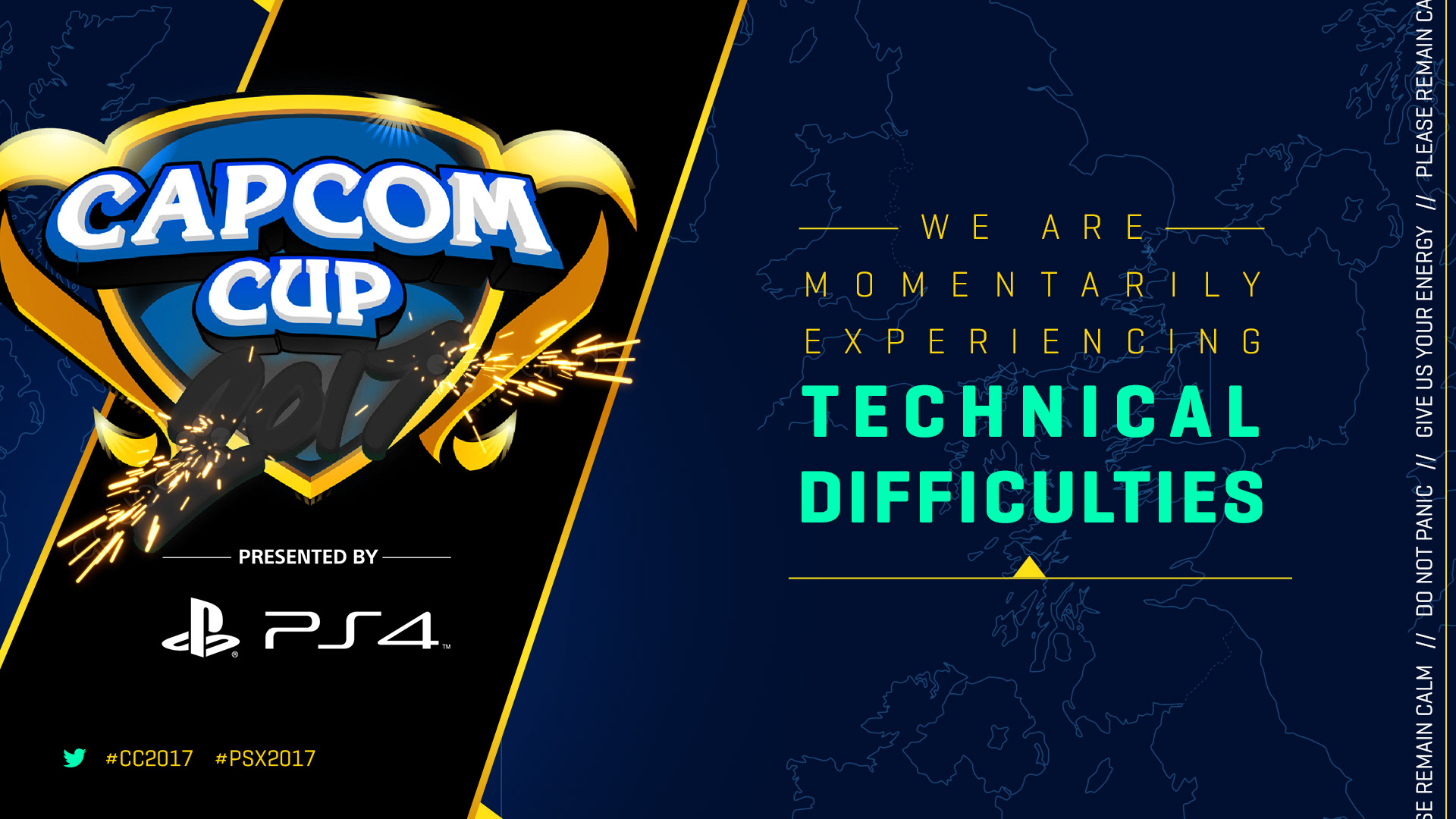
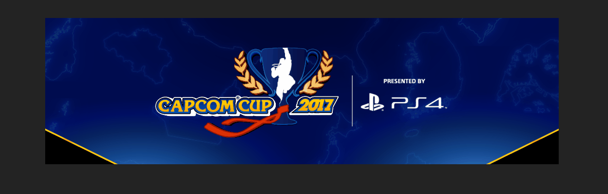
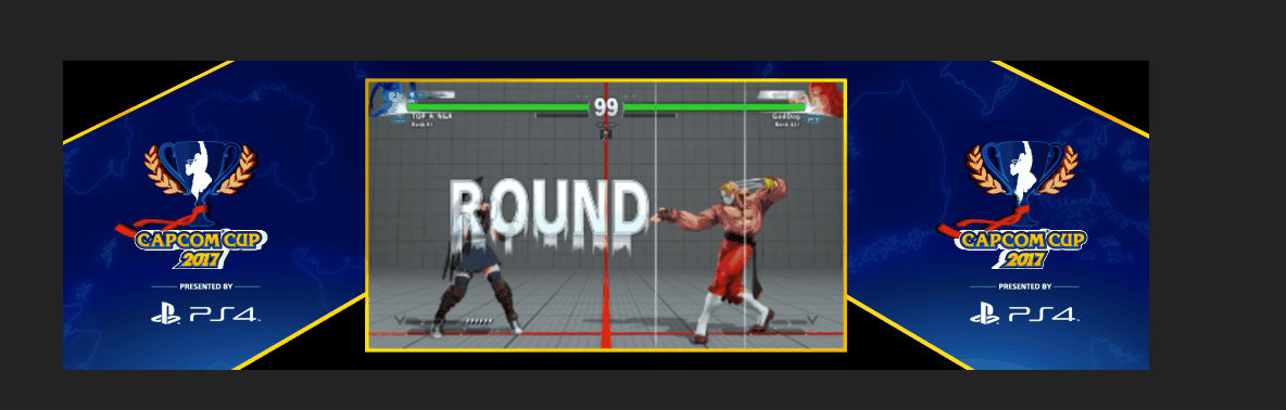
Capcom Cup 2017 logo redesign
Capcom USA | FingerCramp | Logo Designer | 2017
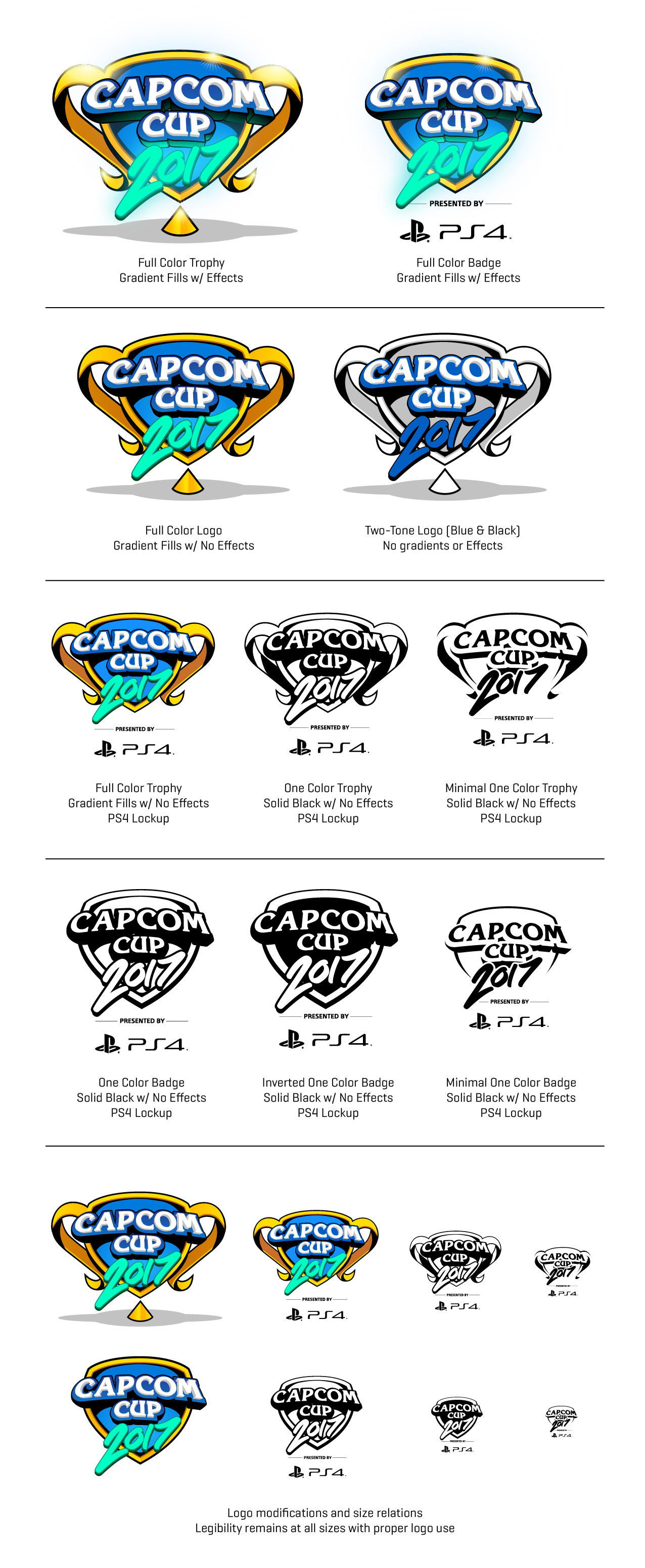
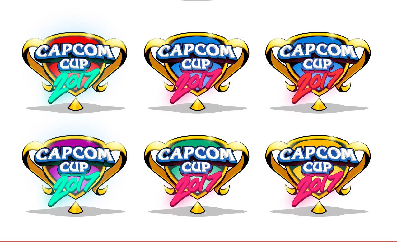
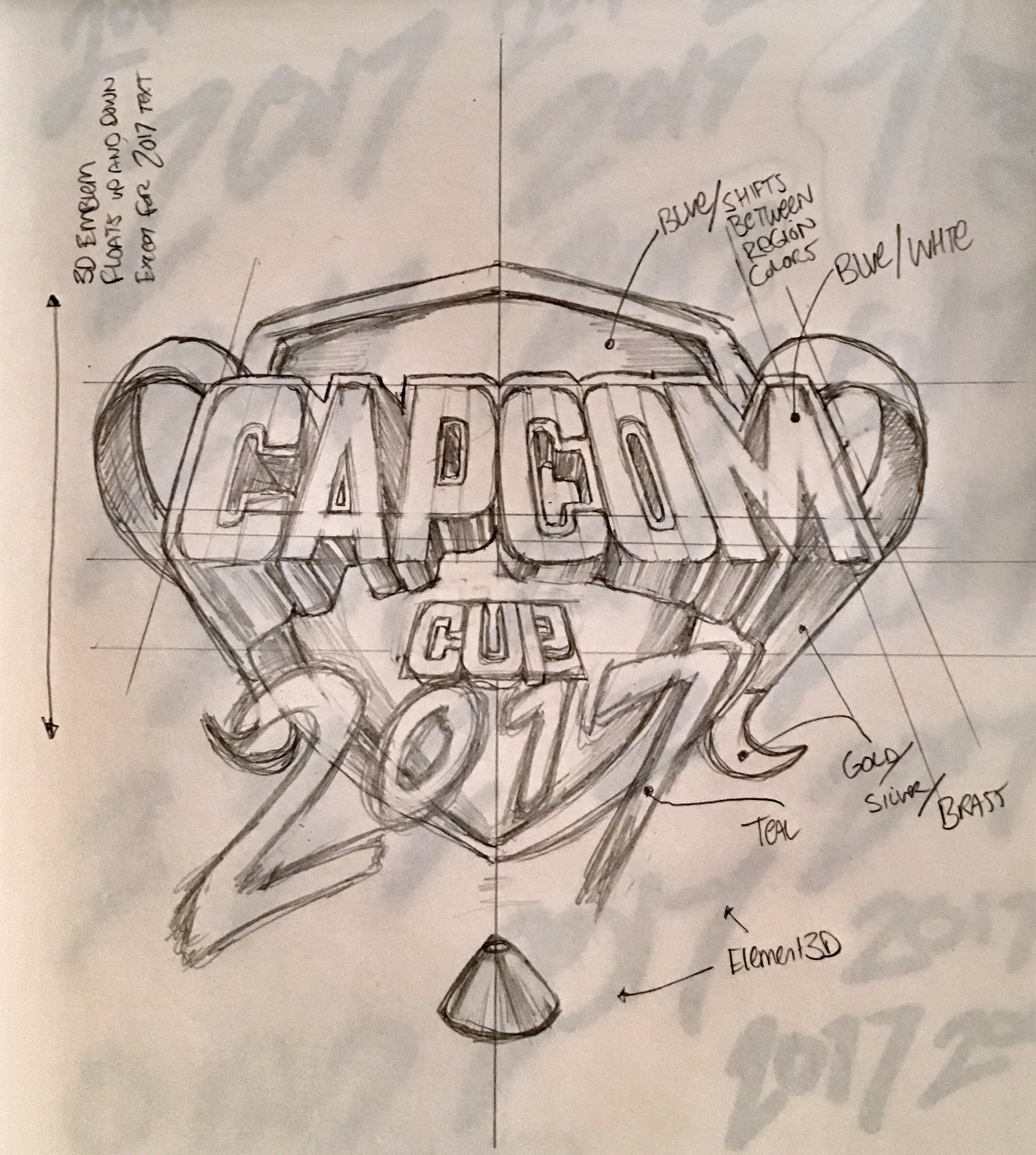
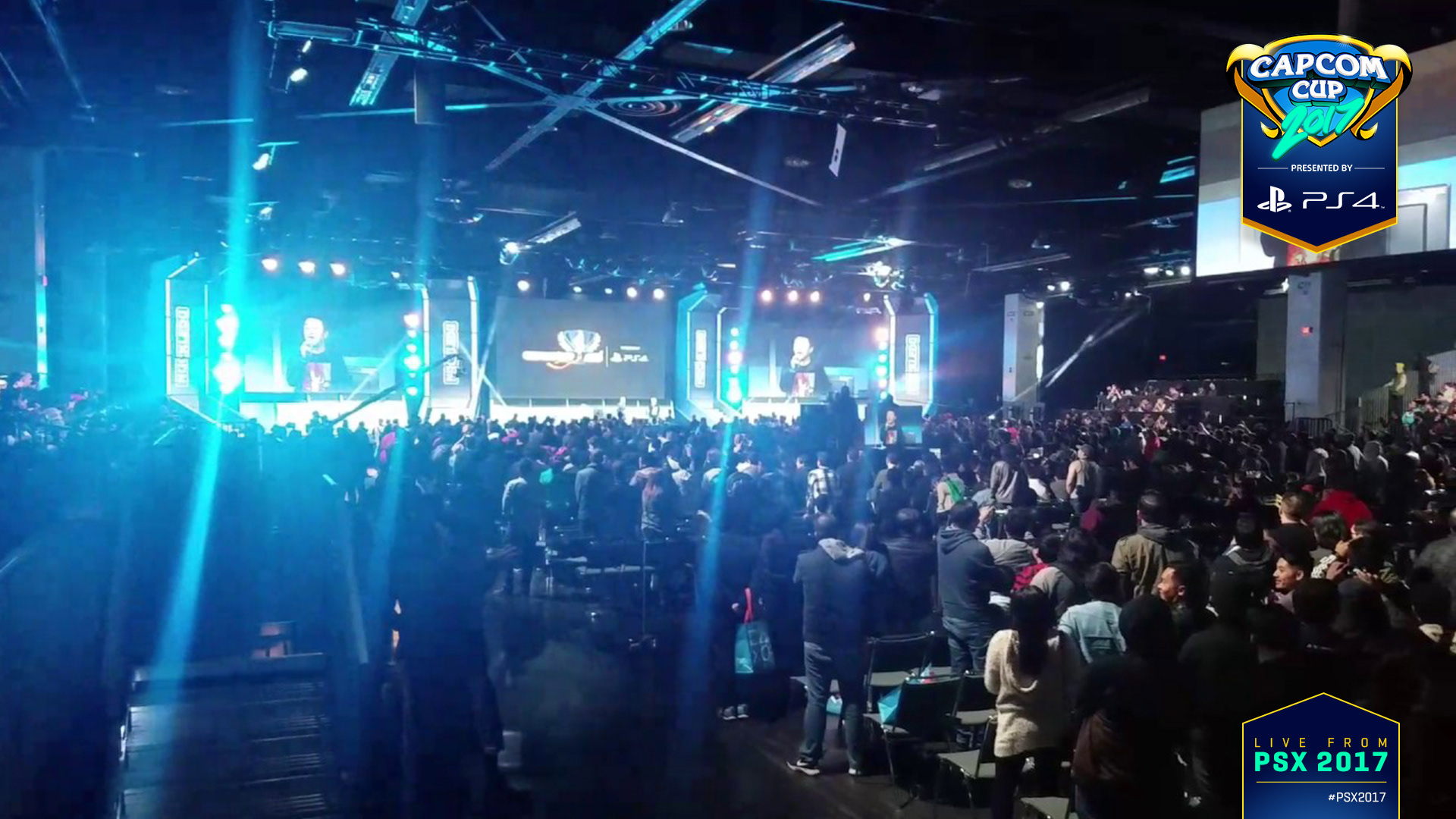
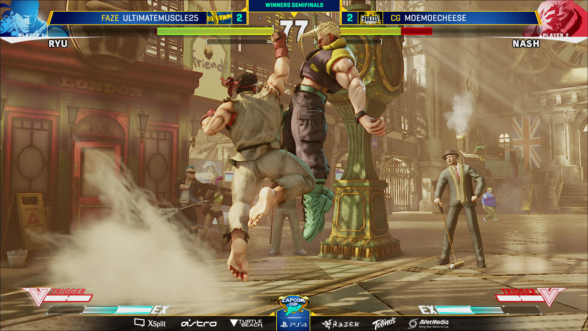
The Capcom Cup logo has remained unchanged since 2014 and became increasingly challenging to work with due to the large amounts of negative space and the large knock-out silhouette across the image. I redesigned the logo with these issues in mind and created a dynamic logo that is striking and adaptable to the many different overlays, backgrounds and sizes it will be displayed at. Unfortunately, the proposal was not considered.